In my two previous articles, I’ve demonstrated the process for creating a landscape in colored pencil, using a classical painting method that involves starting with a complementary underpainting.
You can read how to start your complementary underpainting here and how to begin your color work here. In today’s article, I’ll show you how to finish the landscape.
Step 1: Start in the background, and work forward
I began the final round by once again going to the background.
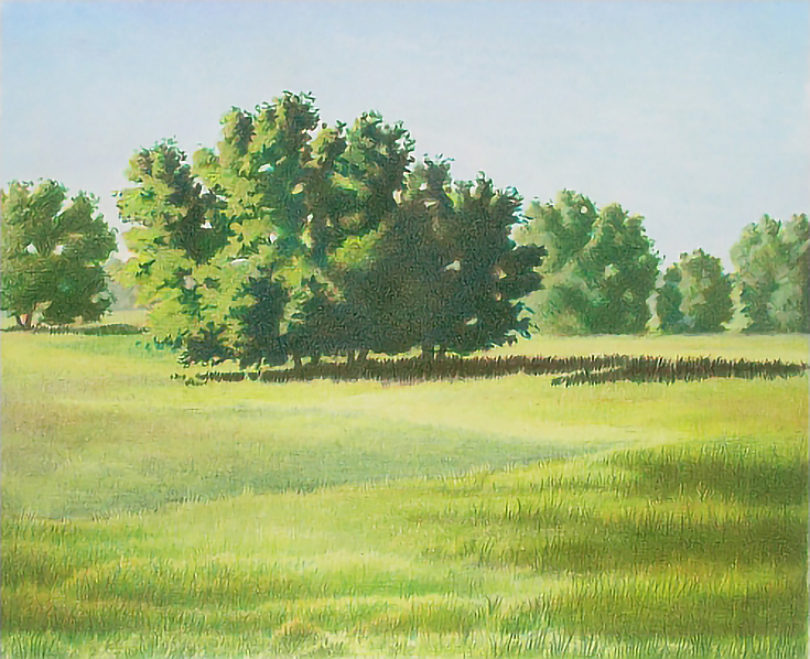
The most distant trees were pushed further into the distance by burnishing with White. I also burnished the places where a distant green shape shows through these trees (see the two spaces on either side of the small center tree in the illustration below.)
There is very little detail in those farthest green shapes, and actually, only a hint of green because they are so far in the background. Note that they are also only slightly darker than the sky.
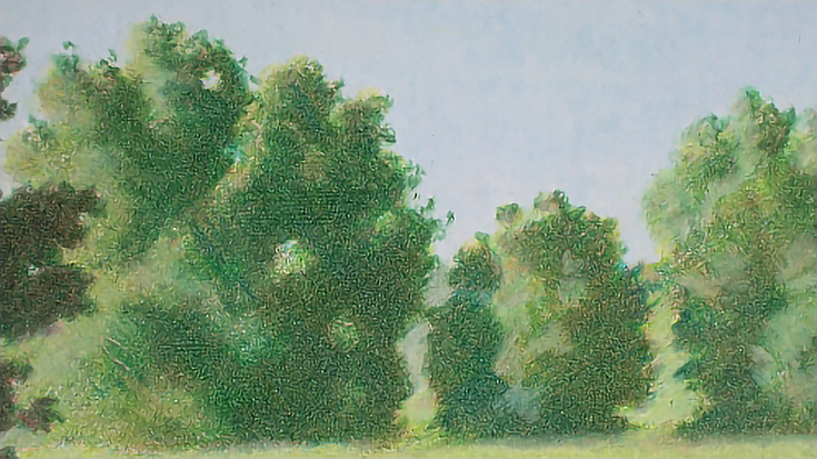
Burnishing the most distant trees with White also set them apart from the next line of trees. That reduced the amount of work I needed to do on those trees while letting me push them further into the distance, separating them from the central tree.
I layered Chartreuse very lightly over the sunlit areas, and darkened the shadows with Peacock Green using circular strokes and heavy pressure. Finally, I layered Spring Green over every part of every tree in that group, and then burnished them with White.
For the background grass, I used Spring Green with heavy pressure to create an unbroken field of color. This area should show very little shift in color or value. Visible pencil strokes should also be kept to a minimum. I used a blunt pencil and placed the strokes close together, often overlapping them. Strokes were applied horizontally across the paper, which also aided in duplicating the appearance of a field viewed from a distance.
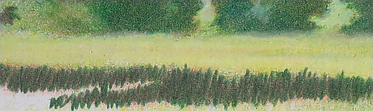
Every part of this area was then burnished once with White, including the edges between grass and trees. The area immediately under the trees was burnished a second time with white. I also added a second burnishing to a narrow strip about two-thirds of the way down. The purpose of this second burnishing in each area was to create a little bit of contour by suggesting light on rolling ground.
Step 2. Add mid- and foreground detail
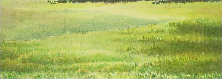
The area in front of the central tree shows varying amounts of color and value contrast. The closer to the bottom of the landscape, the closer to the viewer. The closer to the viewer, the more detail will be visible, so I changed pencil strokes from one area to the next to get the look I wanted.
To begin, I used Limepeel applied with light to medium pressure. I used a short, vertical stroke throughout most of the foreground, but reduced the amount of visible texture near the central tree’s cast shadow by adding a layer of horizontal color over the vertical strokes.
I also began further defining the visual path by adding Limepeel around the edges with very light pressure and broad horizontal strokes with the side of the pencil. At the bottom of the composition, I used a continuous, up-and-down stroke to add Limepeel to the “clumps” of color already in place.
In the shadows, I layered Dark Green, Peacock Green, and Grass Green using medium pressure with up-and-down strokes. I used Dark Umber to tone down the greens mid-way through the work, then again later in the process. I applied Dark Umber in a combination of vertical strokes using the pencil point and horizontal strokes using the side of the pencil.
The sunny areas were finished with alternating layers of Chartreuse, Limepeel, and Grass Green applied with medium to light pressure using the up-and-down stroke. A very light glaze of Sand was used in the lightest areas.
Once the larger shapes in the foreground were established, I continued to layer these colors until I had the saturation and value range I wanted.
The foreground was finished with alternating layers of Yellow Chartreuse, Chartreuse, Limepeel, Olive Green, and Dark Green. A few touches of Sand were added as accent highlights and the foreground was finished for the moment.
Step 3: Create contrast for your focal point
Your focal point is the center of interest. It should have the most contrast in value and color; the darkest darks, the lightest lights, and the strongest colors.
My focal point is this central clump of trees. I worked from light to dark using Chartreuse, Limepeel, Spring Green, Dark Green, Grass Green, Peacock Green, and Olive Green, with the focus more on the dark colors. All colors were applied in alternate layers throughout the tree to build up color saturation and value.
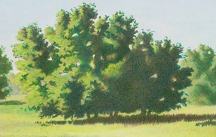
I then used Yellow Chartreuse, Chartreuse and Spring Green with light to medium pressure on the sunlit side, and Indigo Blue and Dark Brown with medium to heavy pressure in the shadowed side to add accents.
For the most part, I used a combination of directional, circular, and squiggly strokes to lay down color, especially around the edges of the shadows. I also used pencils with blunt tips to avoid leaving linear marks.
Step 4: Take a break, then add finishing touches
It’s routine to set aside a work after it looks finished and review it again the next day. Waiting gives me a fresh look at it and I can often see where adjustments need to be made.
There wasn’t much to do with this landscape. I added a few accent highlights to the central tree and the foreground grass using burnishing pressure and the lightest, brightest of the greens. I used the same technique to add dark accents with Black Grape, Indigo Blue, and Dark Green to the shadowed side of the central tree and to the cast shadow, which you’ll see below.
Toward the end of the process, I had to spray the image with workable fixative to restore tooth. I was then able to add detail around the outside edge of the tree with a variety of greens, and create a very strong three-dimensional shape in the darkest shadow colors.
Thanks to a detailed complementary underpainting, the final product is a vibrant green landscape that still manages a wide range of warm and cool colors—very similar to what you’d see in real life.
This post may contain affiliate links.