In my previous article on drawing a complementary underpainting, we walked through the underpainting process using different kinds of reds to underpaint a green landscape. If you missed that article or would like a refresher, make sure to read that article first!
This week, I’ll describe how to begin adding color to your underpainting.
Step 1: Adding color to the sky
The first area you should address with any landscape is the sky. This is because the sky is usually the lightest value in the painting—even those landscapes that include water.
I begin with several layers of Verithin Non Photo Blue, using a different stroke (vertical, horizontal, circular, etc.) for each layer to produce even color. I worked on the top third of the sky with this color. I next added Prismacolor Light Cerulean Blue, using the same procedure and covering roughly the same area. In both cases, I worked from the top down and used light to medium pressure.
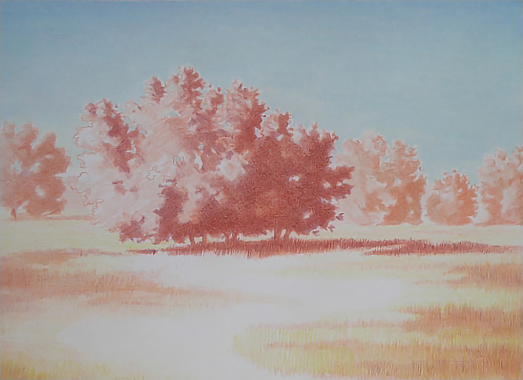
Next I used heavy pressure to apply Prismacolor Sky Blue Light to all of the sky, including filling in some sky holes in the trees. I used a layer of vertical strokes, then a layer of horizontal strokes.
I finished the sky by burnishing Prismacolor Powder Blue over all of the sky, then burnishing the lower one quarter of the sky with Prismacolor White.
Step 2: Adding color to the background trees
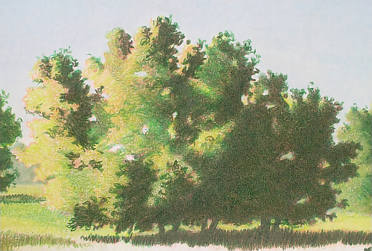
Because these trees do not show a full range of color or value, I used a limited selection of greens. In order of application, Chartreuse, Olive Green, Grass Green, Dark Green, and Jade Green.
I layered Chartreuse over the shadows, middle tones, and highlights of each tree, using light pressure and broad strokes with the side of the pencil.
In the middle tones and shadows, I added Olive Green and Grass Green with varying stroke and pressure. Short, directional strokes and circular strokes with medium pressure in the shadows; circular strokes and longer directional strokes with lighter pressure in the middle tones. In the darkest areas, I applied Dark Green with heavy pressure and circular strokes to fill in the shadows and add interest around the edges.
Once the shadows and shapes were well established, I alternated layers of the same colors to build mass and form. The final color was Jade Green, which I applied with pressure heavy enough to blend the underlying colors without burnishing the area.
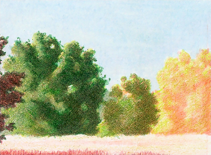
So you can see the steps in my process, the illustration above shows various stages of progress. The tree on the left is nearly finished and has been blended with Jade Green. The small, center tree only shows the application of Chartreuse, Olive Green, and Grass Green, and the tree on the right shows only Chartreuse.
I finished all of them to the Jade Green stage before moving on to the next step.
Step 3: Adding color to the background grass
I used Chartreuse applied in short strokes with medium pressure. There is very little detail in this area, so I worked in a horizontal pattern, using a sharp pencil and closely spaced strokes.
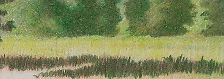
The visual temperature of that area was then cooled by burnishing with Sky Blue Light, which I applied only to the grass. After that, I burnished the grass and up into the distant trees with Jade Green to blur the horizon and push it a little further into the background.
Step 4: Adding color to the foreground
I used the same basic colors for the middle- and foreground, building color one layer at a time and working light to dark. I used Chartreuse, Olive Green, Grass Green, and Dark Green in that order to lay in these basic colors and shapes.
Initial layers were added with light pressure and the side of the pencil in long, horizontal strokes that followed the contours of the landscape. I then added layers of color with varying vertical strokes to mimic the look of grass. The closer to the foreground, the longer the strokes.
I continued building color and value by adding lighter colors such as Chartreuse, Olive Green, and Spring Green using light to medium pressure and a variety of strokes. At this stage, I focused on breaking up the large area of green to better define the topography and to create a visual path by careful placement of light and dark colors.
At the bottom of the image, I added about half an inch to provide a little more margin for final framing. In this area, I didn’t add an underpainting. Instead, I began with the colors listed above and “grew grass” layer by layer.
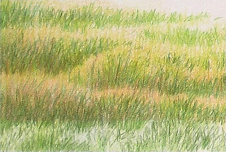
You may note that I also used a different stroke. This stroke is directional in that it mimics the thing I’m drawing. In this case, grass. But rather than lift the pencil after each stroke, I moved it up and down on the paper without lifting. I also rested the heel of my hand on the drawing paper, then worked around the pivot of my hand, creating “clumps” of lighter and darker greens in a random pattern.
As you can see, some of the clumps run together and some do not. This is a particularly effective stroke for unmown grass. Use it wisely, however. Too much and you end up with a very busy image.
Step 5: Adding color to your focal point
The central tree is the focal point of the landscape, so it is the last part of the landscape I work on.
I layered Olive Green and Dark Green into the shadows with heavy pressure and circular strokes to mimic the look of foliage. I then glazed Grass Green and Chartreuse into all but the brightest highlights. Both colors were applied with light pressure and the side of the pencil.
Cast shadows under the trees were darkened with layers of Olive Green, Grass Green, and Dark Green applied with short vertical strokes and medium to heavy pressure.
At this point, the first round of color is complete. All that remains is detailing and polishing the entire landscape drawing, which we’ll look at in my next article.
This post may contain affiliate links.