NOTE: Before I begin, I want to mention that the process I’m about to describe is entirely intuitive. I’m not guaranteeing it will work for every artist; it’s just what feels right to me. But, with that said, these principles are based in color theory, so they should work in most situations.
Selecting your color palette for new drawings is a personal matter. A number of factors play a role, like your own artistic style, your favorite subjects, and your working methods. I draw a lot of horses, so my palettes are usually pretty heavy on earth tones and other “horsey” colors. :)
But no matter what you draw or how you draw it, there are a few basics I think you should keep in mind when you’re putting together a palette for your next drawing:
1. What is the main color of your subject?
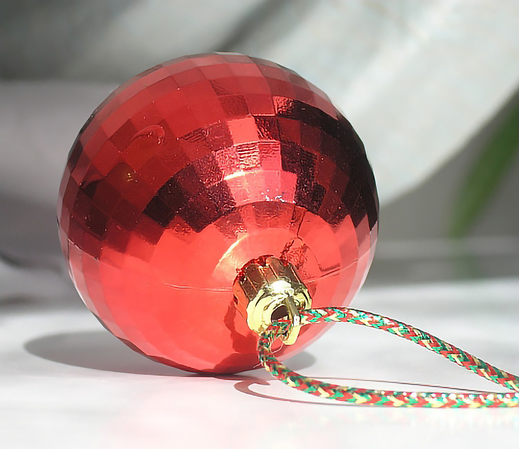
The first thing to determine is also usually the easiest. What is the basic color of the item you’re going to be drawing? For example, let’s say you’re going to draw this Christmas ornament. It’s clearly red, so it’s in the red family.
That was simple, right?
2. What color does your subject “lean” towards?
You’re unlikely to find a subject that is a pure, single color. Most of the time, it will lean toward another color. Is the ornament a warm red—leaning toward yellow? Or is it a cool red—leaning toward blue?
Determining the secondary color can be more difficult and may require a little comparison. One way to do that is to compare each of your red pencils to the object you’re drawing.
Here are four red colored pencils. Which one is the best match?
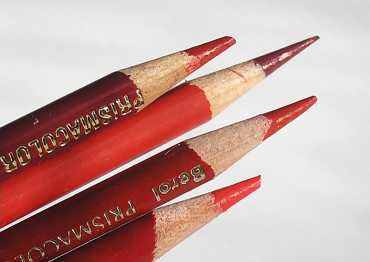
If you look at the ornament again, you can see that the bottom half is closest to the bottom pencil, while the top half looks more like the top pencil.
It’s actually pretty common that none of your pencils will be an exact match. On the other hand, if there are a lot of color variations in your item, you could possibly find matches for more than one of your pencils.
This just means that (most of the time!) your best option is to blend two or more reds to get the correct red. So I usually begin by laying aside every pencil in the color family that best represents the color of my subject.
And, if the red you’re drawing is a yellowish red, you may also want to lay aside the closest matching yellow pencils to your palette. If the red is bluish, add the closest matching blues. Don’t be afraid to blend in those colors as you need them.
3. What complementary colors are in your subject?
If you’ve studied an artist’s color wheel, you know that a complementary color is simply whatever color is opposite on the color wheel to the color you’re using.
Complementary colors are helpful for a two reasons.
First, adding a layer of complementary color will tone down the brightness of a color. Layering a bit of green over red makes the red less bold. Adding an earth tone or red to landscape greens makes the green look more natural.
Second, the best way to get realistic dark values is often by layering complementary colors. (EmptyEasel has an article on mixing oil paint to make black that covers this concept very well.)
So in addition to pulling out your main colors, grab a few complementary colors as well to use whenever you need to tone down a color or make a convincing dark color.
4. What additional colors are in your subject?
Lastly, take a look at the other colors in the object. These are the odd ones out. Can you see them? Take a look at the highlights and shadows (that’s where they live). What colors are they?
This is especially important if you’re drawing a reflective object, since reflective objects reflect color. In some cases, the color of the object is disguised by the colors reflected on the surface of the object.
In the illustration below, there are at least three areas that appear nearly white (I’ve put arrows pointing at them). What color are they really?
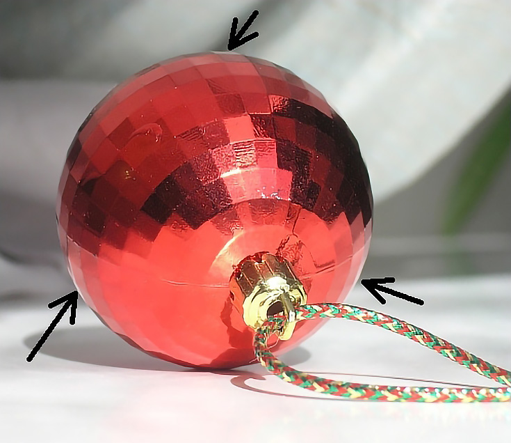
And what about the gold cap that attaches the ornament to the braided cord? What colors are visible in those areas?
You’ll want to take these colors into consideration in assembling your palette, too.
When it comes to colors, keep an open mind. . .
As I’m choosing colors for a drawing, I don’t just select one or two for each category above. I usually select three or four close colors on each side. I often end up with entire color families in order to capture all the nuances of color and value.
The same applies to choosing complementary colors. Let’s say a particular object requires a complement of grass green. It’s not uncommon to have a cup full of pencils at the ready when I begin a new project.
What it all boils down to is learning how the colors interact with each other, how they blend visually, and which colors work best to get certain results. So yes, you’ll need to use some trial and error, and be OK experimenting on scratch paper sometimes.
In fact, learning how the various colors look by themselves and when layered with other colors is an important part of the process. That’s why making colored pencil color charts is such a valuable exercise.
And as I mentioned at the start of this post, this process is something that just feels right to me. Even if you decide not to select your color palette like I do, I hope it’s good jumping off point to discover the method that works best for you.
Happy drawing!
This post may contain affiliate links.