Does choosing the right color when drawing or painting always seem like a gamble?
Every artist benefits from taking the time to make a color palette, but in my opinion, colored pencil artists gain special benefits.
Colored pencils are generally more translucent than most other mediums, so every color influences every other color. With such a medium, what better way is there to avoid mistakes, miscues, and other color-related problems than with a color palette?
It’s a good idea to make a color palette every time you buy a different type of pencil.
But what if you already have tons of pencils? Making color palettes for all of your possible combinations would require a lot of coloring! (And take way too many hours.)
So is it really necessary? Well, no. I’ve drawn for years without making color palettes. But ask me if it’s worth the time. . . my answer is a resounding yes.
I’ve ruined many a drawing by choosing the wrong color and creating a mess that was unrecoverable. I’ve learned a lot about fixing mistakes with colored pencil, but that’s time consuming, too. It would have been far better to have had color palettes for reference before I made those mistakes—maybe, just maybe, some of those mistakes could have been avoided.
But here’s the good news! If you already have lots of pencils, you don’t have to make a color palette for every single possible combination. Here’s what I’d suggest:
1. Start with subject-specific color palettes
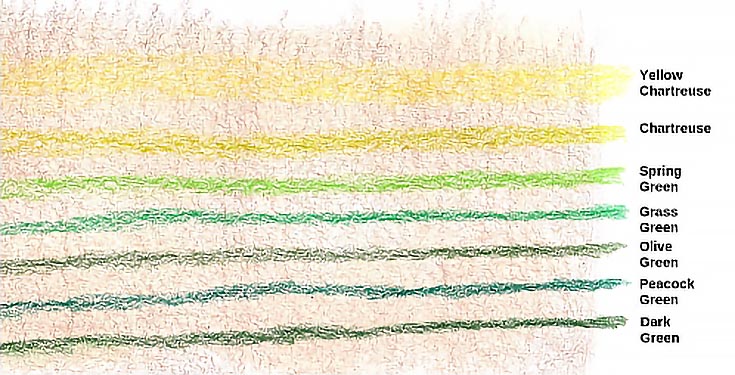
I like to draw landscapes and animals—primarily horses and dogs. If you’re like me and have a favorite subject, focus your color palettes on that subject. There’s nothing more helpful for a landscape artist than a series of color palettes showing how to draw various greens in different lighting situations and on different types and colors of supports.
This first color palette shows seven greens glazed with medium pressure over a medium value under drawing of light umber on white paper. Since most of my work begins with an umber under drawing, this palette is all that’s necessary to show how the greens I use most frequently react with light umber as the under drawing.
Sure, some subjects are more diverse than others, so you may need to make more (or less) color palettes depending on your interests. But trust me, making color palettes for your favorite subjects will have huge payoffs for future drawings.
2. Make a few color-themed color palettes
If you tend to work within a narrow band of color themes, make color palettes focusing on those colors first. Start with the color combinations you use most often, then expand into other combinations.
In the example above, I made a color palette for landscape greens on a Light Umber under drawing. Another good reference for me would the same colors over a complementary under drawing.
What colors do you use most often? Start making color palettes with those.
3. Create a drawing-specific color palette
Are you about to start a new project? Why not take the time to make a color palette for each element in that drawing?
Is there a blue bottle in your still life? Try different combinations of blues and other colors until you get a good match for the highlights, shadows, and middle values for the bottle you want to draw.
Is the landscape on your easel full of fall colors? Mix and match colors in a pre-drawing color palette until you have a good idea of the colors required to re-create those rich reds, golds, oranges, and yellows without making them look artificial.
4. Remember to include value variations
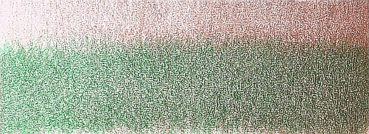
When making color palettes, don’t forget to include differing values. A good way to include values is to make a value scale for some of the more frequently used colors.
For the illustration below, I drew gradated Light Umber ranging from very light at the left and to as dark as possible on the right. Then I glazed Grass Green with medium pressure over part of the Light Umber. The result shows how the darkness of the Light Umber affects the appearance of the Grass Green glazed over it.
In the following color palette, I drew Process Red in gradating value from very light to very dark. Over that, I glazed True Blue, also in gradating value, but with the lightest value on the right instead of the left.
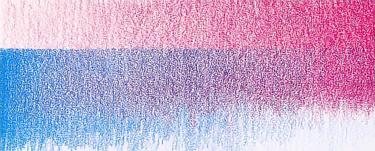
By overlapping the two colors as I have, I can see how they appear when used alone as well as how they interact when layered.
Try doing the same exercise, but glaze Process Red over True Blue to see if the order of application makes any difference in the final appearance.
5. Bonus tip for saving your color palettes. . .
If you draw color palettes on scrap paper (which is advisable), you can then collect them into a single reference resource when the drawing is finished. Do this with every drawing and it won’t be long before you have a handy library of color mixtures and values to help with future drawings.
Storage is easy. All you need is a basic three-ring binder and 8×10 top loading album pages, so you can slide color palettes in and out with ease or page through the album until you find the most helpful palette.
If you plan to keep drawing-specific color palettes for future reference, make sure to label them with the title of the drawing, the type and color of paper, and any other details that will help you in the future. Label the section for that blue bottle, for example, or the colors you used, the order in which you applied them.
Color palettes don’t have to be complicated. In fact, it’s probably better if they’re not. Suit the complexity of your color palettes to your artistic personality and style.
Making color palettes shouldn’t be a chore, either. Have fun with it. I’ve seen some very beautiful color palettes that are very nearly works of art themselves. Give your artistic imagination free rein and see what you come up with!
This post may contain affiliate links.