How do you know which colors to use for colored pencil drawings?
More specifically, how do you know which colors make the best underdrawings? There are probably many different answers to this question, but today I’ll be sharing my own simple, fun solution that should help in almost any situation.
First, though, here’s an explanation of underdrawings.
What’s an underdrawing, and why do I need one?
The short answer is that an underdrawing is made up of the first layer (or layers) of color you put on paper. They are a sort of “pre-drawing” for the more detailed layers that you’ll be adding over the top, later.
There are four basic types of underdrawings:
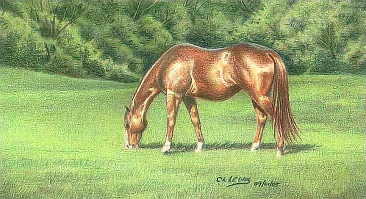
A complementary underdrawing is one in which the first colors are the color-wheel-opposites of the final image. Here’s an example of a finished drawing that I drew over a complementary underdrawing:
And this is the complementary underdrawing that was underneath:
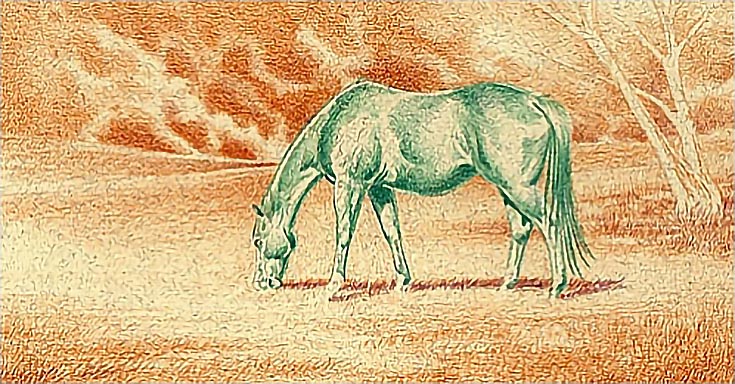
This allows complementary colors to show through in my shadow and mid-tone areas, to make the final colors really pop.
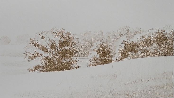
An umber underdrawing is done in earth tones. For the example below, I used light and dark umbers, but any earth tone that is neutral in value and color temperature (in other words. . . not too light or too dark, and not too warm or too cold).
Here’s the final drawing:
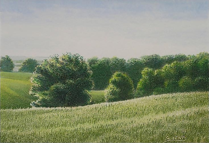
In this example, the umber underdrawing helps to unify the entire drawing into a more cohesive whole. (Read How to Create a Colored Pencil Landscape Underpainting for more information on how I made that particular drawing.)
A monochromatic underdrawing simply uses a single color—and it can be any color! Usually it’s chosen based on either the intensity you want in the final drawing (for example, high-key, bright colors or low-key, subdued colors) or as an accent color that you think would look good peeking through your final drawing.
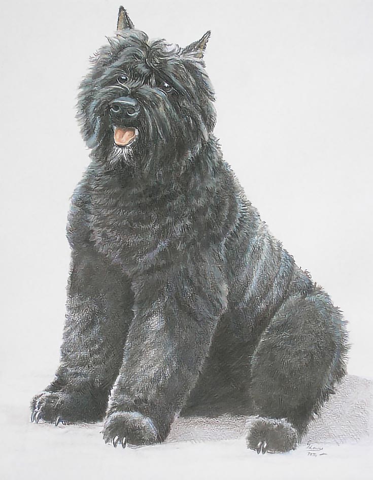
For example, I chose Indigo Blue for this next underdrawing because indigo blue not only provided a good foundation for the black coloring of the dog, but was an accent color in both shadows and lighter middle values.
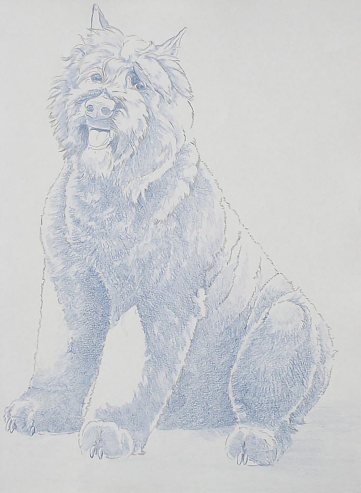
It also works well with dark brown and dark umber to create a rich, realistic black.
Several other colors of similar value would also have worked, including Dark Brown, Dark Umber, Violet, or Dark Green.
So, now that we’ve discussed underdrawings, let’s go back to the original question. How do you decide which colors to use?
Step 1. Try this underdrawing exercise
Begin with a sheet of drawing paper. Any type of drawing paper will do, but for best results, use the same type of paper you usually draw on.
Layer different colors onto the paper. Use light to medium light pressure. In my sample, shown below, I used the sides of well-sharpened pencils and medium pressure (normal handwriting pressure) for each sample.
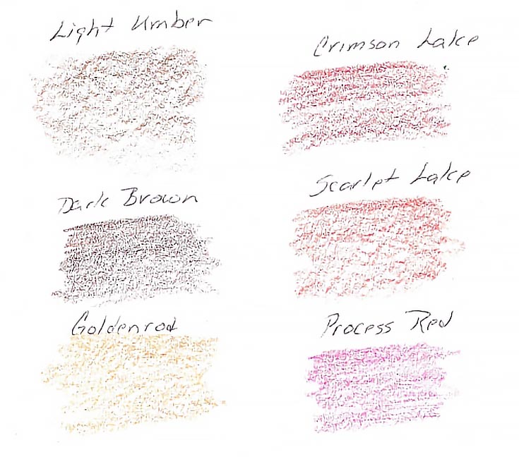
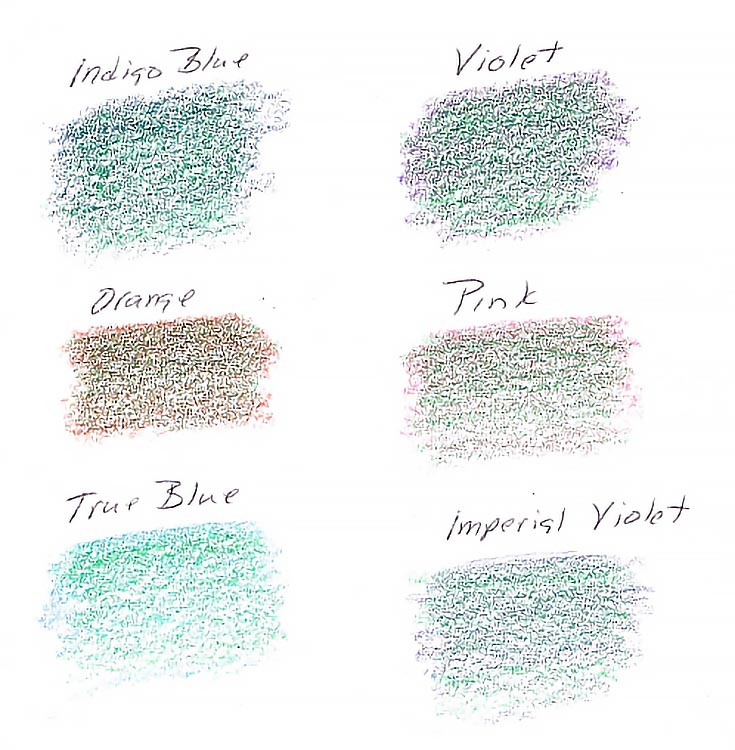
I began with Light Umber, since that’s my favorite color. It also provides a starting point that’s always the same. I also included a complementary color or two, then various other colors such as Indigo Blue, Violet, Pink, and other colors of similar value.
Make sure to label each color swatch. If you use multiple brands of pencils, make note of the brand, as well as the color, since there are very few colors that are exactly the same across all the brands.
Now choose a color, any color. You’re going to layer this color over all of the swatches. I chose Grass Green (since I often do landscapes, or scenes with pastures in them).
Layer this color over each color using the same type of pressure and stroke for each. You want to see how the various colors work together, so it’s important to make everything else as similar as possible.
Once again, I used the sides of well-sharpened pencils and medium. Here’s my finished color chart:
Not too difficult, right? And some of the results may surprise you!
Here’s another color chart I made using some additional colors, again with Grass Green layered over the top:
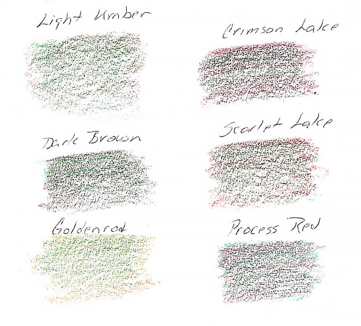
It’s easy to see how each of the underdrawing colors affects the color you are laying over the top. If you’re drawing a landscape, you know before starting the landscape which colors will work well for environmental greens and which are best avoided.
You can also see how the colors work with the paper that you’ve chosen. I used an ordinary drawing pad for this exercise, but your color chart will show how the colors lay on the tooth of the paper, and how the amount of paper showing through the color samples effects the samples.
If you want to work with colored paper, make a chart on the same color of paper to see how the various colors work with that paper.
Step 2. Create a reference file
Making a color chart before you start a new drawing is a great way to see whether a color will help or hinder you in your underdrawing. Even better, you’ll soon have an excellent color chart library for future drawings. Just make sure to label the type and color of the paper, along with the colors used.
Color charts are best kept in sheet protectors (archival of course) in three-ring binders for easy storage and access. The pages will lie flat for reference while you’re working on a drawing, or can be supported by a small tripod or tabletop easel for easy viewing.
I encourage you to take a little time to make a color chart before beginning your next drawing project—my guess is that you’ll gain some new insight into the colors you’d like to use, and perhaps even save yourself some time and trouble in the long run!
This post may contain affiliate links.