I’ve been using colored pencils for fine art for many years, and one of the most difficult things I’ve ever tried to draw/paint with colored pencils are natural looking landscapes.
Over the years, I’ve tried a lot of things to make painting a landscape easier, and have narrowed my favorite techniques down to three: direct painting, a classical layering technique with an umber underpainting, and a classical technique with a complementary underpainting. Each has advantages and disadvantages.
Let’s take a look at how you can paint/draw a landscape in colored pencil using the classical technique with an umber underpainting.
Choosing a color for your underpainting
Large or small, landscape or portrait, the first step is either refining or developing the drawing and establishing values. Major compositional problems will quickly become evident as you work through the undepainting. They can also be most easily corrected at this stage of the process.
For a single color underpainting, choose a neutral color that will allow the fullest possible range of values. You want solid dark values and whisper-soft highlights. My preferred color is Light Umber, but French Grey 50% is also a good neutral color.
The underpainting can also be shifted warm or cool by the color you choose. Although you will be glazing color over the under painting, the temperature and color of the under painting will affect how the finished painting looks.
The goal with the underpainting is to provide as solid a foundation as possible for the final painting. Because local color is glazed over the under painting, as many details as possible should be established in the underpainting phase of the classical painting technique. It is very common (and perhaps even expected) to spend more time with the underpainting than with the color phases.
Starting the underpainting
After sketching in my composition, I began painting with a very sharp Light Umber Prismacolor pencil and a very light touch (1 on a scale of 1 to 10, with 1 being the lightest and 10 the darkest).
The most distant work (marked #1 in the illustration below) was lightest, and I darkening the values in each successive area to create the sense of space and distance.
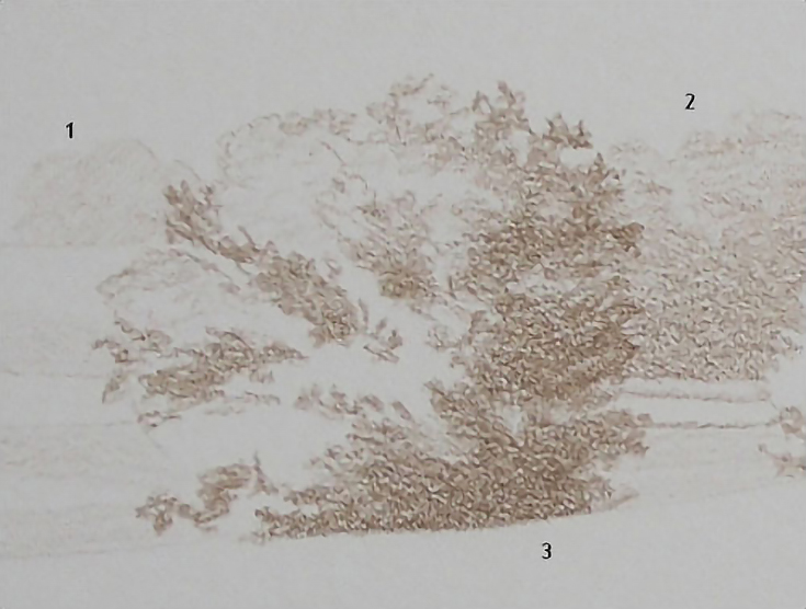
I also let the pencil-paper combination do as much of the work as possible. The paper is Rising Stonehenge 90 lb. with a vellum finish. There isn’t much tooth, but there is some. By using either a blunt pencil or the side of the pencil, I was able to quickly and easily create the look of distant foliage in the area marked #2 in the illustration below.
You’ll note that shadows can be created with a second layer of color applied in the same fashion, using the side of the pencil. Most of the strokes were horizontal, but I also used circular strokes in some areas.
The large tree toward the left of the drawing above (marked with a #3 in the first illustration) is the focal point of my underpainting, so it has the broadest range of values. The lightest lights and darkest darks should occur in this area. The lighted areas of the tree were left untouched. In the darkest shadows of this tree, I used a pressure of 6 to 8 (medium pressure).
I also used a pencil with a rounded point and bolder strokes in the focal tree, again allowing the interaction between pencil and paper to assist in creating the type of texture necessary for this part of the painting.
The look and feel of distance has already begun to take shape. By doing nothing with the far distance and very little with the foreground, emphasis is right where it needs to be—on the main tree.
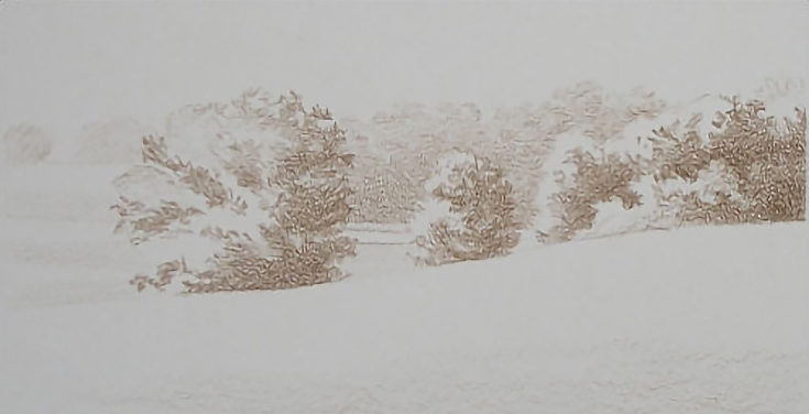
Finishing the underpainting
In this second phase, values are pushed to the extremes, yet I’m still trying to create as much detail as possible. I also want the finished underpainting to be very close to a sepia-type painting.
As I continue to add more contrast, most of my attention is on the focal point. In this area, the darkest shadows were darkened and mid-tones were expanded, giving greater emphasis to the highlights, which remained untouched.
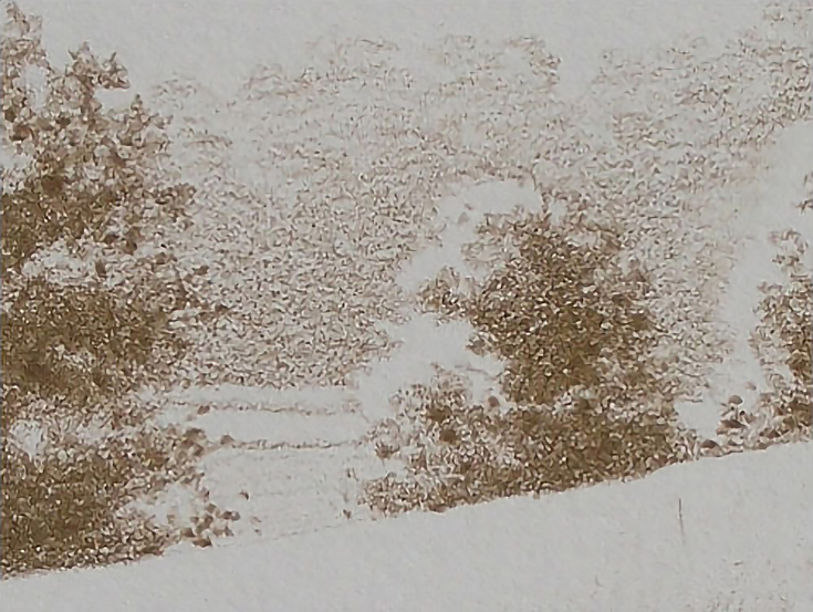
I used a blunt pencil and medium to heavy (7-10 on the scale) pressure to tap color into the foliage in the deepest shadows, overlapping layers until I was satisfied with the variety of lights and darks.
I repeated the procedure throughout the rest of the trees in the grouping at the center right. As I worked away from the focal tree, I used lighter pressure, letting the value range gently narrow to keep those trees from competing with the tree in the focal area. Edges were also softened to visually push those parts of the painting away from the center of attention.
To bring the highlights forward, I shaded another layer of color over the trees in the middle ground, using light pressure (2-3) and the side of the pencil.
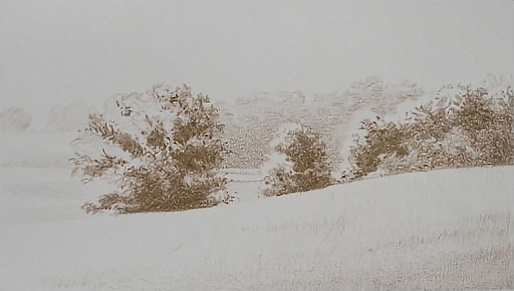
I thought the underpainting was finished at that point and was ready to begin with color work until I noticed the shape of the mass of trees on the center right was a little too regular and straight-edged. I “picked out highlights” by lifting color with a click eraser. The final result, seen below, is much more satisfying.
Now that I have a complete underpainting, I’m ready to start layering colors on top to finish up this landscape. . . but that tutorial will have to wait for another day. :) Be sure to check back for more in a few weeks!
This post may contain affiliate links.