In my previous article (Creating Distance in Landscapes, Part 1) I discussed using line, value, color temperature, and overlapping layers to begin developing pictorial depth, right from the start of your drawing.
The process continues with further development of values, colors, and aerial perspective. Let’s get started.
Developing a middle ground
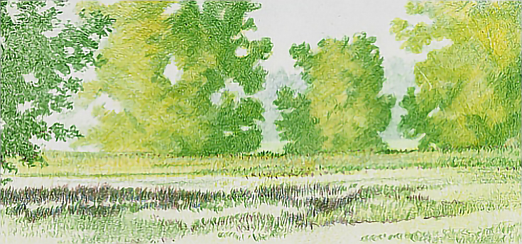
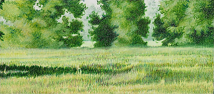
I used one layer of Olive Green over the middle distance trees, then added two or more layers in the shadows, using light to medium pressure.
Next, I glazed Jasmine over each tree, added another layer or two of Limepeel, and a layer of Olive Green. I used medium pressure and a variety of strokes for each layer, hatching, cross-hatching, and circular or squiggly strokes to mimic the look of distant foliage.
In the meadow in front of the trees, I used short vertical strokes and light to medium pressure to layer Jasmine, Limepeel, more Jasmine. I finished with a few touches of Olive Green before burnishing alternating layers of Jasmine and White with horizontal strokes.
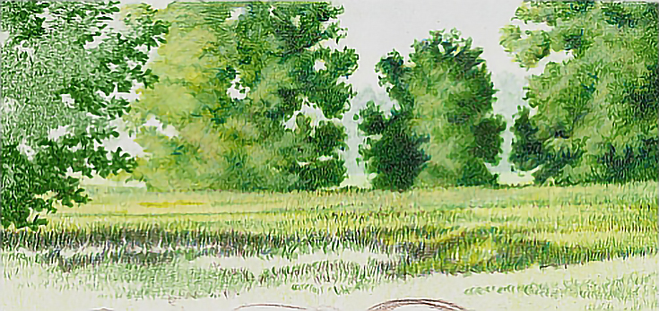
The trees on the horizon were layered with Olive Green into the shadows on each tree, then and glazed Bronze over all of each tree. I followed that up with another layer of Olive Green into the shadows, then burnished with Sky Blue Light, a little Dark Green and Dark Brown into shadow accents and a burnishing with the colorless blender.
To add visual interest to the shadows, I alternated between the colors to create a range of values. I used heavy pressure, sharp to slightly blunted pencils, and a variety of strokes.
In the middle tones, I used Olive Green and Limepeel with heavy pressure and a variety of strokes. I then burnished the trees with Cream in the lighter areas and Powder Blue in the darker areas. Those two colors are about the same value, but the difference in color temperature (Cream is a warmer color than Powder Blue) helped create the look of distance as well as light and shadow. The result was a muted value range. Burnishing further blurred the details and pushed the trees into the distance.
Next, I layered Cream over the meadow in front of the trees in the middle ground using medium heavy pressure and short vertical strokes with a blunted pencil. The meadow was then burnished with Powder Blue and White. I added accents with Olive Green using very short vertical strokes.
In the strip of meadow immediately in front of the middle meadow, I layered Limepeel with medium heavy pressure and vertical, zigzag strokes (without lifting the pencil). Finally, I burnished with Cream and added accents with Olive Green.
To create a pattern of sunlight and shadow in the area above the horses’ backs, I alternated between Olive Green, Indigo Blue, and Dark Brown using medium pressure and vertical strokes. These strokes were a little longer than the strokes in the background, but they were still quite short. As I moved forward in the drawing (toward the bottom), I lengthened the strokes.
To unify the colors and values, I glazed Sand over the background above the horses using the side of the pencil and light pressure. That was followed by a glaze of Limepeel then a glaze of Yellow Chartreuse using the same pressure and stroke over the same area. Wherever necessary, I toned down the greens with Bronze in vertical strokes with medium pressure.
The last work before starting the horses was burnishing the meadow with Cream using short, vertical, zigzag strokes. The shadows were burnished again with Powder Blue and I added touches of White burnished into some of the highlights
Finishing up the drawing
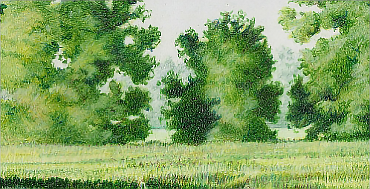
After the horses were finished, I reviewed the drawing to make sure colors and values worked together. It was also important that the drawing looked deep. The most distant trees were a mile or more away and I wanted to capture that distance.
To accomplish that, I layered Metallic Green into the most distant trees to gray down the colors. I used a slightly blunted pencil and medium pressure with squiggly strokes to “doodle” vague shadows into those trees.
Next, I burnished all of the meadow between the distant trees and the next most distant trees with Sky Blue Light and White, using blunted pencils and a vertical stroke for both colors. I used Sky Blue Light all over that area, but applied White in just a few spots to create very faint suggestions of highlights.
I also added a few burnished highlights with White in the trees.
Next, I burnished the far edge of the meadow in front of the middle ground trees with White. I worked across the line between meadow and trees to blur it, pushing it further into the distance. I alternated between horizontal and vertical strokes.
The meadow in the foreground and near middle ground was burnished with Cream using vertical strokes. I worked carefully around the horses to keep those edges crisp and clean, but in the rest of the meadow, I burnished over lights and darks alike to lighten shadows and unify the greens.
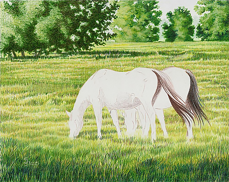
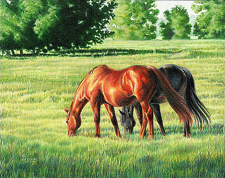
Below is the finished drawing. Color, value, and lighting are balanced to capture the mood of a late afternoon, slightly humid day.
In general, here’s the takeaway: if you want to create a sense of space—the illusion of pictorial depth—your best tools are value and color temperature.
The further away an object is, the less intense its value will be. This means that dark objects look lighter and light objects look darker. Even in black-and-white art, it’s possible to create the feel of deep distance just by correctly handling the values. This is sometimes called “aerial perspective.”
Colors also lose some of their vividness, and tend to become cooler as they recede. You can see this by looking at the most distant trees in this drawing, which are more gray than green.
And keep in mind, even though my demonstration features colored pencils and a small format surface (8×10), these methods will work for any medium and any size of artwork.
Excerpted with permission from Colored Pencils: The Direct Method Step-by-Step by Carrie L. Lewis.
This post may contain affiliate links.
