For many representational artists—myself included—the biggest hurdle to successful and believable artwork is creating the illusion of space, which is also known as pictorial depth.
But how in the world do you depict a three-dimensional subject on a two-dimensional surface?
In truth, MANY factors play a role. Shading. Overlapping. Aerial perspective. Value. Color temperature. Edges. Any one of those things alone will help you create the illusion of space (pictorial depth). If you use them together in various combinations, you’ll get even better results.
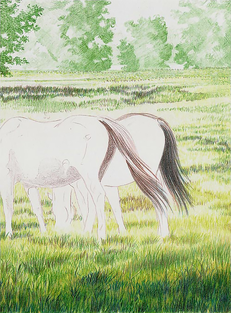
The purpose of this article is to show you how to create pictorial depth using a few of these principles. I used colored pencil to draw horses in a landscape in the sample, but these techniques will work with any media and subject.
1. Draw with a variety of lines
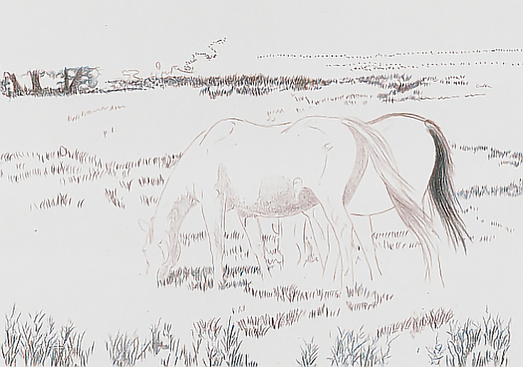
Depicting visual space begins with using different types of lines in the drawing. For example, to draw the grass, I used long, vertical lines in the foreground; shorter, vertical lines in the middle ground; and a horizontal dotted line in the most distant part of the drawing.
I also varied the pressure from medium pressure in the foreground to very light pressure in the background. To further enhance the space in the drawing, I used darker colors in the foreground and lighter colors in the background.
2. Add color
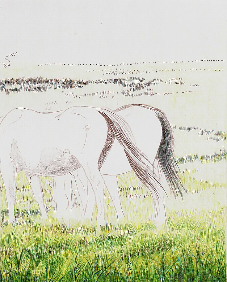
A glaze of Limepeel was applied with vertical strokes using the side of the pencil and very light pressure throughout the landscape. It was a very uniform glaze designed to establish a color foundation.
The next glaze was applied with horizontal strokes using the side of the pencil and very light pressure. I worked from the foreground up to the more distant middle ground, but left the background alone. The second layer added value and color depth to the foreground and middle ground, making them appear closer than the single layer in the background.
Next, I applied Sand and Olive Green with medium-heavy pressure and directional strokes to begin developing highlights and darker greens in the foreground. The strokes were upward traveling (starting the stroke at the bottom of the image and moving upward). The combination of colors, increased value, and pencil strokes mimicking the appearance of grass brought the foreground forward.
I then glazed Limepeel across the bottom with medium light pressure and short, vertical, closely spaced strokes. I reduced the pressure and put more space between the strokes as I moved into the background to create a base color that was lighter in color and value.
3. Build depth of color
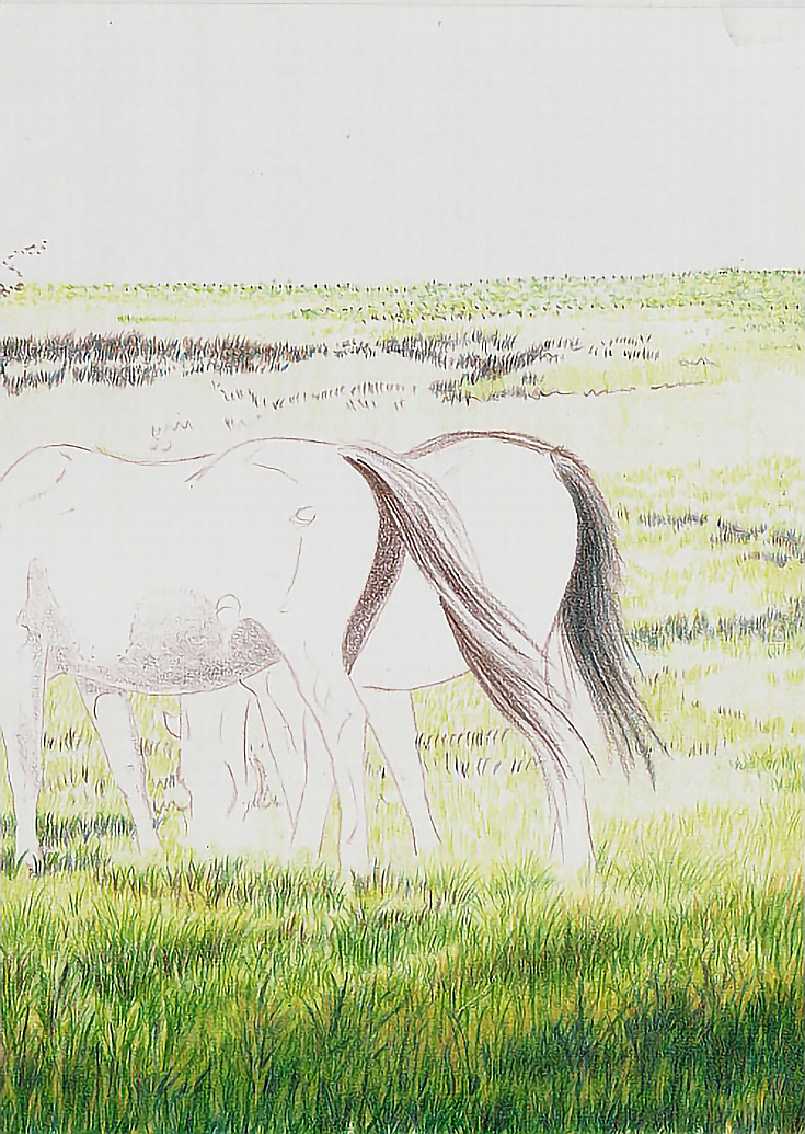
I added Limepeel to the middle ground and distance with vertical, directional strokes, but varied the length of the strokes. Longer strokes in front and shorter strokes toward the horizon line. In the field beyond the larger trees in the middle ground, I stippled Olive Green with Limepeel to create variations in color.
Then I glazed Cream throughout the background using light pressure and closely spaced vertical strokes.
I next added Limepeel into the darker areas with short vertical strokes beginning in the background. As I moved forward in the composition, I lengthened the strokes and made them less uniform. French Grey 20% was then glazed over the foreground and middle ground using medium pressure.
NOTE: French Grey 20% is lighter in value and color than Light Umber, which is the color I usually use to tone down greens. It’s also less yellow than Cream or Sand, which are also excellent colors for toning down environmental greens.
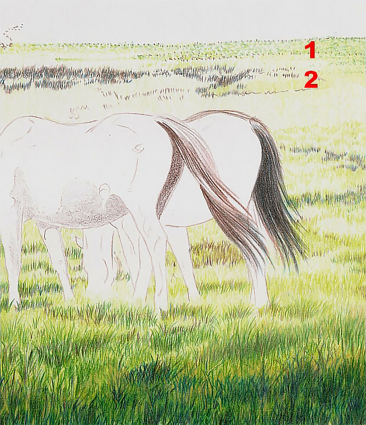
In the distant meadow (#1 below), I glazed Olive Green using horizontal strokes, placing strokes close enough together that there are no visible individual strokes.
The grass at #2 was darkened and modeled with Olive Green applied in short vertical strokes, varying the length of strokes slightly. Some are little more than elongated dots. Others are a little bit longer.
I worked throughout the background and upper middle ground in this fashion, creating visual interest in the patterns of light and dark. As I worked into the foreground, I continued to increase the length and variety of the strokes.
4. Draw the distant trees
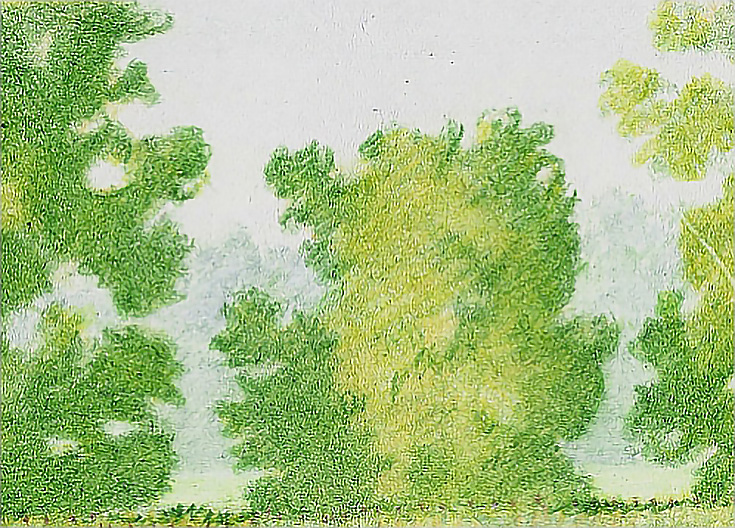
Before starting on the distant trees, I used a blunted Olive Green pencil to stipple in a grove of trees in the middle ground and on the left side of the drawing (the darkest tree on the extreme left in the next image).
I roughed in the trees on the horizon line with Olive Green with light pressure and an open, diagonal stroke, then turned the paper 90 degrees and glazed in the opposite direction, creating a cross-hatching pattern that was open and, therefore, light in color and value.
Next, I blocked in form shadows and cast shadows. I worked through each tree five or six times, using the same pressure each time. Each additional layer darkened color and enhanced value.
When those trees were clearly in place, I sketched in the trees on the very distant horizon, along with a strip of field using Olive Green with very light pressure; almost whisper soft pressure.
I finished the most distant trees with a layer of Jade Green applied in tight, small strokes with medium pressure. One layer on the sunny side and two or more on the shadowed sides created just enough form to keep those shapes from being flat without creating so much form they came forward.
NOTE: Jade Green is gray enough that I didn’t need to burnish with a cooler color or with a gray to create the appearance of deep pictorial space and aerial perspective.
I finished the meadow between the two groups of trees with glazes of Yellow Chartreuse and Jade Green applied in horizontal strokes with light pressure and a burnishing with Sky Blue Light, then White.
As you can see, developing an accurate and believable sense of distance in a drawing or painting begins with the first pencil mark. This drawing is about half complete at this point, but pictorial depth is already well developed. In the last illustration, there is a clear difference in visual distance between the two groups of trees. That difference is the result of changes in color, value, edges, and detail.
But the differences can be pushed a little further and I’ll show you how in the next installment. Stay tuned!
Excerpted with permission from Colored Pencils: The Direct Method Step-by-Step by Carrie L. Lewis.
This post may contain affiliate links.
