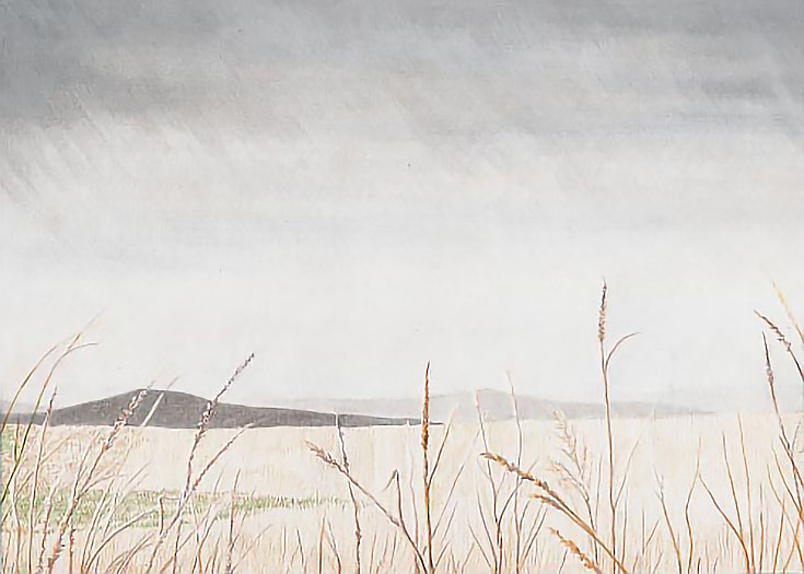
Over the course of the last few weeks, we’ve looked at drawing a landscape influenced by rain and gray skies.
The first week, I described drawing the foreground and starting the middle ground. The second article looked at the sky and falling rain. This week, we’ll finish the middle ground and make whatever adjustments are required to finish the drawing.
The middle ground ties the foreground and sky together. It’s comprised of two parts: low hills on the horizon and a grassy slope in the near middle distance. Though they appear next to each other in the composition, they are separated by considerable distance. Capturing that distance will make or break this landscape.
Filling in the middle ground
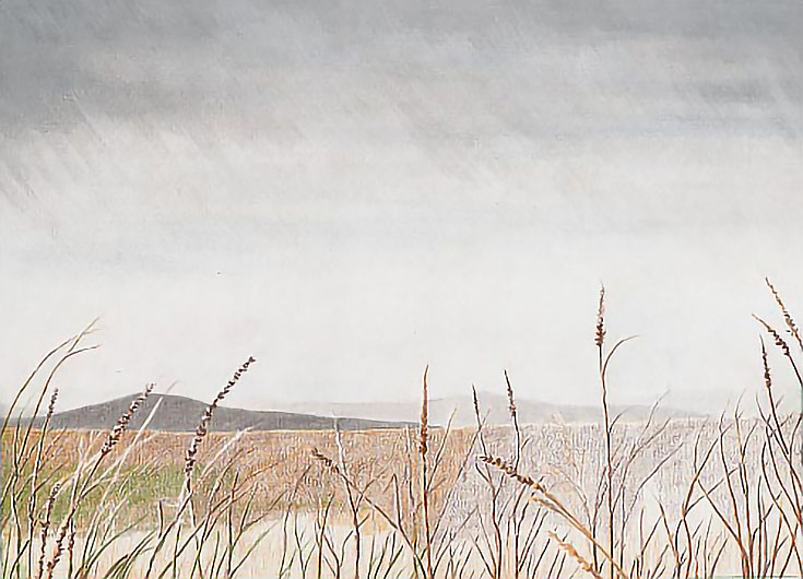
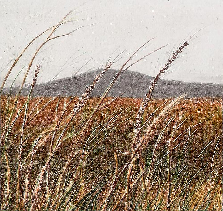
I began by stippling Olive Green and Bronze into the middle ground from top to bottom with light to medium-light pressure using the point of a well-sharpened pencil. To create variety in color and value, I randomly overlapped the two colors and varied the number of layers throughout the middle ground.
Then I darkened all of the middle ground except about two inches along the bottom with Dark Brown using short, vertical strokes and medium-light pressure.
Where tall grass overlaps the middle ground, I outlined the grasses, then filled in each area. On the lighted side of the larger stems, I left a slim highlight.
In some areas, I used a .05mm stylus to impress lines, then added Dark Brown to make the newly impressed lines appear. When the drawing is finished, these lines will be darker than the brightest highlights, but lighter than the middle ground, adding depth to the landscape.
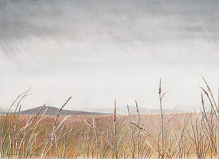
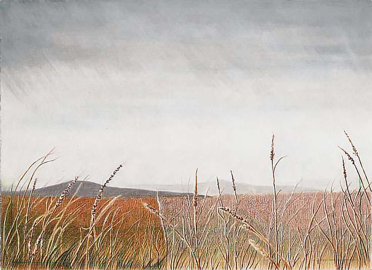
Next, I layered Yellow Ochre over the same area using the same method and strokes. The left side of the illustration below shows both Dark Brown and Yellow Ochre, while the rest of the middle ground shows only the Dark Brown.
During this step, I darkened existing grass stems and added new ones. I also used Verithin Goldenrod to impress grass that’s closer than the middle ground, but further away than the foreground.
Next, I glazed Burnt Ochre into the middle ground and all the way down to the bottom. In addition, I impressed more lines near the bottom of the picture with Verithin Olive Green. Finally, I glazed Burnt Ochre and another layer of Dark Brown so I could see the new lines more clearly.
For the next phases, I spent time reviewing the drawing as a whole and making whatever adjustments were necessary to finish the drawing.
In order to “see” the drawing with a fresh eye, I set it aside for a few days, then reviewed it as though seeing it for the first time. Anything that needed further work was more obvious that way.
Adding color and highlights
I added a glaze of Pumpkin Orange using medium pressure and a slightly blunt pencil, followed by a layer of Goldenrod with heavy pressure and a blunt pencil. In the darker places, I added Indigo Blue, Dark Green, and/or Dark Brown as necessary.
I also went back over the foreground grasses with Goldenrod and Silver, adding warm highlights to the surfaces angled toward the ground and cool highlights to the surfaces facing the sky.
Then I layered Pumpkin Orange with heavy pressure, followed by Goldenrod, Dark Green, and Dark Brown. I used vertical strokes and blunted pencils for most of the work.
Accenting some of the larger grass stems with Dark Brown, Indigo Blue, and Goldenrod was the final step for the middle ground.
Connecting the hills to the middle ground
Once the middle ground was finished, I used French Grey 70% to change the shape of the darkest hill and alter the edge between it and the middle ground. I used heavy pressure with vertical zigzag strokes along that edge and directional horizontal strokes along the crest of the hill. I followed up with Steel to darken the hill a little bit more.
Then I repeated the process with the next darkest hill using Cool Grey 20% and Cool Grey 30%.
TIP: Harder pencils such as Verithin allows you to impress a lines through layers of wax and pigment. In this case, I used Verithin Silver to add fine lines slightly darker than the sky against the sky and reflecting the gray of the sky where grass overlapped darker areas.
Impressed lines are a great way to add fine detail and they can be used at almost any stage in the drawing process. Be careful not to go overboard. A few go a long way.
Creating distance and atmosphere in the landscape
After the drawing was finished, I put it into a mat and set it aside where I could see it, but where it wasn’t “front and center.” After reviewing it a few days, I decided a few finishing touches were in order.
The darkest hill was too dark, so I burnished the entire hill once with White, then burnished the crest a second time with White. This pushed it a little deeper into the distance visually.
I then darkened the middle hill with Cold Grey 70%.
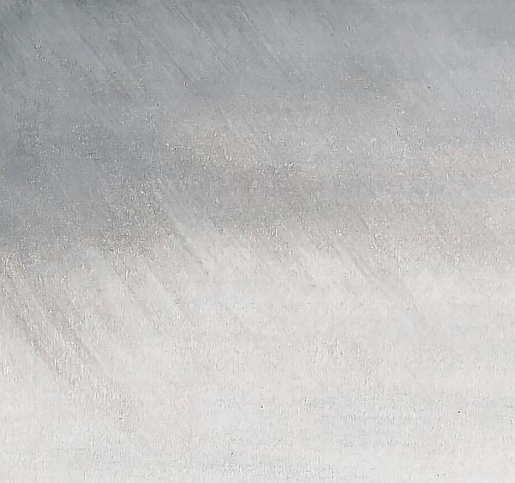
I also darkened the top portion of the sky with Cold Grey 70% to emphasize the falling rain. I used directional strokes, overlapping some and leaving gaps between others.
Finishing the landscape
Lastly, I toned down the warm colors in the middle ground with a layer of Cold Grey 70%. I then blurred the horizon between middle ground and distant hills by burnishing Warm Grey Light, followed by burnishing White over the same edge.
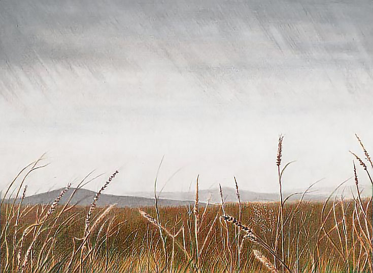
Here is the finished drawing, as promised. . . a rainy, distant landscape.
This post may contain affiliate links.
