No matter how carefully you plan and render a composition, not every drawing turns out as you expect. Even among those drawings that do turn out well, every now and again, you’ll have occasion to wish there was a way to make changes or improvements.
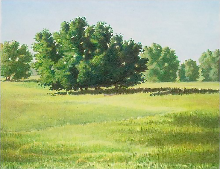
Below is The Sentinel. It was the demonstration drawing for a series of articles describing the use of a complementary underpainting. The articles appeared on EmptyEasel and you can read the first article of my three-part series here.
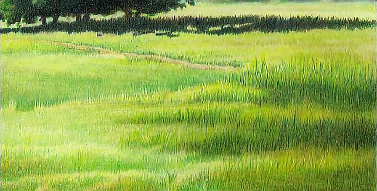
The painting was “officially” finished by the end of that series, but I was never completely satisfied with it. The more I looked at it, the less satisfied I became. I’d used heavy applications of color, blended with rubbing alcohol, and burnished the final drawing. This made any changes after the fact a bit tricky! But it needed some adjustment, so I put it back on the drawing board.
Here are the steps I followed in order to improve (and not ruin!) the original drawing.
1. Carefully remove color with an edged eraser
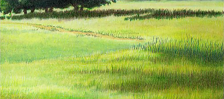
The first thing I wanted to do was tweak the grassy areas in front of the central tree. Color application was the lightest in that area, making it the easiest to adjust. There was also a very lightly colored strip in front of the tree that suggested a path, which I wanted to develop more.
So my initial step was using a White Pearl eraser to lift as much color as possible along that strip. I used the edge of one end of the eraser to lift color, using short strokes and beginning with light pressure, then increasing the pressure as color was removed.
When I’d removed all the color possible, I applied Prismacolor Sand using a short, slightly curved horizontal stroke. I next added Dark Brown in short, vertical strokes along the right side of the path and in patches along the left side to add shadows to the lower edge of the grass along the path. I added Indigo Blue over the Dark Brown to deepen the shadows, then worked Apple Green, Chartreuse, and Yellow Chartreuse in alternating layers into the areas along each side. In the slightly darker areas, I used Apple Green and Limepeel, then burnished with Sand and White.
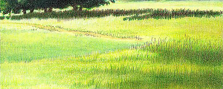
I also stroked Dark Brown and Indigo Blue into the rise on the right of the drawing, where foreground grasses overlap the middle ground.
Because there was already color on the paper, I had to use heavy pressure. Since I was working on a grassy area, I also used short, vertical strokes in the middle ground. In the area on the right, I used longer strokes to bring that area forward.
2. Add new color with matching strokes and pressure
Next, I added highlights along the path with alternating layers of Chartreuse, Apple Green, and Limepeel, burnished with White and/or Cream. I repeated the layering and burnishing process as necessary to fill in any remaining “paper holes” and to get more natural greens. I used short, vertical strokes to apply color and to burnish.
I sharpened my pencils each time I used them, but since this area is in the middle distance, I was able to get the affects I wanted with slightly blunted pencils. Burnishing only along the “high” points in the ground created the illusion of sunlight slanting across the landscape and shining across the top of the blades of grass without having to highlight individual blades.
To emphasize the effect of burnished highlights, I added middle tones with Apple Green in the places where the ground slopes toward the foreground. I used medium heavy to heavy pressure, a slightly rounded pencil tip, and short, vertical strokes. If I burnished at all, I used Limepeel or the colorless blender.
3. Work with the existing drawing whenever possible
I then darkened the slope immediately behind the foreground with alternating layers of Apple Green and Limepeel, then glazed Dark Brown and Indigo Blue in alternating layers into the part of the slope that meets the crest of the hill in front. I used vertical strokes, but used sharper pencils and pulled color down into the crest of the hill in front to create the taller grass on top of the hill in front.
Notice the small “notch” carved out of the hill in front toward the left side of the illustration below. I decided the path in the middle ground needed to move forward and began the process by replacing some of the tall grass on the foreground hill with the darker middle ground.
I also began darkening the lower right foreground by stroking multiple layers Dark Brown and Indigo Blue into that area. I used open strokes, stroking from the ground upward to establish the tall grass in the foreground.
4. Add fixative to restore tooth when necessary
There was so much wax on the paper from the original work, that I had to spray the drawing with workable fixative a couple of times to restore surface tooth. Each time, I applied two light coats of fixative, allowing the drawing to air for a minimum of 30 minutes after each application.
IMPORTANT TIP: Workable fixative should be used in a well ventilated area and the artwork should be allowed to dry or air until the fumes are no longer noticeable. I generally allow artwork to sit over night even after it has aired.
After the first treatment with workable fixative, I shaded the foreground path with Light Umber, applying it in downward sloping horizontal arcs to create a sunken path. I used medium heavy to heavy pressure, but didn’t burnish. Next, I used the same strokes and pressure to add Sand or Cream in the highlights and Dark Brown and Indigo Blue in the shadows.
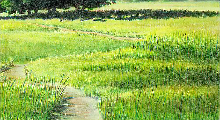
Once the path was established, I began building up the grass along the path and throughout the foreground. The second treatment with workable fixative occurred near the end of this process.
5. Rework all areas of the drawing, for a unified look
Once the major changes were in place, the finishing process became a matter of layering color and burnishing until I was satisfied with the work. I worked throughout the composition and even burnished white over the distant trees and the sky to give the composition more depth.
Here is the original version:

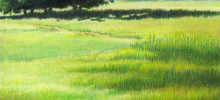
And here is the current version:
There is no doubt these changes resulted in a better drawing.
Just remember that changes should be made using the same methods used to create the artwork. Proceed carefully and work slowly. . . always take the same care in correcting the drawing that you used to create it in the first place.
This post may contain affiliate links.