Everyone’s monogram has endless creative potential. We’ve all seen a renewed popularity of letters on jewelry, linens and clothing. It’s interesting to learn that in other countries, royal monograms (with crowns) are used on coins, flags, and police badges.
Here in the US, the Post Office prints monograms on postage stamps. Take a look at the two creative examples below, or check out this link for many more.

“Monograms have been used as signatures by artists and craftsmen on paintings, sculptures and pieces of furniture, especially when guilds enforced measures against unauthorized participation in the trade. A famous example of a monogram serving as an artist’s signature is the “AD” used by Albrecht Dürer.”

Contemporary wedding monograms
A wedding is a very special time to design a monogram. Tradition holds that the groom’s last name letter is shared (in the middle) with the bride’s first name letter on the left and the groom’s first name letter on the right.
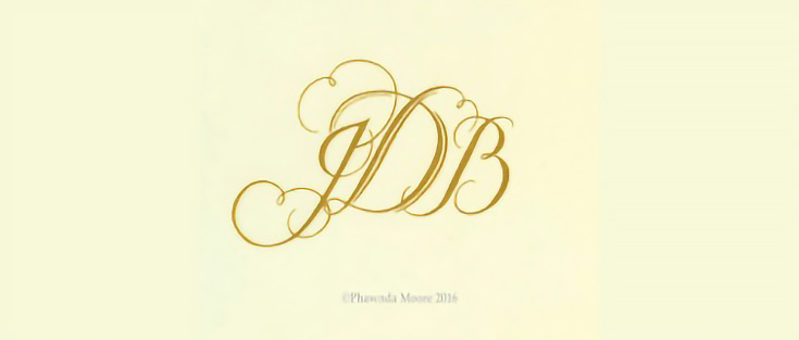
The image below shows one of monogram designs for a client:
This monogram was used on complete wedding invitations, and also embroidered on towels with metallic thread.
Some couples opt for a monogram of just two letters (first names only) but no matter how many letters are used, a contemporary monogram is always defined by some part of each letter connecting to the others, signifying unity. Hand lettering or calligraphy always makes a monogram a piece of art.
Here’s how to design and draw a monogram
I’ll demonstrate my monogram process by sharing the design of a 5″ x 7″ birthday card for a friend whose initals are “DB.”
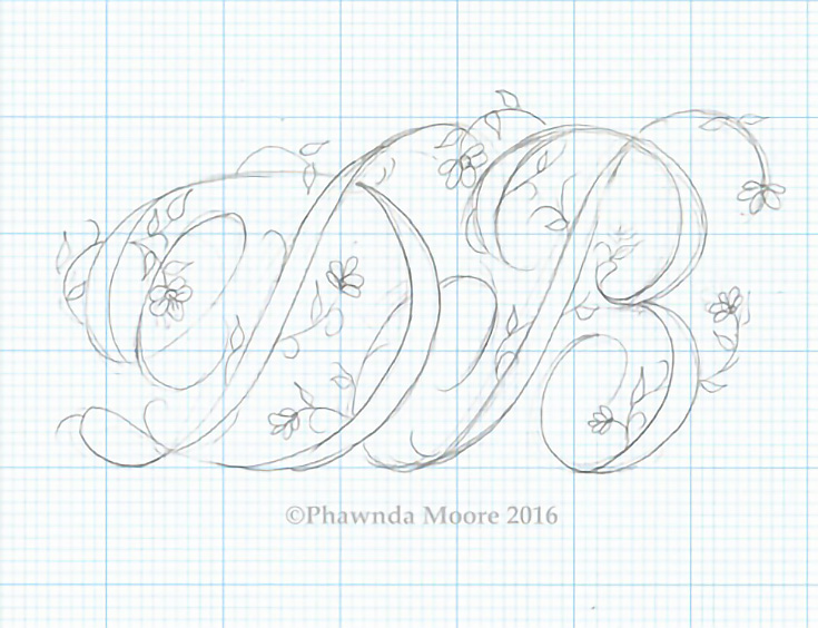
A humble pencil and eraser were the tools I used to create this script-style monogram. Using graph paper, I drew the chosen letters. This first photo shows a bit of the early refining process; I erased the lines that didn’t work well and continued.
Notice how I placed the letters close enough to touch, and connected them with the lower flourish on the “B.” I modified both capital letters so that they became a single unit in the monogram.
Once I was finished with the design, I used a light box to transfer it to the card and envelope. (I just upgraded to an ArtOGraph 930, which is so much smaller and thinner than the older model.)
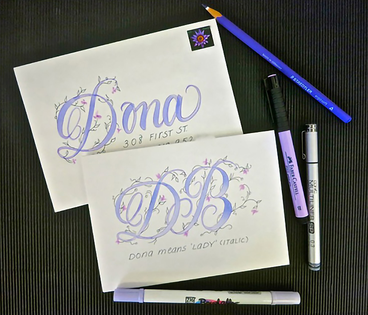
Using the Copic multiliner pen, I drew the outlines on the card and brushed in color with a Zig Brushables pen, which gives two shades of a single color, one on each end. The little pink flowers were made with Faber Castell brush markers.
I always coordinate the envelope with the card. In this case I used the “D” to write her first name and added the address with the Copic marker.
Often when I design a card/envelope, I’ll choose the postage stamp first (as it’s my least flexible element). However, this day I forgot and lucked out when I found the watercolor stamp in the same colors—serendipity!
Love it when that happens—here’s wishing a little serendipity for your day!
This post may contain affiliate links.


