I love to use hand-lettering techniques when creating my illustrations and paintings—in my opinion, there’s really no better way to add an extra layer of meaning. It might be a special quote or phrase layered over an image, or just a single word for emphasis, but it always “pops!” and makes that artwork feel a little more special.
Today’s tutorial will show you how to create a simple set of letters. As you gain more confidence in using these techniques, I encourage you to experiment and check out the books of many talented hand-lettering artists to explore additional free-flowing techniques.
Here are the steps I use to create hand-lettered words and phrases in my artwork:
1. Before you start, know what you want to write in your artwork, and how you want that word or phrase to feel. Get inspired by hand-lettering on signs, advertising, publications and many other items that surround you.
2. Plan on using simpler lettering for large amounts of text, while reserving fancier lettering for single words, titles and short phrases. This will make the process easier for you, and make your lettering more legible.
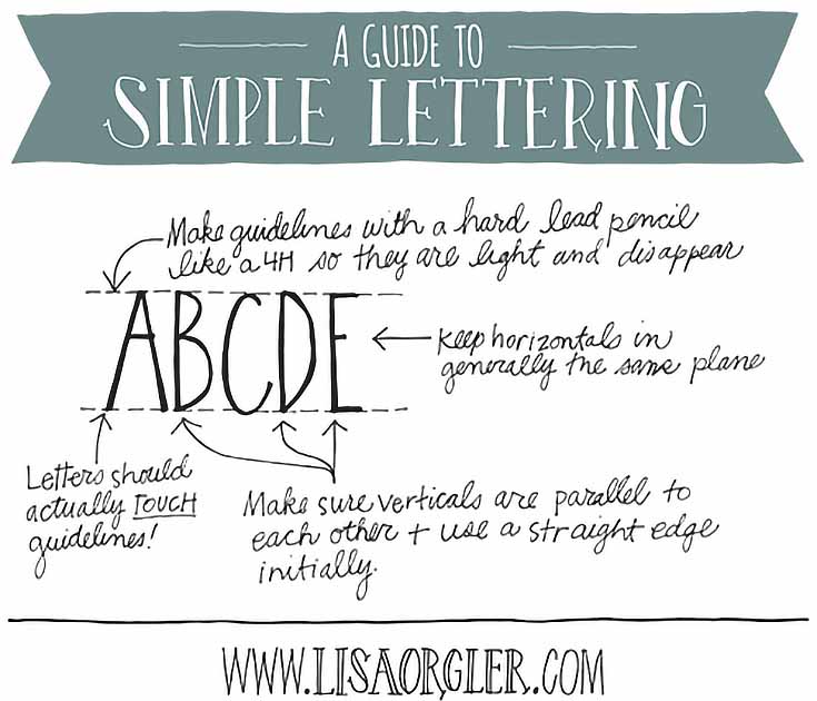
3. Wherever you’ll be adding your lettering, place guidelines at the height you desire. Use light lines, so these don’t compete with your lettering. I suggest a hard lead pencil like a 3H to a 6H. Never use ink for guidelines. You can use a ruler to measure these or a handy-dandy Ames Lettering Guide. Many calligraphers and cartoonists use this tool to keep their lettering professional.
4. Start drawing your lettering using pencil first (with hard lead once again). This will help get the spacing correct. If these are light enough you don’t even have to erase them after the ink is applied.
5. A very important component to nice lettering is keeping the vertical lines parallel to each other. Even if you want to italicize your letters, just be consistent with your angles. How do you keep verticals parallel, or your angles consistent? Use a ruler! This is a great way to add neatness if you have a shaky hand. Then, just free-hand anything with a curve or angle (like Rs,Ps, Ks, Os, etc.).
6. Keep all your horizontal connections at relatively the same level. If the cross bar on your A is high, keep it high on your other letters. Consistency is key.
7. Now you can ink in your letters. Once you become more confident you can skip directly to ink rather than using pencil first, but pencil is a much safer way to learn, so it’s worth the extra time! This is where you can add double vertical lines, or serifs, or any other details you’d like. Just make sure that your finished letters touch both the top and bottom guideline. If you stray from this your lettering will look messy.
8. Practice, repeat, and enjoy the process! Perfection ISN’T required. Your own personal style will shine through, just as in your artwork, and that’s what you want!
Note: I also teach landscape design, and have tought my hand-lettering process to my students there, too. Although I made the following video for them, I wanted to include it here as well, in order to demonstrate how easy it is to create basic lettering, plus lettering with a little bit of flair. Enjoy!
Have fun, and don’t forget to try out different ways to incorporate hand-lettering in your own artwork!
This post may contain affiliate links.


