A few weeks ago, I shared some pointers on how to draw realistic hair with colored pencils. If you missed that article, you may want to click the link and read it before continuing here, since those methods will provide a good foundation for today’s walk-through.
The focus of this article is also hair, but this time I’ll be showing you how I drew the long, disheveled hair of a spaniel in a two-part, step-by-step demonstration.
The initial drawing
With most subjects, I develop a detailed line or value drawing first. I make as accurate a drawing as possible because colored pencils leave little room for error or correction later.
This portrait is such a unique subject with so few fixed features, however, that a different approach was necessary. I spent just a few days on the drawing, focusing on the eye, nose, and mouth. I sketched in hair masses enough to know where and how they defined the dog’s appearance and how they related to the fixed features, but I didn’t spend a lot of time on them or draw a lot of detail.
I chose 146 pound, regular surface white Bristol for the final artwork. It’s a lightweight paper with enough strength to take lots of abuse, but a surface that’s ideal for detail. I used a light box to transfer the fixed features and enough detail in the hair masses to show the major shapes and shadows of the drawing.
Starting on the features
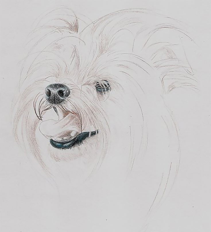
The first step in drawing the portrait was using Verithin Light Peach to impress lines of color over the nose, mouth, and eye. Because the fixed features are very dark and the dog’s hair is very light, it was essential to get the lines impressed first, before adding in dark elements where the hair would need to go.
Then I began layering Verithin Black into the lip, nose, eye, and eye lid. I used circular strokes in the nose and eyes and linear strokes in the lip, combined with other strokes as each area required. All of the strokes were closely spaced to produce even color.
I created shading by layering. One layer of color in the lightest of the shadows and multiple layers in the darkest. I followed up with Verithin Dark Brown.
With each new layer of color, the impressed lines became more visible. When I could see them clearly and compare them to the features they overlapped, I deepened some of them by going over them with Verithin White or my stylus. I also added additional impressed lines where necessary.
The next step was adding reflected highlights with Verithin True Blue and layering Verithin Light Peach to the underside of the tongue, then continuing to layer each color again to build color saturation and detail. Most of the work was done with light or very light pressure.
When I finished with the features at this stage, I used the stylus to impress more stray hairs and Verithin Terra Cotta to add damp hairs around the mouth. I used long, curving strokes following the direction and pattern of hair growth and focused on larger hair masses.
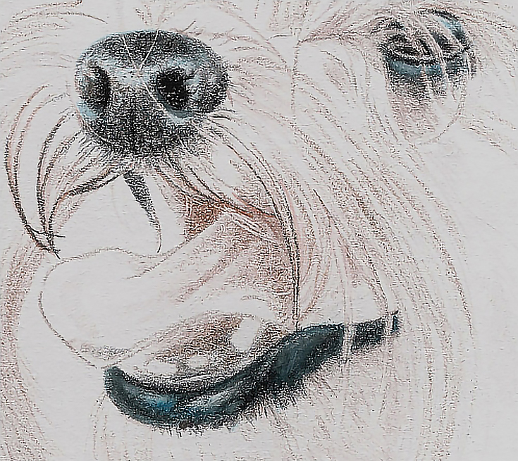
Then I switched to Prismacolor Black, Indigo Blue, and French Grey 70% to darken the features and burnished the features with Sky Blue Light in the reflected lights and French Grey 20% in the middle tones, and white in the highlights.
In the illustration shown above, you can see the details, including a couple of stray hairs crisscrossing the top part of the nose. These lines were impressed at the beginning and show the color of the paper.
If you look closely at the tongue where it disappears behind the hair along the top lip, you’ll see another impressed line. This line is not quite as bright as the lines impressed across the nose because I added it after a glaze of color over the tongue. The difference is subtle, but adds form by making the impressed line darker in value than those over the nose.
Beginning work on the hair
To begin drawing the hair I switched from the highly detailed digital image I used for the fixed features to a printed version of the reference photo that showed less detail. Doing so allowed me to focus on the larger shapes and values.
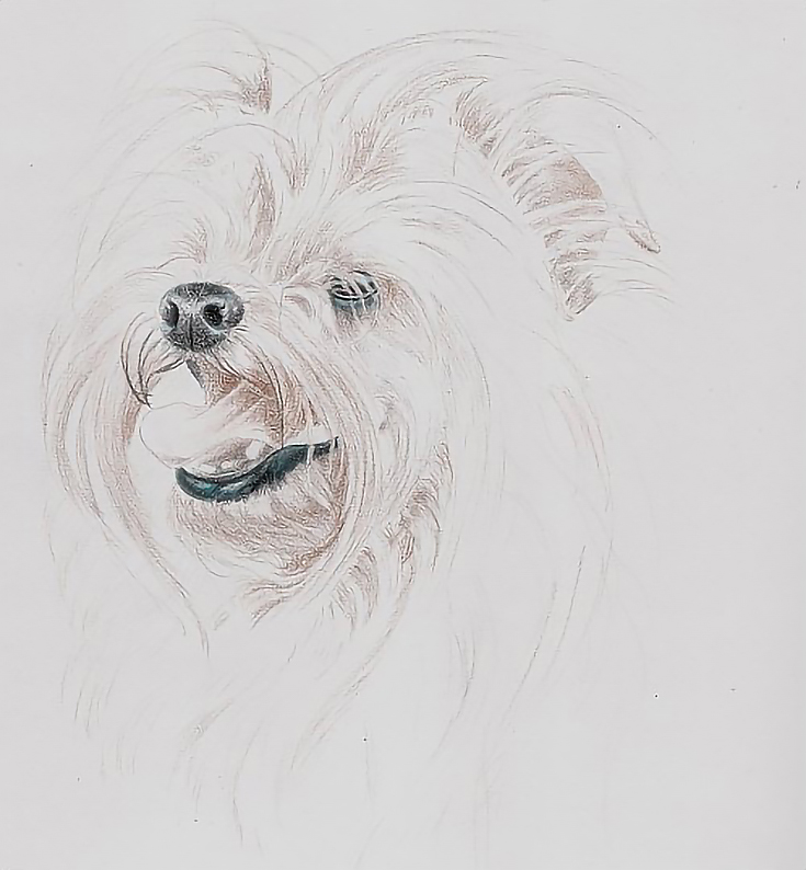
Working from the eye, nose, and mouth toward the outside contours of the head, I sketched the lightest lines first with Verithin Light Peach and Prismacolor French Grey 20%. I then went over each area with White using medium heavy pressure. This combination produced lines that were dark enough to see and work around, but not so dark they were distracting.
Next, I used Light Umber, French Grey 20%, and French Grey 50% to work throughout the portrait, darkening shadows and building middle tones. I used light pressure and long, directional strokes in the direction of hair growth most of the time, but also used strokes opposing hair growth where necessary.
I added the suggestion of hair around the far side of the head, neck, and shoulder with French Grey 20%, and began work on the inside of the ear with French Grey 20%, French Grey 50%, and Light Umber.
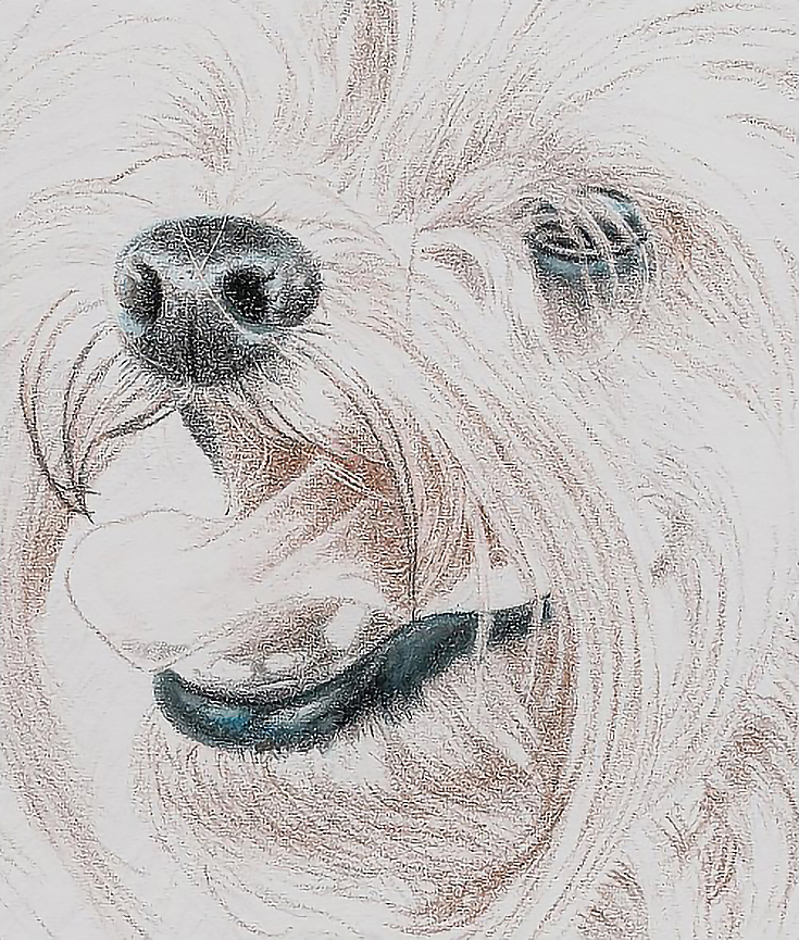
On the tongue, I applied additional layers of Light Umber in tiny, circular strokes, followed by a layer of Verithin Light Peach with light pressure and directional strokes, then another layer of Light Umber in the shadows and on the inside cheek.
Note that most of the work in the hair has been in the shadows (the ear, under the chin, around the eye, etc.). I’m still working fairly loose and defining the lighter hair masses by drawing the shadows around them.
Because the paper is so close to the color of the dog, I won’t have to add highlights until the end of the process. For the moment, I can define highlights by carefully placing the shadows and darker middle tones around them.
At this point, the major details are well developed and nearly finished. I’ll continue to tweak them as I continue working the portrait.
The overall shape of the dog’s head has also been established through a combination of value, color, and the direction of hair growth. There’s still a lot to do in this area, but we’ll take a look at that in Part 2, coming up soon!
This post may contain affiliate links.
