Last summer I did a lot of experimenting with colored pencil on sanded art paper. Despite having done a piece or two a few years back, I wasn’t sure how I’d like the surface for more detailed landscapes.
After completing a couple more this year, it’s safe to say I like it! If you want a quicker way to use colored pencils without sacrificing detail or color saturation, I definitely suggest giving sanded art paper a try.
Today, I thought I’d start a new tutorial series based on one of my early pieces from last year. It includes my missteps and difficulties, so it’s perfect for helping you get started (and hopefully avoid the mistakes I made.)
Ready to jump in? Then let’s get started!
Step 1. The line drawing
The first way you’ll save time when working with sanded pastel paper is in the initial line drawing phase.
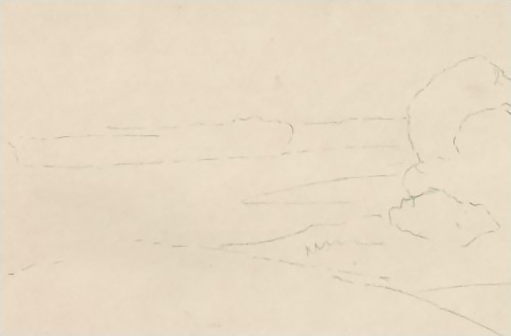
I always used to make detailed line drawings to make sure everything was correct in my composition before diving into the real drawing. When I started using sanded art paper, the first change I made was to drop the line drawing altogether and just sketch my compositions directly onto the sanded paper. It’s fast and easy and lets me start color more quickly, but is still very forgiving.
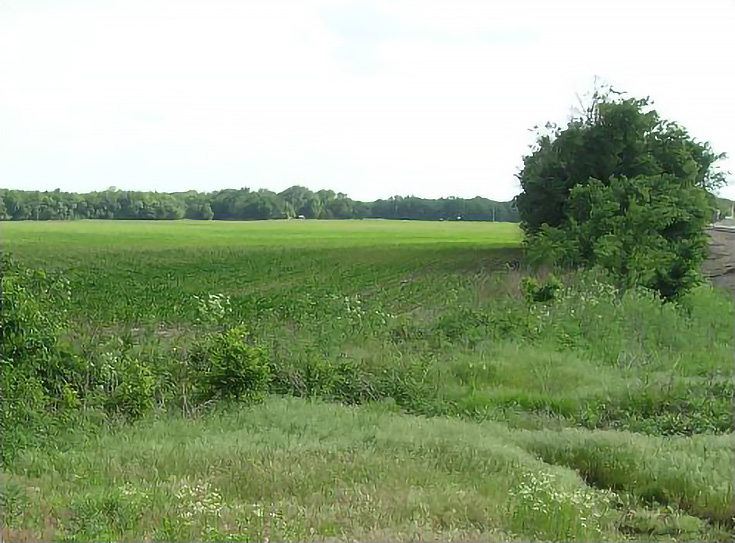
Here’s my reference photo for today’s tutorial:
I marked all the borders of the drawing, then sketched in the largest shapes. Usually I begin with the center of interest, then place the horizon line and any other major shapes such as tree lines, hills or roads.
I may then add a little more detail to the center of interest, but not much.
Typically I’ll use either an earth tone or medium value green color for this. They show up well on the light tan color of sanded art paper, and are visible through enough layers to establish the drawing, but they also can be covered up fairly easily once I no longer need them.
Step 2. Adding my first color layer
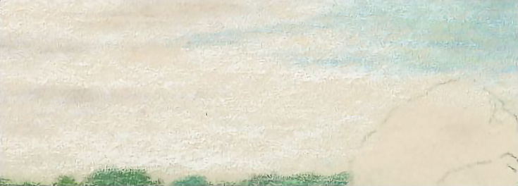
I used Koh-I-Noor Progresso Woodless pencils for the first layers because they’re capable laying down a lot of color quickly, especially on sanded art paper. Holding the pencil in a horizontal position, I shade with the side of the exposed tip and begin drawing in the sky.
The sky in the reference photo is rather undefined, so I emphasized the blue with a few broad strokes of Sky Blue in the patches of clear sky, then added Dark Green at the top of the sky patches.
Next, I blocked in clouds with Light Grey near the horizon on the left side. I also added a few strokes of grey about two-thirds of the way up the sky.
Lastly, I “blended” those colors by layering White over them. I wasn’t pressing hard enough to really burnish them, but the layer of white did move around enough color to physically blend the previous layers a little bit.
Step 3. Drawing the distant trees
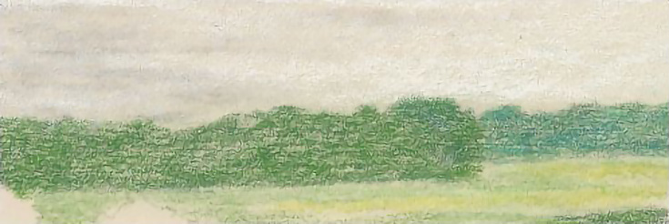
I layered Hooker’s Green over all of the trees along the horizon using circular strokes, with my pencil held in a more upright position. Dark Green was then layered over the trees on the right, which are further in the distance, and Sap Green over the trees on the left.
For now, that’s all the detail I need (you’ll see why when I get to the blending step).
Step 4. Creating an open field
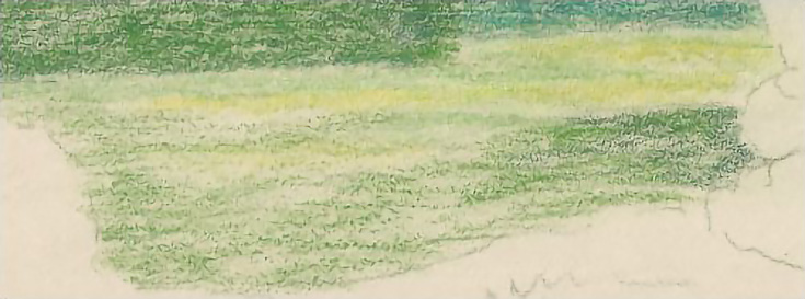
For the field I used a horizontal grip and the entire side of the pencil to stroke Hooker’s Green over most of it. You don’t have to cover every inch of the paper; just let the paper’s texture work for you.
Next, I used the same stroking technique to add a few strokes of Light Yellow from the treeline to the cast shadow from the trees on the right side of the composition.
Finally, I added Sap Green to the field, and blended with White near the treeline.
TIP: Don’t mess around with light pressure when drawing on sanded paper. It won’t accomplish anything. Instead, begin with medium pressure and a sense of boldness and adventure.
Step 5. Putting in the foreground
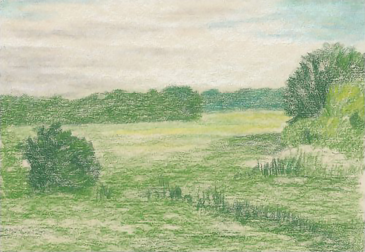
In the foreground, you want lay down rough layers of Hooker’s Green, Sap Green, and Light Yellow in the trees and grass. Use your pencils like chalk, holding them in a horizontal position and pushing them over the paper. Concentrate on values more than color at this stage.
The Koh-I-Noor Progresso Woodless pencils come in only 24 colors, so if you’re using those, your color selection is limited to begin with. Make use of your greens and yellows to establish the basic light and dark colors and values.
You can layer light over dark on sanded art paper, so if you want to block in all of the darks, then lay lights over them, you can. However, you can also lay down color only where it’s needed, as I did with the smaller trees on the right.
Believe it or not, all of this will be blended with odorless mineral spirits in a moment, so feel free to work fast and loose with your color application! That’s the beauty of sanded pastel paper—it let’s you draw almost impressionistically in these first few stages—so don’t get bogged down in details. The time for that will come!
TIP: When you plan to blend with solvent of any kind, it’s important to have a sufficient amount of pigment on the paper to allow the solvent to blend. Don’t worry if your drawing begins to look ugly. That will pass. Continue add color until you’re satisfied.
Step 6. Blending your underdrawing
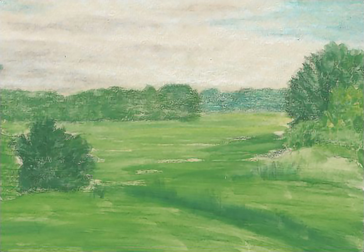
Once you’ve layered in enough colors, it’s time to blend it! I often use turpentine, but odorless mineral spirits are equally good. Many artists use Gamsol, others prefer Mona Lisa Odorless Mineral spirits, and there are many other brands to choose from as well.
A stiff bristle brush is best for blending with solvents on sanded pastel paper. Choose as large of a brush as possible that still fits the size of your drawing. I used a #6 bristle bright, but a larger brush would have also worked.
NOTE: The reason for using the largest brush possible for each drawing—or for each area of the drawing—is that the larger the brush, the fewer strokes you have to make. Fewer strokes make for smoother color.
Wet the brush with mineral spirits, then blend from light to dark and rinse the brush before you move to a new color. Otherwise, you may end up putting color from one area in the next area you blend.
Work within the edges of the shapes. For example, in this drawing, I blended the blue sky, then the clouds, then the background trees, and so on. This keeps your edges sharp and the shapes distinct.
For the fields, sky, and foreground I held the brush with the edge of the bristles parallel to the paper, then stroked the drawing horizontally. For the trees, I used the brush so that my strokes mimicked the look of foliage, either stippling or dabbing the paper. You don’t need to fill in every bit of the paper unless you really want to. All you need for this under drawing is the basic colors blocked into each shape.
NOTE: Don’t worry if you don’t love how your drawing looks at this stage! I almost always wonder if I did the right thing after a solvent blend. It goes with the territory.
Whenever you use solvent to blend colored pencils, you must let the paper dry thoroughly before adding more color. If you work on damp paper, you run the risk of damaging the paper’s surface—even with sanded art paper.
So set your drawing aside to dry and join me again next week for Part 2!
This post may contain affiliate links.
