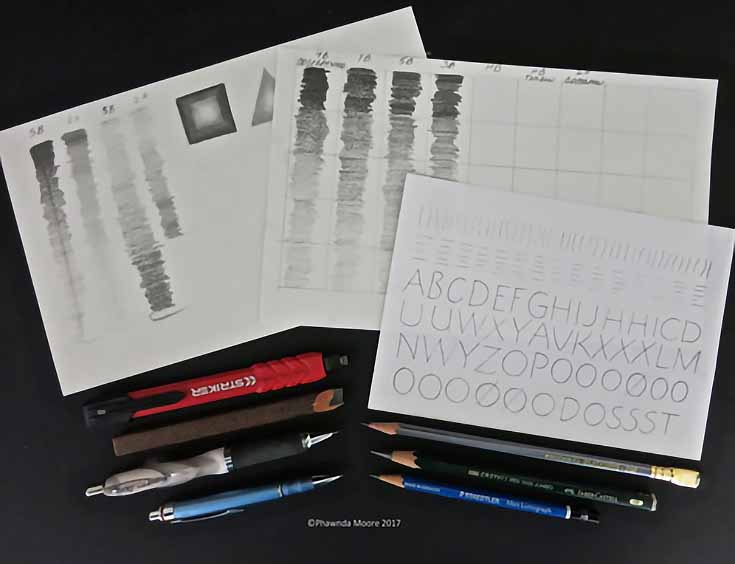
Warm up exercises for drawing are shown in the photo above. On the left and center sheets, explore your pencils’ value range using pressure. Make reference pages; you’ll be glad you did! On the right, try a simple, classic alphabet.
If you haven’t already gotten acquainted with what different types of pencils can do, here’s a little background:
Types of pencils
Pencil lead is a combination of clay and graphite. The softer the lead, the more clay is in it. H pencils are the hardest lead, and will create a lighter value on the paper. B pencils are the softest and will be darker, while HB is in the middle.
The numbers on pencils are scaled for value range, unique to the type of lead. From dark to light, you would arrange your pencils like this:
Darkest – 6B – 4B – 2B – HB – 2H – 4H – 6H – Lightest
The pencils I use fall into 3 categories, and all are shown in the photo above.
On the left, the red pencil (and the one below it) are carpenter’s pencils. You’ve probably seen these at Home Depot; they’re often used in construction projects. Carpenter’s pencils are variations of chisel nibs, which is held at certain angles for thicks and thins. The red pencil provides the lead automatically, whereas the brown pencil requires hand sharpening.
Here’s an early project I did with a carpenter’s pencil—the Z Quilt.
The two Z’s in the center diamond are not “filled in” with lots of pencil strokes; this pencil creates that width automatically (sort of like a calligraphy pen). Keeping the tip perfectly sharp is a challenge, but it’s worth it for accents like this!
(The outer Z’s are ink on mat board. I really understood why zzz’s are the perfect letter for sleep after doing this piece!)
Below the carpenter’s pencils in that original photo are two mechanical pencils. ( I really like the cushioned grip and wider barrel models.) If you purchase one, be sure the replacement lead is the same size (03, 05) as the pencil allows, otherwise it won’t fit. I use both HB and 3B for most projects.
On the right in that photo are some of my favorite pencils. Yes, it’s still OK to use these! Note that Faber Castell makes a bigger barrel, similar to what we had in my school days. I actually use that one a lot because of hand issues; it’s important to be comfortable when you’re creating.
I often use graph paper to help me make straighter letters. Also the spacing between words is easier to analyze. If need be, I will cut out a section and visually correct it on my final paper.
The good news about pencil lettering art is that it works on lots of different papers. And it works differently. The piece below is on a textured paper, Arches MBM.
After you’ve practiced and are familiar with each letter shapes, you can approach a layout like this with a looser attitude. I think the pencil marks above help to accent that loose, unstructured feeling. Give it a try!
Finally, I have to admit I just love the versatility of pencil letters. They complement watercolor, ink, and most markers. Below is the inside of a thank you card, a mash-up of styles! I had fun making this.
Thanks so much for experimenting with pencils! I hope you’ll visit my FB page for new projects and classes. I’ll be teaching at Mendocino Art Center, California in November, and it would be lovely to meet you!
This post may contain affiliate links.


