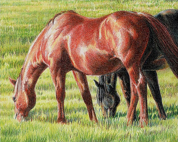
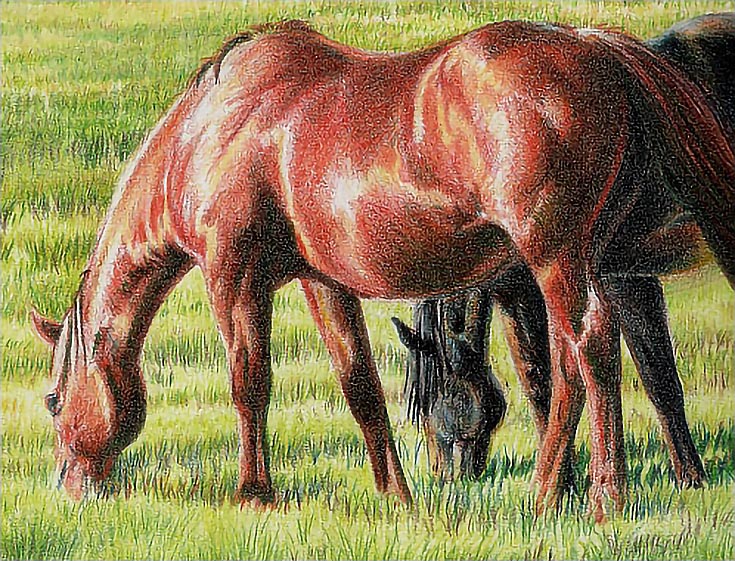
If your artistic goal is life-like realism, drawing horses—or any animal—is a difficult and demanding process. And, using colored pencils doesn’t simplify matters.
So this week, I’ll walk you through the process I use to draw a chestnut horse using the direct method. This method can be applied to any color of horse or to any type of animal or other subject.
Let’s get started.
Step 1. Begin with the highlights
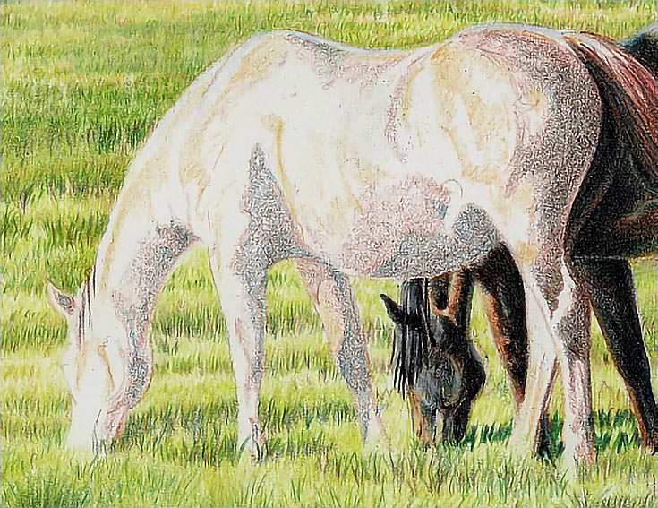
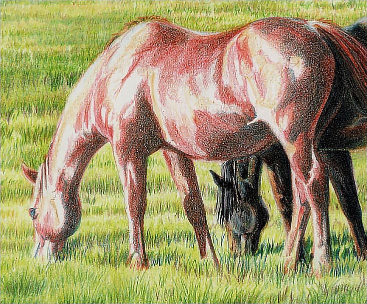
Assuming you’ve already drawn the outline of the chestnut, I would suggest you start by glazing goldenrod into the highlights. I used open strokes (not close together) and applied them around muscle and body contours.
Along the horse’s top line and rump, I layered powder blue to establish reflected light, and once the highlights were roughed in, I began adding shadows. Using light pressure and tight, circular strokes, I layered terra cotta into the shadows and darker middle tones. I followed up with Indigo blue, focusing on the darker shadows. Next, I added a layer of dark brown.
My objective was to create smooth base color and even color layers, so I used light pressure, tight strokes, and blunt pencils for each layer. In the illustration above, the shadows of the hind leg and rump show all three colors. The rest of the horse shows only terra cotta and Indigo blue.
Step 2. Add a base color of red
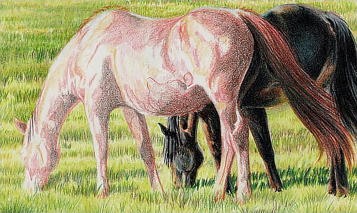
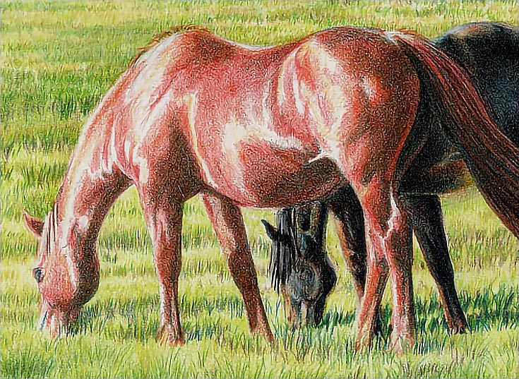
Pale vermilion is next in the process. Beginning at the head and working my way to the tail and down each leg, I outlined the areas where I wanted to add color. I used very light pressure for the outlining (which you can see along the belly in this illustration), then used light or very light pressure to fill in the shapes. I used a variety of strokes, but worked around the contours of the body, legs and muscles.
I then began working back toward the head with the second layer. Note the darker oranges on the hind quarter and just ahead of the hip. This is the result of two layers. The lighter colors toward the front of the horse show the first layer of color.
I finished the second layer of pale vermilion, then went over the horse again, fine tuning details and the shapes of shadows and muscle masses, evening out the layers and adding finer detail. On this layer, I was more careful to keep the pencil as sharp as possible. For the previous layer, I used sharpened as well as blunt pencils
Step 3. Add more colors, layer by layer
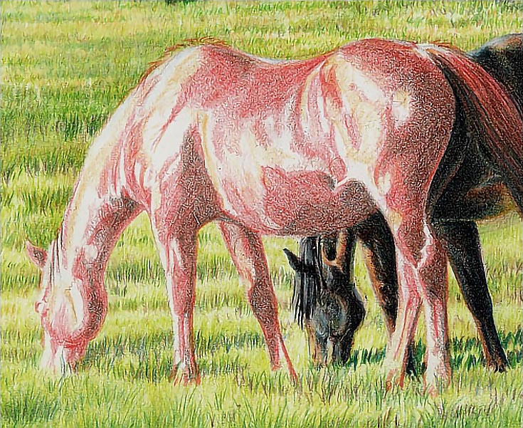
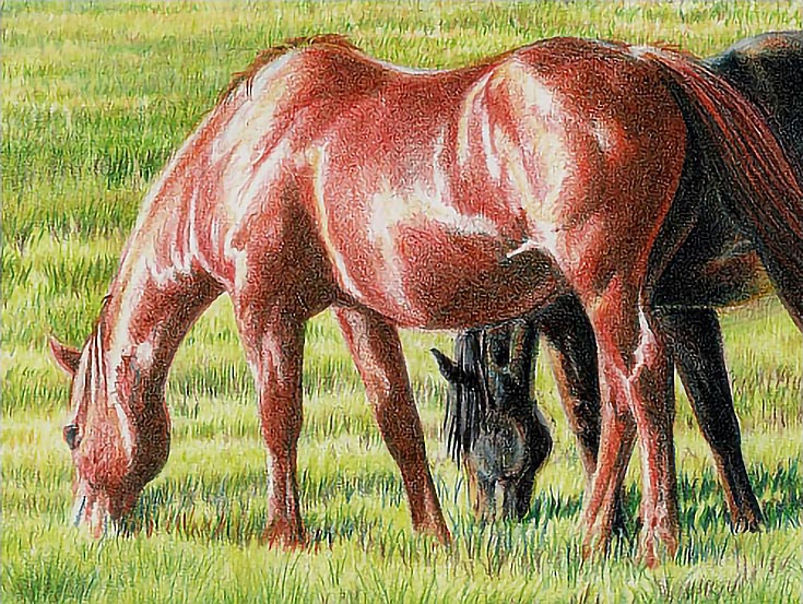
Beginning with the off side front leg, I used light to medium pressure to glaze terra cotta into each shadow. I worked with directional strokes and a minimum of two layers, though some areas received more layers. I kept the pencil sharp and used whatever strokes were most helpful in drawing an even color layer.
In the middle tones, I used light pressure, a sharp pencil, and directional strokes.
At this stage, the process is all about building color and value depth. I worked throughout the horse with each color, refining and building detail, adjusting edges, and revealing highlights by gradually and carefully adding darker colors and values around them.
When I finished with the terra cotta, I switched to Indigo blue to darken the shadows. Beginning with a needle sharp pencil, I started with the near side hind leg and worked upward and forward, reshaping and redefining the deepest shadows. I used a variety of strokes, but kept the pressure light, since I didn’t want to go too dark too fast.
At the head, I added the first color to the eye and surrounding shadows, then stroked in the beginnings of a cast shadow in the grass around the horse. I used upward moving strokes and medium pressure, sharpening the pencil to get the finest possible strokes.
I next layered orange over all of the horse except the brightest highlights, which I carefully outlined and worked around. A second layer of orange was added to the shadows. I used light pressure and directional strokes, working around the contours of the body.
Pumpkin orange was then layered over the shadows. I continued using directional strokes and light pressure, but used a blunt pencil. The blunt tip produced wider strokes with softer edges and that allowed me to soften the edges between highlights and middle tones more effectively.
Step 4. Use multiple glazes of each color if necessary
I glazed sienna brown over all of the horse except the highlights. In the shadows, I applied two or three layers, while in the middle tones adjacent to the shadows, I applied one or two layers, and in the lighter middle tones, only a single layer. So even though I used one color, I was able to increase value and color gradations by adding additional layers where I wanted darker value or deeper color.
Step 5. Add color to the highlights and middle tones
I followed up with jasmine and orange applied with medium pressure in the highlights and middle tones. Jasmine was layered over all but the brightest highlights, which I left white. Orange was applied over the middle tones to blend the darker highlights and lighter middle tones.
Then I glazed orange over all the rest of the horse (except the tail) with medium pressure to unify color.
Step 6. Blend and burnish
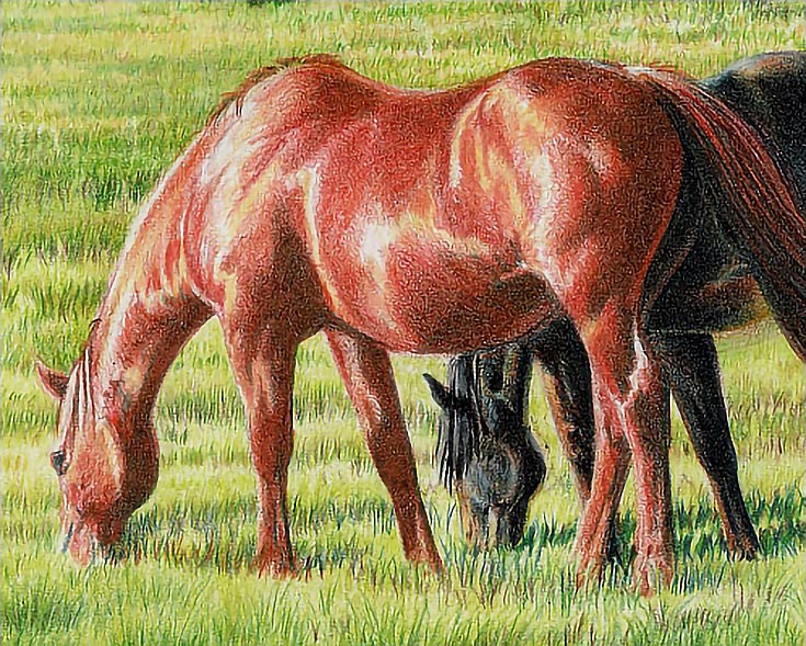
I burnished the shadows of both off side legs with the colorless blender, stroking downward along the legs on the shadowed edges and along the contours of the lower legs, and stroking horizontally around the bulk of the upper front leg. I then burnished the middle values with lemon yellow and the highlights with white.
I also layered dark brown into the darkest shadows with a blunt pencil to get a wider, softer-edged stroke. In the darker shadows on the legs, neck, shoulder, belly, and rump, I used heavy pressure (not quite burnishing).
For the most part, I used directional strokes following the contours of muscle and bone structure, but in some places, I also layered strokes in other directions where the coverage wasn’t solid enough.
Step 7. Finish by adding touches of reflected light
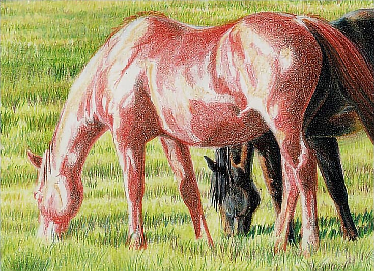
I followed up with dark green in the dark shadows on the lower surfaces and Copenhagen blue in the dark shadows on the upper surfaces. The shadows in each area should be slightly tinted by the colors in the grass and sky. I used heavy pressure with the green and medium pressure with the blue. Since the blues are in lighter areas, I used a sharper pencil and more open strokes.
The key to success with a detailed, realistic drawing like this one is to use light pressure for as many layers as possible. A slow, careful development of color allows you to adjust gradations in color, value, and saturation and will help you create stunning, life-like drawings of your favorite animal.
Today’s post is taken from Colored Pencils: The Direct Method Step-by-Step by Carrie L. Lewis. As a special bonus for EE readers, Carrie’s book will be 20% off with the coupon code ZL26P through October 31st. Follow this link, enter the coupon code during checkout, then download and enjoy!
This post may contain affiliate links.
