A few weeks ago, I gave several suggestions for how to repurpose unsold artwork. Today I’m going to expand on that by showing how I redesign pieces using Photoshop.
Like most artists, I have my fair share of unsold artwork sitting around the studio. Typically, these pieces haven’t sold simply because they are so subject-specific that they’re hard to market to a new buyer.
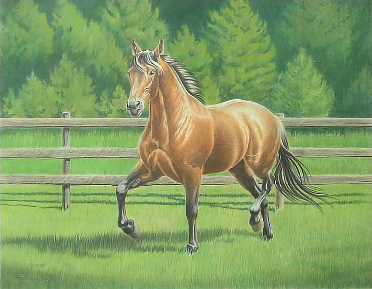
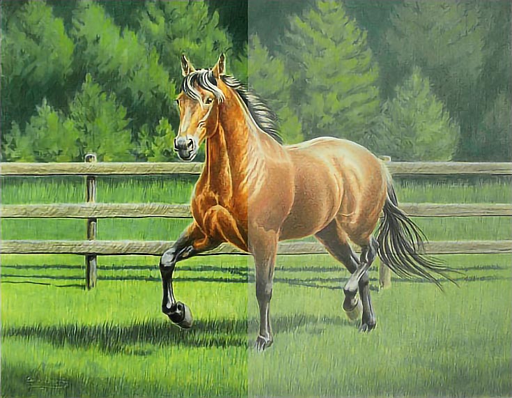
The drawing below is a 16×20 colored pencil drawing originally created as a study for an oil portrait. I hoped to sell it to the owner of the horse or to someone else connected with the horse, but that didn’t happen.
However, since this is a drawing of a specific horse in a specific setting, finding another buyer has been problematic. Most people want artwork of their own horses, after all—not someone else’s.
The oil portrait has long since been delivered, but this colored pencil study has been hanging at the top of my stairs ever since it was completed. It’s definitely time I do something with it.
Unfortunately, I have only a vague notion of what to do. Some of my options include making the drawing a vignette with a dark background, cropping the drawing into a small head study, or some combination of those The process could be as simple as reframing or as complex as changing the drawing itself.
I lack the courage to do something that can’t be reversed. . . if I ruin it, then I’ve lost a good piece of art!
So, recently I started using my computer to mock up different ideas. I’m using Photoshop 7 on a Mac G4, but almost any computer and software will let you do the things I’m doing.
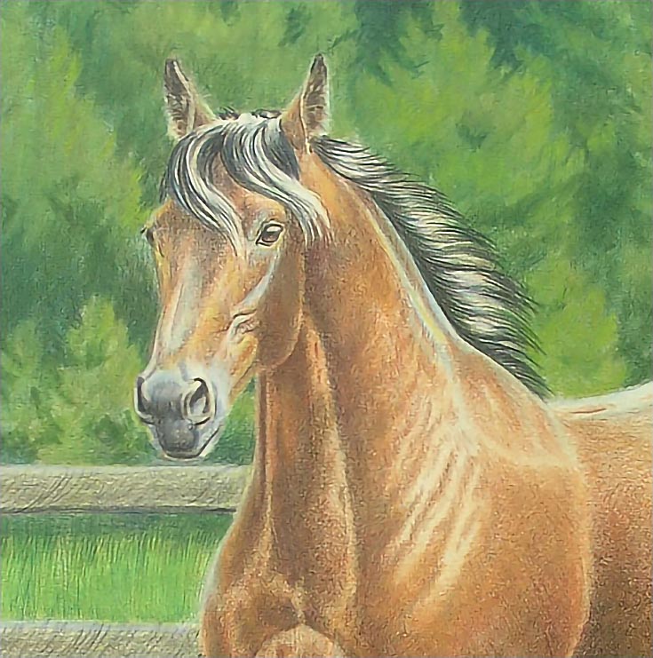
The first thing I did was a basic crop to focus on the horse’s head, neck and shoulders. This composition would be roughly 8×10 in size and it would be the easiest. Simply cut the paper and frame it.
But is this composition better than the original composition or just smaller?
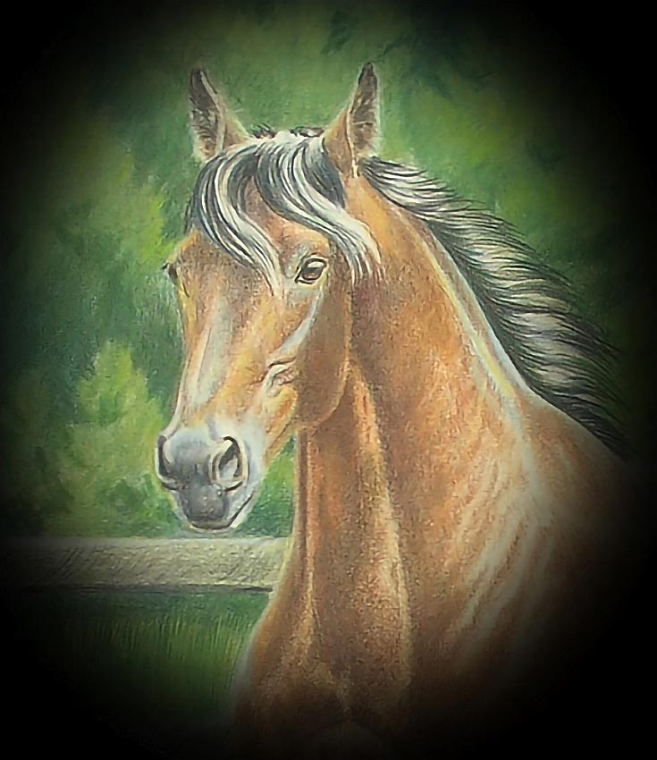
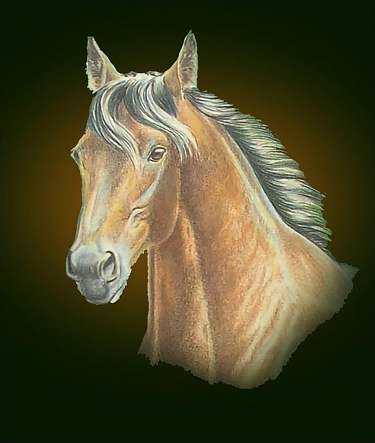
Next, I darkened the background and made the edges blurred (known as “feathering” in Photoshop). The focus of the drawing is much tighter—now just the horse’s head. The green background, which is part of the reason I’m dissatisfied with the drawing, is still visible, but there’s much less of it.
I also like the taller, more rectangular shape of the drawing. This option would be fast and easy. Punch up the details, values, and colors in the horse to make it stand apart from the greens in the background and I have a new drawing.
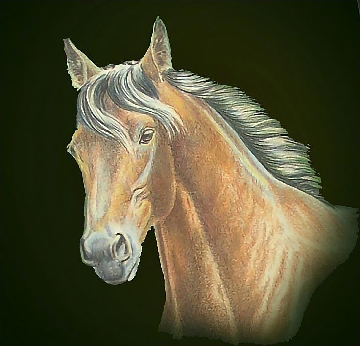
I wasn’t satisfied with the easy solutions, though, so continued to experiment by making a horizontal composition. This composition is basically the same as the previous one, but has a greater sense of movement because of the orientation of the image and because more of the horse is visible.
Of course, more of the green background is also visible, but that could be muted if necessary, by glazing other colors over it.
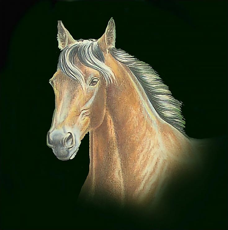
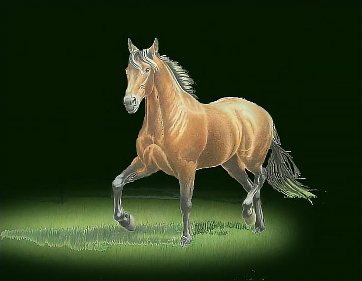
The next logical step was to use Photoshop to replace all traces of green with solid black. I also blurred the edges of the horse at the lower and right edges of the drawing. This is closer to what I’m thinking of doing, but it’s still not quite there.
So I changed the black background to a very dark green. Then I lightened the area around the horse with a darkened brown from the shadows on the horse.
The position of the horse is rather static, even focusing on the head and neck. Horses quite often prance with their necks arched and their heads tucked. The best I can do on the computer is to rotate the image so the head is in a similar position.
Unfortunately, that doesn’t do much to create an arching neck, so if I want a composition like this, I’d be much better off to start from scratch with a new reference.
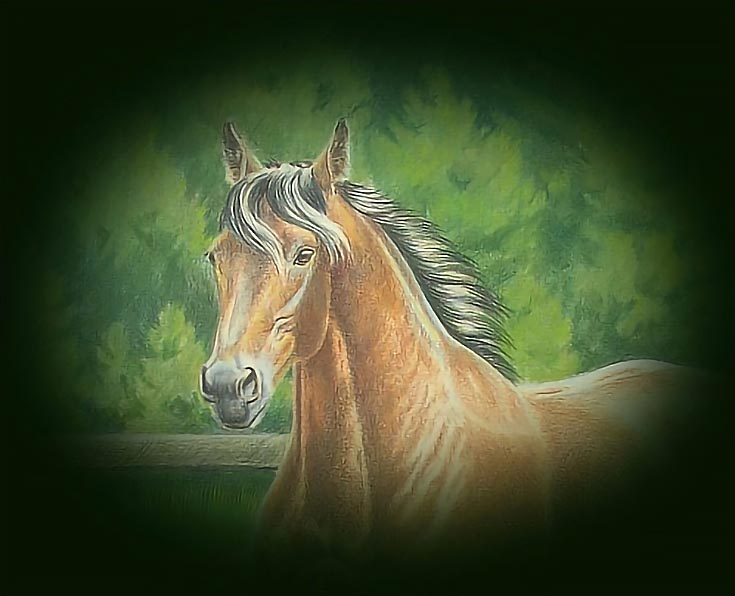
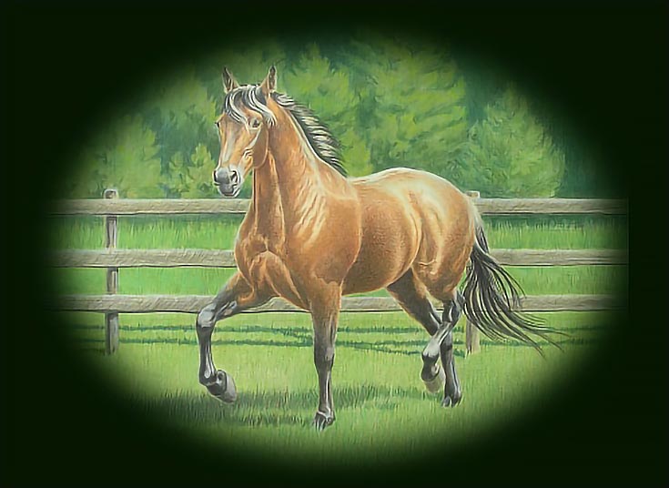
Crops are nice, but I wanted to see what could be done with the drawing as a whole, so I went back to the original image and added a dark, oval “frame” with blurred edges around all of the horse and surrounding background in a horizontal format.
I liked this one a lot and an added advantage is that I could accomplish this with an oval mat and minimal drawing work.
Then I darkened all the background with the same black-green color, saving only a small area around the horse’s feet. My immediate response was that this was the one. I’d envisioned sandy ground around the horse’s feet, but the greens work just as well and would require no additional work.
By the end of the process, I had several ideas how to redesign this drawing to make it much more dynamic. I also had a few ideas of what wouldn’t work. Those alone made the time well spent, and saved me from making a bad decision.
Whatever I decide to do, the first step is working on the horse. As you can see, the colors are too faded and the value range too narrow. With a little work, the colors could be much more vibrant, as shown in the left side of the illustration below.
In addition, I’d try to make the horse more generic by darkening the coat color and maybe adding white markings. (That’s too much to try to do in Photoshop, however!) I also love manes and tails, so I’d plan to emphasize those a little more as well.
Of course, it’s always possible that once I finish the horse, I’ll discover the background doesn’t compete so much, or that the drawing just works as-is. If so, that would certainly be all right with me!
This post may contain affiliate links.
