Every drawing should be more than just a pretty piece of art. . . it should also represent your progress as an artist. Ideally, a look back at your work should tell a story of the lessons you’ve learned and the skills you’ve gained.
These lessons don’t even need to be mind-blowing or game-changing. Not at all! Just accumulate enough seemingly insignificant lessons and you could set yourself up for a break-through moment.
A few years ago, I did (what was, for me at that time) quite an experimental drawing. It was simply a smaller than normal landscape, on a surface I didn’t regularly use, but I’ve never forgotten the lessons I learned because of that drawing.
Here are a few of those lessons.
1. Draw something different
For years, my specialty was horses. That was my niche market. It still is. I appreciated good landscape art and could be inspired by it, but I never had an interest in drawing it myself. I had too many other things to draw; things people paid me for.
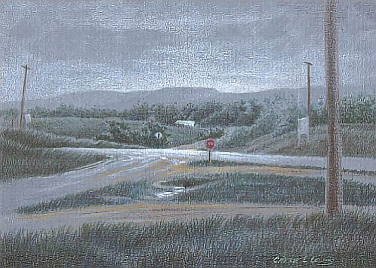
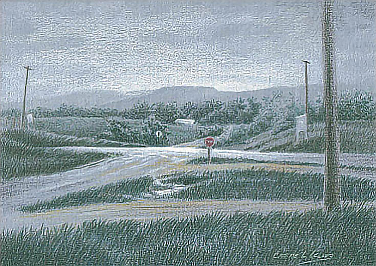
Then I moved to Kansas and fell in love with the Flint Hills the first time I saw them. Before very long, ideas for landscape drawings were appearing. Finally, opportunity, location, and conditions came together and West of Bazaar was the result.
In short, don’t be afraid to draw things outside your favorite subjects.
2. Save scraps
I grew up with parents who had at least a passing acquaintance with the Great Depression. My mother never throws anything away and I picked up the same trait. I rarely throw scraps away and have a nice collection of paper, mat board, even unstretched canvas and sand paper just waiting for the right project.
The support for this drawing came from that collection. It’s a scrap of mat board left over when I cut a full sheet down for another project. I didn’t know when I’d ever use it or if anything I drew on it would be anything more than practice.
Then along came Bazaar and this small scrap was perfect.
Don’t throw scraps away; you never know when they might come in handy.
3. Skip the detailed drawing
Those of you who have read any of my tutorials know I always start with a detailed drawing. When drawing portraits in colored pencil, that’s not only necessary; it’s a time saver.
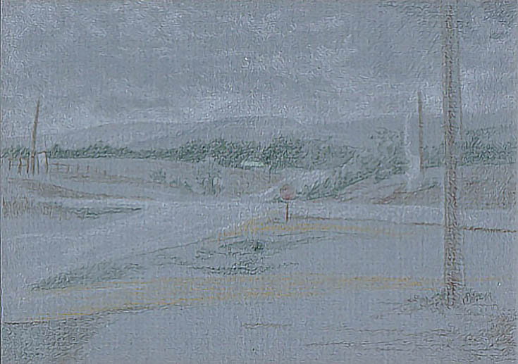
For this drawing, however, I chose to just sketch the composition directly on the mat board. I also didn’t bother with much detail before shading in the shapes with the same colors I’d used for the sketch. I used light pressure and light colors to develop the foundation for the drawing.
Not only did the sketch turn out very well; it saved me at least a day—and probably more—in the drawing phase. It never hurts to start with a simple sketch once in a while.
4. Try new methods
The mat board I used had a medium rough texture, which is not typical for me. While the surface took a lot of punishment, it didn’t take detail very well. The distant background didn’t need a lot of detail, so that was okay, but the trees in the near middle ground did need detail.
So, the best way I found to add color was by tapping it onto the surface. Mixing the colors with dots created the look of leaves and tree forms much more quickly.
I’ve since used this “stippling” method many times on other drawings with equally good results.
5. Make use of the surface texture
Remember, I mentioned this piece of mat board is medium texture? It’s not the type of surface I usually select for colored pencil, but it turned out to be perfect for this gray, rainy day.
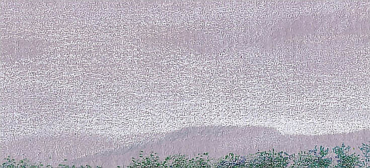
Part of the attraction of the scene was the atmospheric affect of distance, rain, and flat light The medium texture of the mat board allowed me to quickly capture the atmospheric effects of rain, gray light, and distance with a few strokes. I simply used the sides of well-sharpened pencils and let the texture show through in the sky and distant hills.
It would have taken hours to get the same results with smooth paper and layers of color. Choose a support that will aid your drawing processes then let it do its work.
6. Make use of the paper color
Gray rainy day; medium gray drawing surface. Most of the color work was done before I started drawing. The colors I used for drawing all built on the base color of the board.
Incorporate the color of your drawing surface into the artwork to save time and pencils.
7. Know when to say “Done”
Sometimes, the line between not quite finished and overdone is very thin. Knowing when to say “done” is important.
The texture of the paper worked fabulously with the color to create exactly the look I was after. My usual finishing layers would have distracted from the subject and given it too much polish, especially the sky. So it took a good deal of fortitude to decide West of Bazaar was finished when it looked only half done compared to other drawings.
But I did and I don’t regret that decision. Remember that not all drawings are created equal. Know when a drawing is finished and stop.
I learned a lot of lessons with this 5×7 drawing, and I use many of the things I learned to this day.
Most of all, though, I learned that it pays to experiment. Sticking to the tried-and-true has its benefits, but so does striking out in a different direction now and again.
This post may contain affiliate links.


