For many artists, a simple art newsletter is the best way to keep fans up-to-date and interested in their latest artwork. After all, there’s really nothing easier than clicking “send” on an email!
But what happens after that email goes out? Do you know if your newsletter is getting to all of the people on your email list? How many of them opened it? Did anyone click to visit your website? Is anyone on your list interested in buying something, and just MIGHT buy if given a little nudge?
Believe it or not, all of these questions can be answered using some basic email tracking.
For you and me, this is probably beyond our skill set—luckily, many popular email newsletter services (like MailChimp, ConstantContact, Aweber, etc) now offer email tracking along with their other email tools.
Even better, MailChimp is FREE for users with email lists under 2000 subscribers. That’s honestly one of the biggest reasons why I chose MailChimp when I launched Artwork Reveal. I knew it wouldn’t cost us a dime as we were just starting out, and that made it easy to dive in with confidence.
So today I’m going to show you 8 different ways to use MailChimp’s statistics and reporting features. You’ll find that lot of these tips are directly applicable for increasing sales of your art.
If you use something other than MailChimp to send your emails, don’t worry—you’ll still get plenty out of this article. Most of the big email marketing services offer similar tracking and reporting, so it should translate pretty well.
And, if you feel like trying out MailChimp, go for it! It’s a really good solution for anyone with a small-ish email list (which, I’m guessing, is most artists).
OK, let’s get started!
1. Comparing two or more email campaigns
In MailChimp, every newsletter (or email) that you send out is considered one campaign, and they’ve made it easy to see how your campaigns compare to each other over time. Here’s the basic graph that I see right now, after only sending our first two issues of Artwork Reveal:
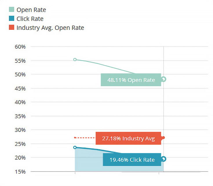
However, once you’ve been sending emails for a while, you’ll see something a bit more extensive, like this:

NOTE: You can get to your own campaign comparison chart by clicking on “Reports” if you’re logged into your MailChimp account.
2. Tracking your email effectiveness over time
As you can see, there are two blue lines and one orange dotted line in the overview graph. The top, light blue line shows “opens,” the orange dotted line shows how many opens (on average) your peers are getting, and the bottom, dark blue line shows “clicks.”
We’ll cover those terms in just a moment, but for now, just keep in mind that you want to see a consistent number of “opens” and “clicks,” or even better, a growing number of “opens” and “clicks.” If you see a large dip in the top blue line, then you know that fewer subscribers opened that email.
Perhaps you changed your newsletter subject line and your subscribers weren’t as interested. Or maybe you sent it on a different day than normal, and your subscribers didn’t know to look for it.
Anytime there’s a dip in opens, take a look at the day, time, and subject line to see what you did differently. My guess is that you’ll be able to spot a trend pretty quickly—and if so, you’ll want to use whatever worked best, next time!
If you see an uptick in clicks, then it’s a good idea to look at the links you included in that particular email. Perhaps you had a more prominent link at the top of your newsletter that week. Or, maybe you offered something for free! Certain links are more likely to get clicked than others—that’s just human nature—so keep track of what helps YOU get clicks, and start using those techniques more often!
NOTE: The last line (the dotted orange line) is a good indication of how your art newsletter compares to other art newsletters. If you’re sending interesting emails, ones that are well-written and targeted to what your subscribers want to see, then I guarantee you’ll be way above that industry average.
3. Seeing how many subscribers opened your email
When you view the report for any of your campaigns, one of the prominent statistics that MailChimp shows you is how many people opened your email.
MailChimp tracks this number by including a one-pixel image—anytime that pixel is loaded, they know that another subscriber has opened your email. This isn’t a perfect system, because some email providers load those images automatically, and some don’t. But, it’s the best tracking method anybody has, so it’s what everybody uses. :)
Of course, some subscribers on your list will open your email more than once, so MailChimp keeps track of how many “total opens” you’ve had as well. “Total opens” will almost always be higher than regular opens and can indicate how interested your subscribers are in your content.
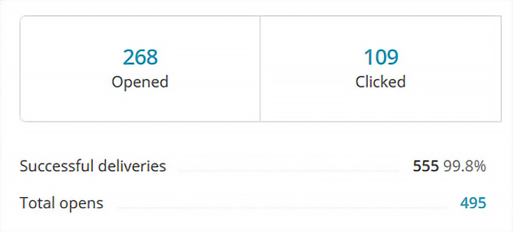
If, for example, you get 100 opens and 110 total opens then you know that most people opened your email, looked at it once, and were done.
On the other hand, if you get 100 opens and 380 total opens then you KNOW that they were really interested in your email. Maybe it had so much good stuff in it that they couldn’t get to it all right away, or maybe they just kept going back to it to read it a second, third, or fourth time.
It’s also possible that they were forwarding your email and their friends were opening it. Either way, it’s a good sign.
4. Finding your most-interested subscribers
If you’re using MailChimp and you want to see which of your subscribers were MOST interested in your latest newsletter, here’s how you do it:
Start by clicking on the “total opens” link to see a chart of all your subscribers who opened your latest email. Then, click on the top of the “opens” column to sort by that column. It’ll probably sort from low-to-high at first, so go ahead and click again.
Now you’re sorting by MOST opens.
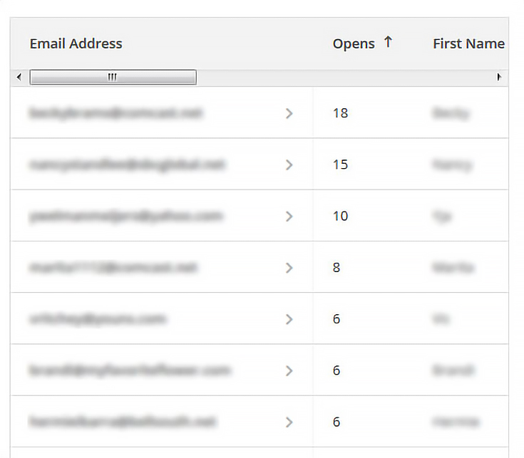
The subscribers who opened your email the most are probably very interested in your content, and may be the most likely to purchase one of your works of art. (Or, as I mentioned before, they may also be forwarding your email to their friends!)
NOTE: You may be able to convince these particular subscribers to purchase by sending a follow-up email with a special discount or offer. If they were truly on the fence before, receiving a special discount is likely to help them make a purchase.
5. Viewing subscribers that clicked
Clicks are really the best way to see which of your subscribers are ready to take action. Maybe that action is just seeing more of your artwork. Or, maybe they’re ready to purchase—as long as the link they clicked takes them where they expect to go. :)
NOTE: Use my email checklist to help avoid dead links and other common mistakes.
Just like opens, your subscribers may click once, they may click several times on several entirely different links, or they might click multiple times on the same links. Your “total clicks” will always be a larger number than your “clicks” and is another indication of how motivated your subscribers are to learn more about your work.
6. Using “top links clicked” to see your best content
In your MailChimp report, there’s a section marked “Top links clicked.” Click the “view more” link to see the full list, as well as the percentages of unique versus total clicks.
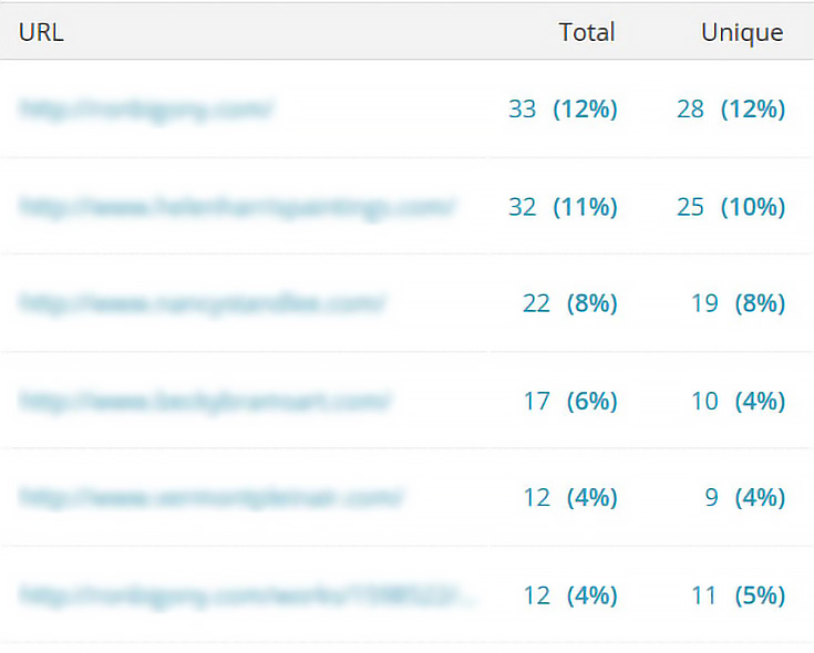
Why is that distinction between total and unique clicks important?
Because ONE subscriber could click 30 times and account for all the clicks, giving you the wrong idea about what your subscribers like. By looking at unique clicks you can see how many different people clicked on the link, and get an idea of what your entire group of subscribers liked the most.
7. Visualizing clicks with the MailChimp click map
Another important way to see where your subscribers are clicking is to look at MailChimp’s click map. When you select that tab, you’ll see your own art newsletter, with an overlay of clicks. This gives a visual representation of WHERE in the email those clicks occur.

NOTE: You can just barely see the corners of my links in the image above. The percentage bars on top of those links shows how many of the total clicks (for the entire email) happened on that link.
For Artwork Reveal, there seems to be a slight increase in clicks for artwork near the top of the email, but it’s not nearly as cut-and-dried as saying that artwork at the top will get more clicks. Admittedly we’ve only sent out a few issues (so I’ll be studying this for a while before I come to any conclusions) but here’s what I think I’ve learned so far:
• Some styles of artwork seems to get clicked more than others.
• Including a “more” link—in addition to a linked image—increases clicks.
And. . . that’s all I can say for now. :) I’ll definitely let you know more if I come up with a solid theory for either of those two things (or if I figure something else out).
In your own art newsletters, try to see if positioning, wording, images, freebies, or anything else seems to increase clicks. It’ll probably take several separate emails to see a pattern, but once you see it, you can use that method anytime to boost clicks (and hopefully sales!)
8. Staying on top of unsubscribes and abuse reports
With MailChimp, all of my emails have an unsubscribe link clearly placed at the bottom. This is actually a GOOD thing, because I’d much rather my subscribers use that link rather than click the “spam” button in their email program.
(Clicking the “spam” or “junk” button creates an abuse report and alerts both MailChimp and major ISPs that you’re sending unwanted emails).
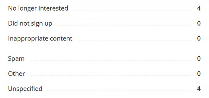
Whenever you get people leaving your list, check out the reason why. If they’re marking “spam” or “did not sign up,” it might indicate that you (or some other well-meaning individual) has added people to your list without asking first.
Or, it could mean that you’re not sending the types of emails you said you’d send.
Either way, it’s OK if a few people unsubscribe, especially if they say they just don’t feel like receiving your emails anymore. But if you get a flood of unsubscribes after a particular email campaign, or a lot of abuse reports, go back and take a look at that particular email to see what might have caused it.
In some cases, it may have just been too long since you sent an email. If so, you may want to send a newsletter once a month, no matter what, just to keep your subscriber list “fresh.” That way they won’t forget who you are, and will always look forward to the next email.
And, of course, it’s never a good idea to sign people up for your list without asking them first. If you signed them up (and they didn’t realize it or didn’t want it) then of course they’re going to mark your email as spam. It only takes a few spam complaints for your emails to start getting banned—and at that point, you won’t reach ANY of your subscribers. Not good.
OK, so what’s the core takeaway for this post?
1. Check your tracking stats for every email newsletter you send out. If you don’t get stats, then switch to a provider that offers them.
2. Look for changes and patterns. When you see a dip in clicks or opens, make a guess as to why. Try the opposite thing (or the same thing) in your next email, and see if your guess is correct.
3. Don’t be afraid to experiment. If you’re not seeing results from your art newsletter, try something new!
Questions? Comments? Got a suggestion for artists based on your own newsletter success? Let me know! I’ll be coming out with Part 4 in this series sometime down the road, so stay tuned!
This post may contain affiliate links.