One of my favorite things about colored pencils is their versatility. Traditional wax-based pencils and water soluble pencils (used either wet or dry) can be combined for a wide array of stunning effects.
For this project, I used Faber-Castell Art Grip Aquarelle (water soluble), Faber-Castell Art Grip (wax based), and Prismacolor Premier (wax based).
In the tutorial below, I’ll be demonstrating a combination of traditional dry and wet media techniques, primarily laying the groundwork for the drawing. In my next article, I’ll show the last steps for completing it.
Step 1: Filling in the sky
I began with water soluble Light Blue, which I layered diagonal then horizontal throughout the upper sky; followed by similar layers of water soluble Light Flesh, which I layered over all of the sky except where the sun will be.
I used light pressure and the sides of the pencils for both colors. Then I blended the colors together with a medium-sized sable flat brush dampened with clean water. I blotted the brush to remove most of the water before blending, because I’m not using watercolor paper. I also used no more than one or two strokes over any area, because additional strokes tend to remove or “pull up” color.
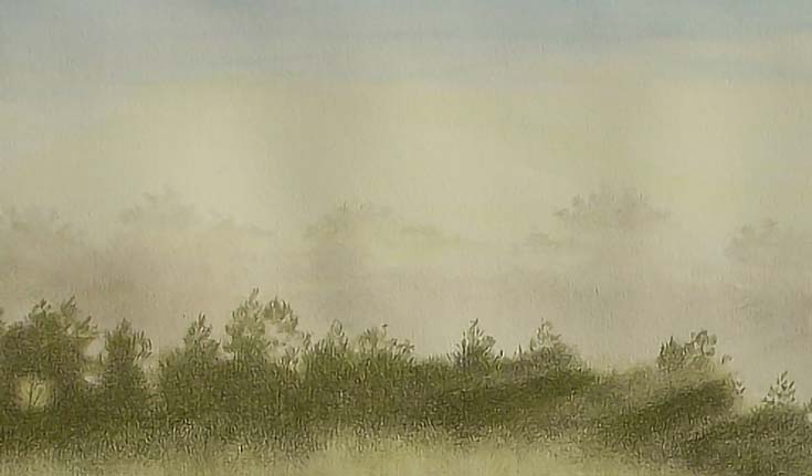
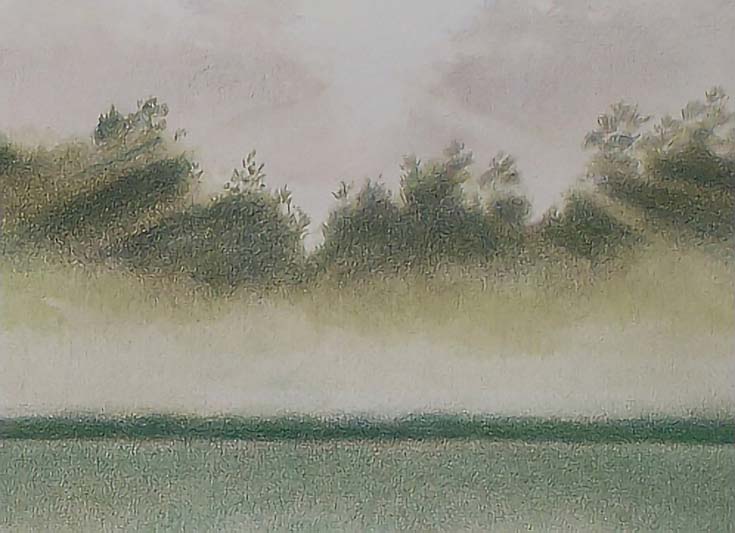
Step 2: Adding trees and sunbeams
When the paper was dry, I added the most distant trees as vague shapes using Light Blue and Light Flesh, then blended them with a wet brush. Note that in a couple of areas (shown above in the first image), I rubbed away strips of color to suggest faint sunbeams.
I drew the darker trees with Van Dyke Brown and blended with a wet brush. Then I moistened the pencil by dipping the tip into water and tapped color into place. I used this stippling technique to create an interesting edge between the trees.
Next, I added Olive Green Yellowish with loose, vertical strokes and light to medium pressure. I used the tip of a slightly blunt pencil and the side of the pencil for the first layer and diagonal cross-hatching with the point of the pencil for subsequent layers. In the latter layers, I kept the pencil well sharpened to fill in paper holes and put down maximum color with medium pressure. I followed up with the sides of the pencil and circular strokes to even out color and value.
To darken the trees, I layered Blue Violet and Cobalt Turquoise with the pencil point in circular strokes and the side of the pencil with a variety of strokes for both colors. The objective was smooth color so I also blended with a finger to remove visible strokes.
Next I blurred the edge of the fog by rolling a piece of Handi-Tak into a ball, then rolling it back and forth between my palm and the paper. That not only lifted color, but put down color. The resulting randomness of value and color was perfect for duplicating the appearance of fog and creating “ragged” and blurred edges.
I also used Handi-Tak to develop the sun beams. This time, I formed the Handi-Tak into a thin shape and pulled it through the color beginning at the light source and stroking away. I used heavier pressure at the beginning of each stroke and decreased pressure as I lengthened the stroke. Each stroke picked up a lot of color at the beginning and diminishing amounts as the stroke lengthened. The less color was lifted, the dimmer the “sunbeam” became. I had worked around the sunbeams with most of the colors but lifting that color brought them to life.
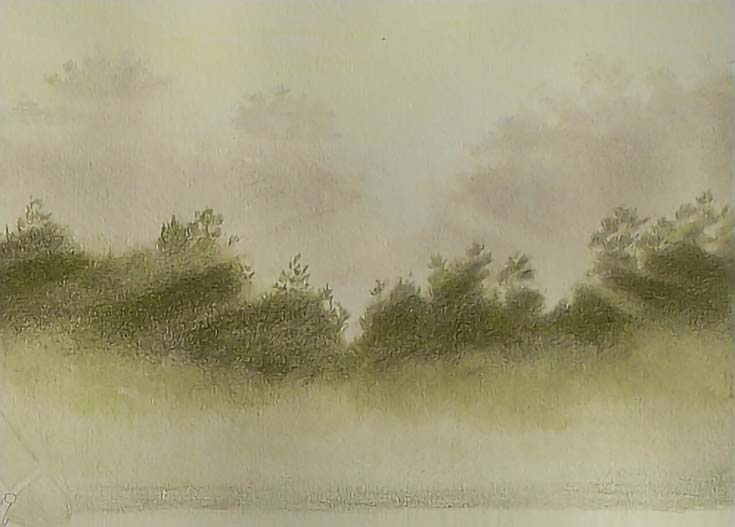
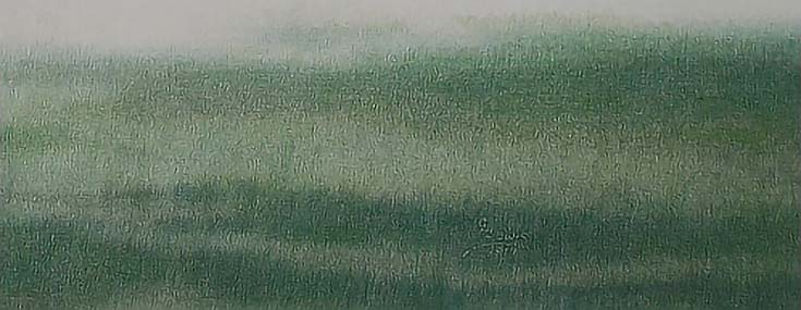
Step 3: Drawing the meadow
In the meadow I applied Olive Green Yellowish with light pressure and the side of the pencil. Strokes were open and sweeping from one side to the other, slightly overlapping in a random pattern.
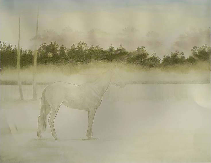
I also glazed the horse and other parts of the background with light pressure.
Step 4: Adding another layer of color
The next round of work began with multiple layers of Olive Green Yellowish in vertical strokes in the meadow. After a few layers, I rubbed the area with my fingers, blending the strokes into a field of color ranging from a very light tint to fairly dark areas along the bottom.
Next, I added Permanent Green Olive. The first layers were vertical strokes of varying lengths with light to medium pressure. Over those, I used the side of the pencil and broad horizontal strokes to cover larger areas quickly. I didn’t blend at this stage, but used the random patterns of overlapping layers and no layers to create lights and darks that gave the meadow the look of undulating ground.
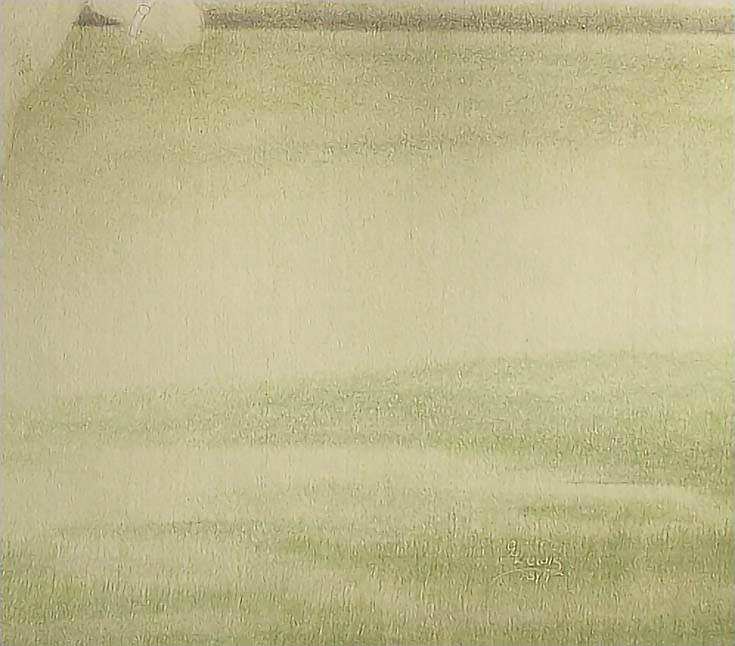
The foreground needed to be nearly black with a greenish cast, so after the initial work with Olive Green Yellowish, I added Helioblue Reddish with vertical strokes, long in front, shorter toward the back. I used medium pressure in the foreground, decreasing to very light pressure as I worked toward the horizon. In the background, I added Cobalt Green then Light Phthalo Green with vertical strokes of varying lengths using the pencil point.
To unify the color of the trees with the rest of the landscape, I layered Helioblue Reddish, Emerald Green, and Helioblue Reddish into the trees. I used medium pressure and worked horizontally and vertically to create a solid band of color. I worked around the bands of sunlight, stroking color in the same direction as the sun beams and finished with a glaze of Deep Cobalt Green over the trees and foreground.
Step 5: Filling in foreground objects
For the pine trees, I used Black, Olive Green Yellowish, Deep Cobalt Green, Helioblue Reddish, Grass Green, and Van Dyke Brown in alternating layers until the trees were the right color and value for the landscape. I used short, upwardly sweeping strokes to mimic pine needles and stroked along the length of trunks and branches, working around the sunlit edges where necessary.
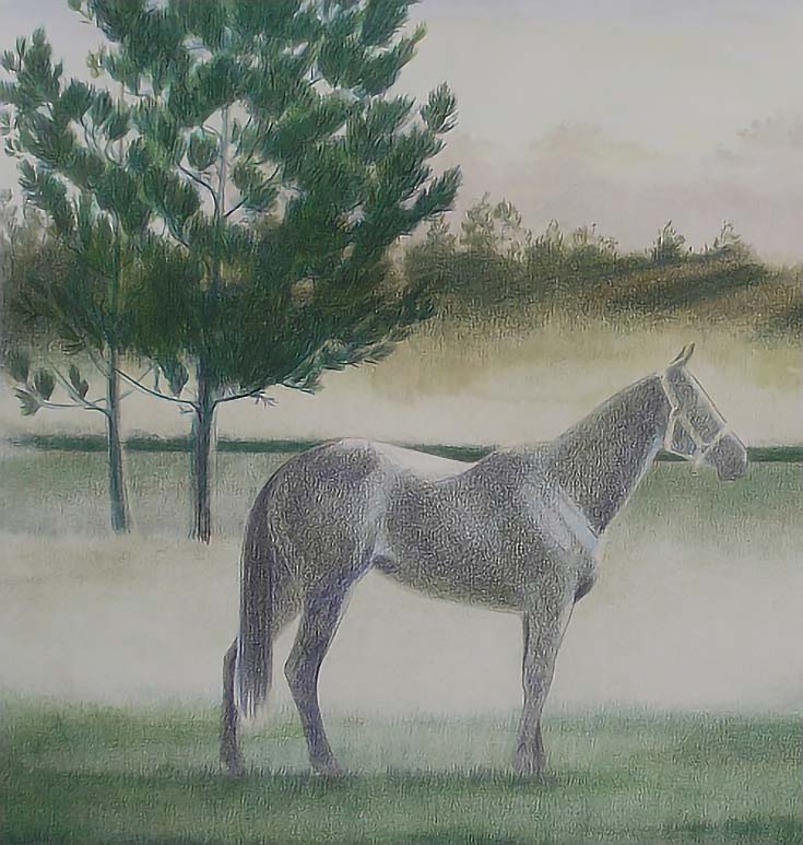
I then layered Helioblue Reddish, Deep Cobalt Green and Van Dyke Brown over the horse and added Van Dyke brown to the foreground grass.
Finally, I did a very limited wash of the grass and the pines with a damp brush. I didn’t want a complete blending, so I didn’t use a lot of water in selected areas and left other areas untouched.
That completes the FIRST stage of this piece, which I refer to as a “color underdrawing.” I’ll finish the landscape and the horse in the next installment.
Stay tuned!
This post may contain affiliate links.