The best way to create the illusion of mass and form in your colored pencil drawings is by pushing your value range to its limit. Bright highlights and dark darks are pivotal, regardless of the subjects you work with, or the style in which you render them.
Take the two following illustrations, for example.
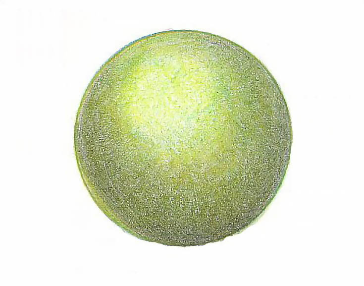
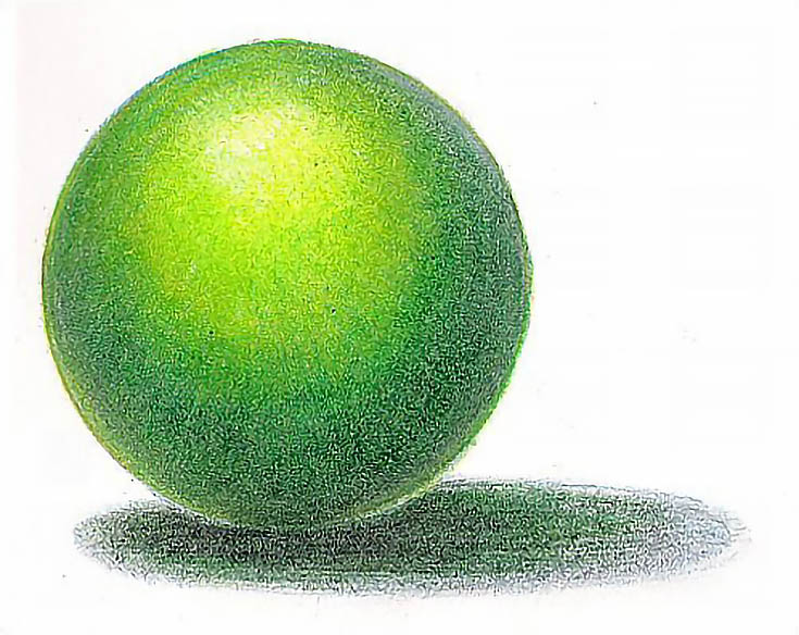
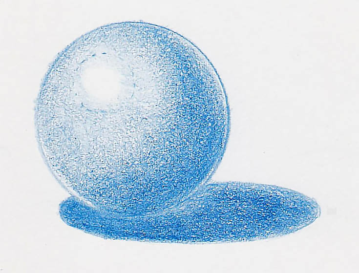
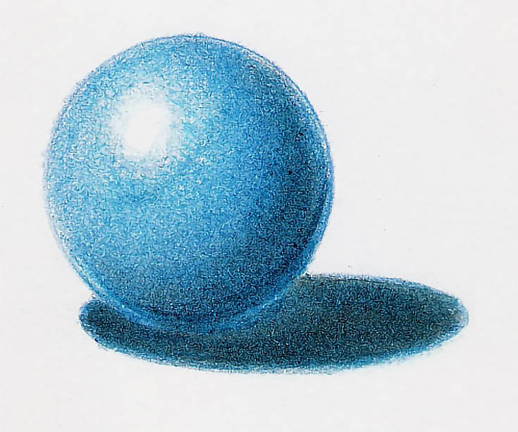
I used the same colors and style on the same kind of paper to do two drawings of the same subject. Of the two, which one looks like it takes up space?
The value range in the first drawing is quite narrow. There is a highlight, a middle tone, and a shadow, but there isn’t much distinction between them. The circle is flat and unexciting; it just sits there.
The second drawing features all of those things but I’ve broadened the value range. The difference between the highlight and middle tone is much greater, as is the difference between the middle tone and shadow.
I also added a cast shadow (the shadow an object casts around it) and reflected light both in the shadow and on the object. As a result, the circle has become a ball that takes up space. Visually, it’s much more “alive” and substantial.
No matter what you’re drawing or the method you use, if you want your drawings to be “alive” and substantial, don’t be afraid of pushing the value range and embellishing details like reflected light and middle tones.
Here’s the process I used to increase my value range and create a solid, three-dimensional image:
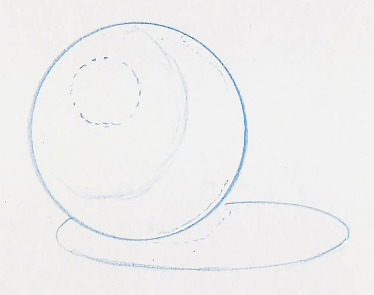
Step 1: Create an accurate drawing
I begin with a detailed drawing, even with simple objects. The line marking the outside edge is the heaviest line in the drawing. I use a lighter line to mark the clearest edge of the shadow. In this case, that’s the line between the shadow and the middle tone, where the surface of the subject curves away from the light source.
If the highlight is well-defined, I draw it with a dotted or dashed line. I use a dotted or dashed line to draw the reflected light, as well. Ordinarily, these lines are all quite light so they don’t show up in the finished artwork, but I’ve drawn them darker than usual so they can be seen digitally.
Step 2: Lay in the foundation
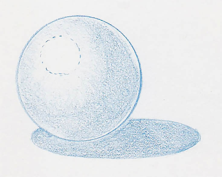
Use light to medium-light pressure and a sharp pencil to lay down an even base color. Stroke around the shape of the object or use two or three layers of cross hatching strokes. Work around the highlight if the highlight is well defined. If it’s not, layer color over the highlight area, but use lighter pressure and/or fewer layers.
I used a combination of circular and directional strokes to lay down the cast shadow.
For the circle, I layered crosshatching strokes. The first layer was applied only to the shadow. The second layer was applied to the shadow and the middle tone. I used parallel strokes for each layer but the strokes for the second layer were perpendicular to the first layer.
For the third layer, I used a directional stroke that followed the contours of the circle to glaze color over everything except the highlight.
I used very light pressure for each layer, kept the pencil very sharp, and used multiple layers to begin developing values.
Step 3: Add more layers and smooth your transitions
Continue layering color. Keep your pencils sharp to fill in the paper’s texture.
You can increase the darkness of an area by using multiple layers, by increasing pressure, by adding complementary colors or by a combination. In the cast shadow, I did one layer of horizontal strokes, then followed up with a layer of vertical strokes. But I also increased the pressure in the darker parts of the cast shadow. In the darkest areas around the ball, I used heavy pressure.
In the ball, however, I continued to use light to medium pressure and several layers of color. I wanted smooth gradations in value and smooth color within each area, so I used different strokes and multiple layers.
Step 4: Look for ways to increase your value range
Repeat these steps until the drawing is as finished as you think it should be. Don’t be afraid to add more layers of color. Try a darker version of the color you’ve been using in the shadow.
Test a complementary color. See how it affects the value of the shadow and the color.
You might also layer a little Black into the shadow, though I recommend waiting until near the end of the process for this.
Darkening the shadow isn’t the only way to increase the value range. What about the highlight? Is it bright enough? If it isn’t, try lifting a little color with an eraser, a piece of clear tape, or Handi-Tak. Maybe burnishing with a lighter color is a better solution. Burnishing with a colorless blender will intensify the color; not make it lighter.
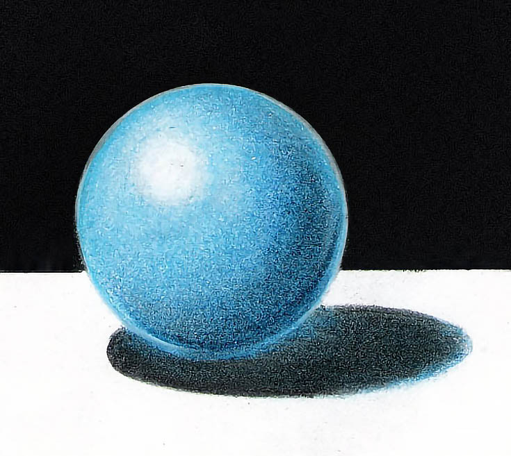
In my sample, I added Indigo Blue with medium heavy pressure to the cast shadow, followed by Orange (the complement), then more Indigo Blue. I burnished the shadow to smooth out the color, then added more Indigo Blue with heavy pressure.
In the ball, I used Indigo Blue in the shadow. Then, to darken the darkest part of the shadow, I used medium pressure to apply Black, followed by another layer of Indigo Blue. I burnished that area, then switched to Non Photo Blue to burnish the middle tone. Finally, I burnished everything but the highlight with a colorless blender.
Finally, I also used a blunt pencil and heavy pressure to add black to the background and medium pressure with a sharpened pencil to glaze black into the cast shadow and White over the highlight.
In short, any drawing can benefit from enhanced values. If your drawings look flat, try one or more of the layering solutions above to broaden your value range.
Or experiment with your own ideas. . . You might be surprised at how much depth you can achieve, just by pumping up the darks and lights in your drawings!
This post may contain affiliate links.
