A good color wheel is helpful any time you’re making color decisions in your art. This holds true whether you’re working with a limited number of colors (a limited palette) or with many colors.
Most companies sell color wheels and color charts of their products, as do many print shops, art supply stores, and online providers. Instead of buying a color wheel, another option is to make your own, which may be much more helpful. Not only will it be a useful studio tool, but making a color wheel is an excellent way to learn how colors mix with each other.
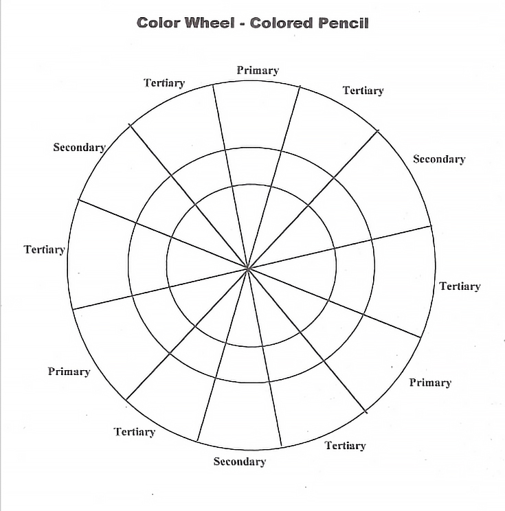
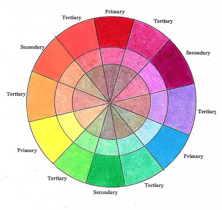
The template I use for my colored pencil color wheels (shown below) features primary, secondary, and tertiary colors. Its outer “ring” is for color applied with heavy pressure, the middle ring is for color applied with light pressure, and the center ring is for showing how each color mixes with its opposite (complementary) color.
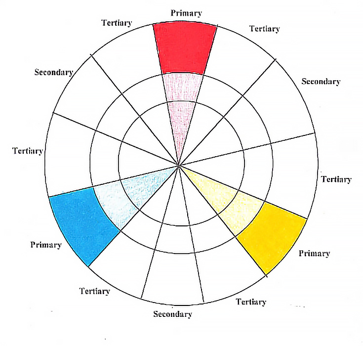
Step 1: Primary colors
Primary colors are colors that cannot be created by mixing other colors. There are three primary colors: red, yellow, and blue. All other colors are combinations of these colors. For this demonstration, I used Process Red, Non Photo Blue, and Lemon Yellow and applied color into each of the slices labeled “Primary.”
I used light pressure in the inside rings. For the outside ring, I used heavier pressure and multiple layers, then burnished with the colorless blender.
This is the color wheel with the primary colors.
Step 2: Secondary colors
Secondary colors are a one-to-one mix of two primary colors. For example, one layer of yellow and one layer of red produce orange.
I added secondary colors to my color wheel by glazing (using light pressure to apply color) a single layer of two primaries into the secondary slice between them. I glazed one layer of Process Red into the secondary slice at the bottom of the wheel. I then glazed Non Photo Blue over the same slice to create purple. I used light to medium pressure with both colors.
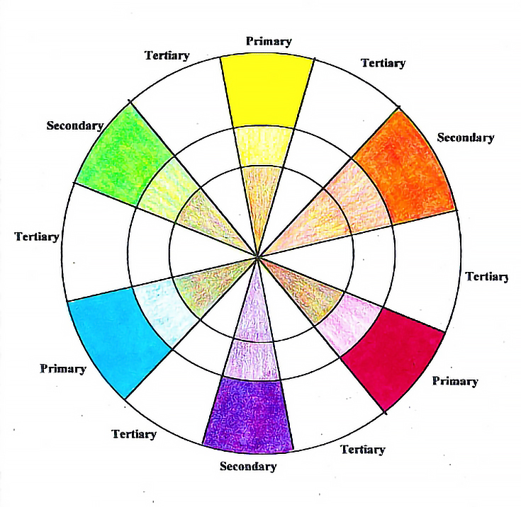
To finish the outer ring, I applied alternating layers of Process Red and Non Photo Blue at medium pressure. I then used heavy pressure to add a final layer of each color, then burnished the outer ring with the colorless blender.
Green and Orange were added to the color wheel in the same way, using Lemon Yellow and Process Red to make Orange and Lemon Yellow and Non Photo Blue to make Green.
Finish this step by adding each color to the inner ring of its complement. Using light or medium pressure, glaze Lemon Yellow over the inner ring of the purple slice and so on. Each color should be glazed over its complement. Yellow should be glazed over the inner ring of the purple slice and purple should be glazed over the inner ring of the Yellow ring. The difference will be subtle, but you will see a difference in the resulting two colors.
Do the same with the secondary colors. Layer each of the colors that make up the secondary color over the complementary color. Keep the pressure about the same for each color to get the most accurate results possible. You can also burnish the inner ring when all the necessary colors have been applied to that area.
NOTE: Make sure to clean the colorless blender between colors to avoid carrying the color from one slice into the next. This is especially important if you burnish darker colors first. It is better to begin burnishing with the lightest colors, but you still need to clean the colorless blender frequently.
(To clean the colorless blender, either sharpen it like any other pencil, or wipe it on a clean piece of paper until no color remains on the tip of the blender.)
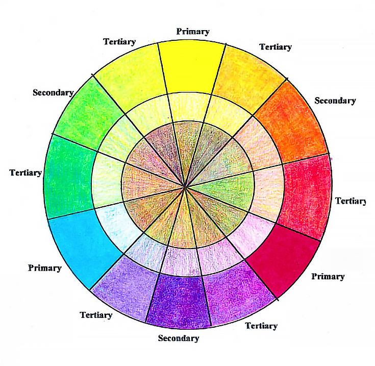
Step 3: Tertiary colors
Tertiary colors are the combination of one secondary and one primary color. For example, Blue-Green is a combination of Green (secondary color) and Blue (primary color).
One easy way to remember what colors to layer is to remember that there are three layers of color in a tertiary color. Blue and Yellow (secondary color Green) and Blue (primary color Blue). To mix a tertiary color, layer blue-yellow-blue.
Glaze one layer of Non Photo Blue into the appropriate tertiary slice between Green and Blue on the color wheel. Use light to medium pressure. Next, use light to medium pressure to glaze Lemon Yellow over the blue, followed by another layer of Non Photo Blue, also with light to medium pressure. Finish the outer ring with blue-yellow-blue with a medium to heavy pressure followed by burnishing with the colorless blender.
Do each of the remaining tertiary colors the same way. Then complete the color wheel by glazing the complement of each color over the color’s inside ring. Notice that the complement of a tertiary color is always another tertiary color. The complement of Blue Green is Red Orange, so red-yellow-red needs to be glazed over the complementary ring of Blue Green and blue-yellow-green needs to be glazed over the complementary ring of Red Orange.
Add the complements to the color wheel. If you prefer, you can then burnish each section. If you choose to burnish the color wheel, burnish section by section. Otherwise, you will pull color into the adjacent areas.
This a finished color wheel. The outside ring shows each color at full strength and burnished. The second ring is each color with light pressure and no burnishing. The next ring shows what each color looks like with its complement glazed over it.
Using stock colors
You can also create a color wheel using stock colors. This final color wheel was created using Lemon Yellow, Crimson Lake, and Non Photo Blue for the primaries; and Orange, Grass Green, and Purple for the secondary colors. I then created tertiary colors by layering the colors that were on either side.
There are advantages and disadvantages to each method. Making a color wheel from three colors is helpful in learning the range of color and value possible with just the primaries. It is a time intensive process requiring layering, careful decision making, and planning.
Using stock pencils wherever possible is a major time saver. Each of the primary groups contain many colors, however. Learning which reds to mix with which blues to get the desired purples can also be time consuming.
Whatever your preferred method, making a color wheel is an excellent way to learn how colors work together while improving your pencil skills. It takes a little time, but it’s definitely worth it in the end.
This post may contain affiliate links.