This month, I’ll be sharing a two-part demonstration of colored pencil over India ink. The project is a small format (6×8 inch) drawing of a quarter horse in a vignette portrait style. The support is vellum finish Rising Stonehenge 250 GSM paper in white.
Applying India ink to the background
I started out with a detailed drawing, and then brushed India ink over the background, inside the horse’s ears and nostrils, and on the shadowed side of the face and neck.
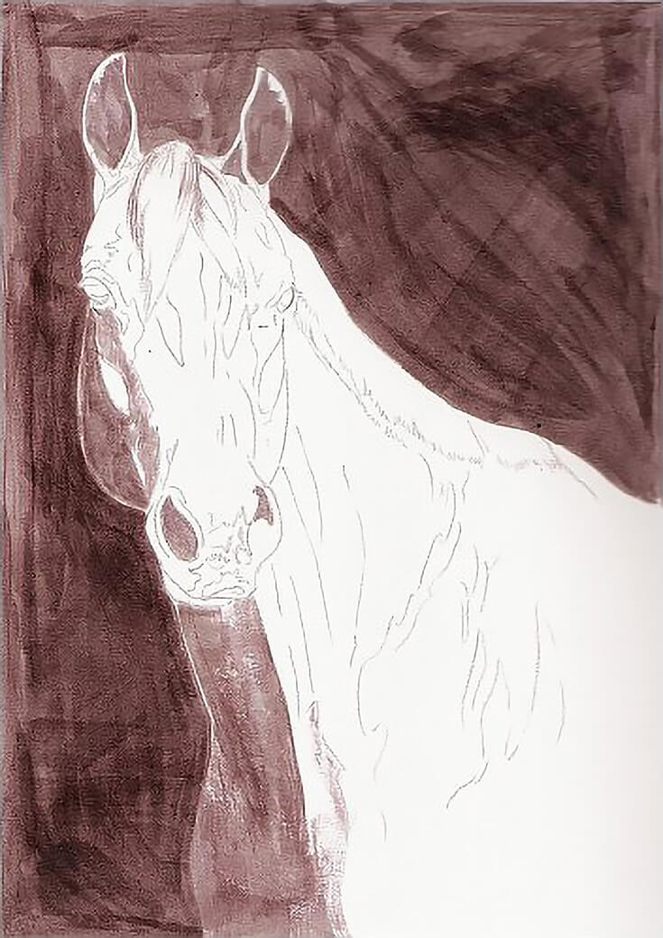
I used a sable round brush for the first layer of ink, which involved more detail work (ears and nostrils). For the second and third layers, I switched to a sable angle shader. The ink dried completely between each of the layers and overnight after the final layer.
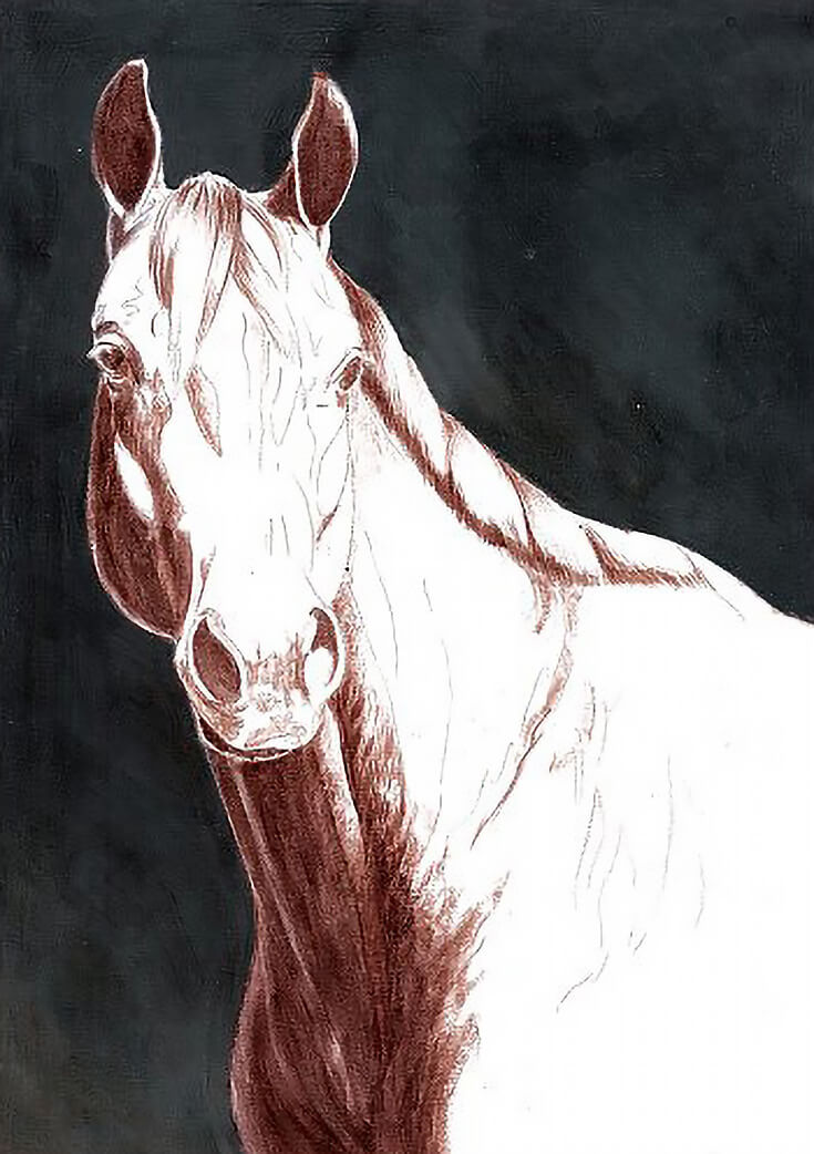
Adding a few layers of colored pencil
I began colored pencil work with Indigo Blue and medium pressure (4 to 6 on the pressure scale). I started in the lower left hand corner, outlining the horse, then filled the space with a variety of strokes and pressure that varied from 3 or 4 to 8 or 9. Some areas received multiple layers, others received only one.
Second, I applied Black in the same manner but with generally heavier pressure—6 to 8 in most places and with burnishing pressure in some areas.
Third, I added Sienna Brown along the mane to create subtle variation, then burnished the background to blend color as evenly as possible.
I considered using rubbing alcohol for a better, more complete blend, but decided to skip that for the time being. I wanted to see how saturated a color field I could accomplish without solvents of any kind. So I began a second round of the same colors. In this round of color application, I used the heaviest possible pressure, burnishing one color over the next to build depth and saturation.
(NOTE: Heavy colored pencil pressure creates color crumbs. When filling in the background they weren’t an issue, but if they got smeared across the horse, they would have caused problems. I used a pencil brush frequently to sweep the color crumbs off the paper.)
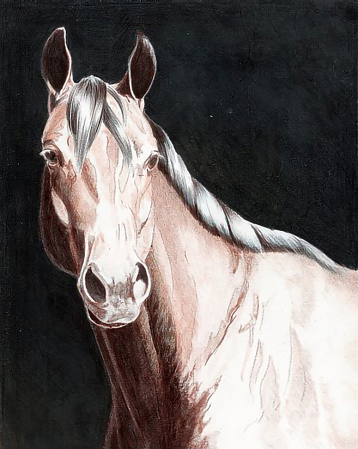
More ink work, for the darkest shadows
For my final ink application, I painted shadows on the horse. I went over the darker shadows several times to get as solid a value as possible.
I also attempted to dry brush some mid-tones into the adjacent areas, but the ink dried too quickly. Since all I really needed to do was establish the shadows, I didn’t fuss over this too much.
Putting in the mid-tones and details
My real pencil work began with Verithin pencils by Prismacolor. I generally use Verithin pencils in the early stages of any colored pencil project because they have harder lead and hold a point much longer. They create thin, even, very transparent layers of color and are excellent for first color work. They also are easier to erase if necessary.
I started with Terra Cotta to lay down a solid, even layer base color. For this horse, I chose Terra Cotta and layered it over all of the neck and shoulder except for the brightest highlights. I stroked a little bit into the mane and forelock, but only in the dark areas. I used very light pressure (not more than 2) and held the pencil toward the end to maintain a light, whisper soft touch. Color was applied either in the direction of hair growth or to follow muscle contours and bone structure.
Since I consider painting long hair to be a treat, I usually do a more difficult task first, before treating myself with a little fun. After glazing color over the horse, I used long strokes in the direction of hair growth to apply Non Photo Blue into the mane and forelock. I followed that with a blunter pencil tip to glaze the same color into the ears and nostrils with whatever strokes were necessary to get an even color layer.
I followed with Indigo Blue into the mane and forelock, ears, eyes, and nostrils. I used medium pressure in these areas, then used very light pressure to glaze Indigo Blue into part of the neck. Black was layered with heavy pressure into the shadow areas and with lighter pressure and the side of the pencil and a light touch to shade the muzzle.
Once the basic shadows and mid-tones were in place, I outlined the highlights on the face and shoulder with Verithin Pumpkin Orange, then shaded all the areas around the highlights with the same color. The next color was Dark Brown glazed over the darker shadows and especially over the inked areas. I covered the inked areas with multiple layers using a variety of strokes in the direction of hair growth.
I finished with Black into the darkest areas and into the mane, forelock and eyes.
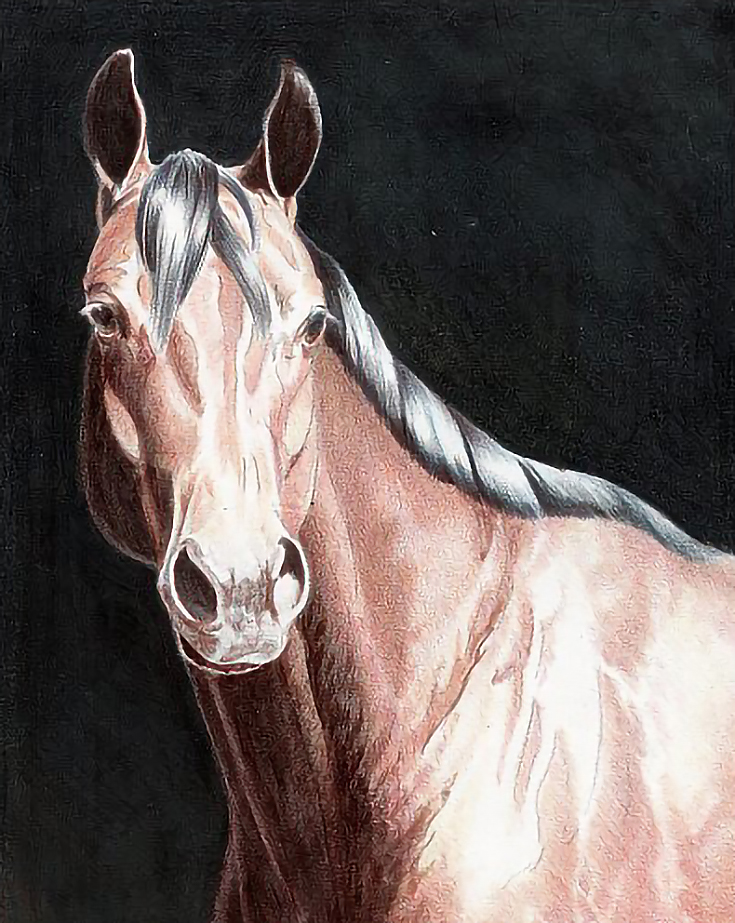
The final rounds of color were Verithin Goldenrod, Terra Cotta, Orange, and Tuscan Red over all of the horse except for the black areas and highlights. I layered colors in that order and worked single or multiple layers as necessary over each area—single layers in light areas, multiple layers in darker areas. I also worked into the mid-tones and shaded Goldenrod into areas that bled out of the composition.
At this point, I’d pushed the painting as far as I wanted with the hard lead of Verithin pencils. The next step (and the topic of my next tutorial) will be my work with Prismacolor Thick Lead pencils.
Stay tuned!
This post may contain affiliate links.