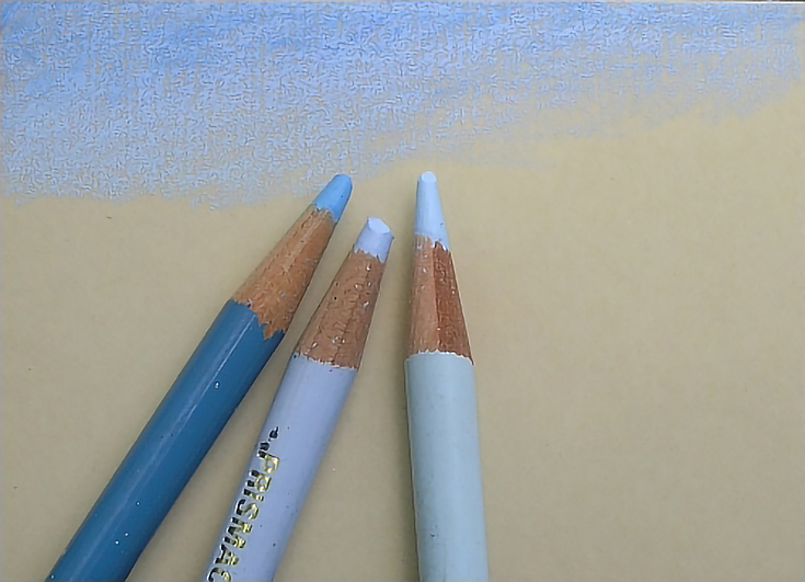
The kinds of surfaces suitable for colored pencil are nearly endless. If a surface will accept dry media of any kind, it will work for colored pencil, often with a minimum of preparation.
The paper
Today’s demonstration was created on UART premium pastel paper. According to the UART website, their paper is pH neutral and acid free, both of which make it an ideal support for artwork. It is available in grades ranging from 240 grit (coarse) to 800 grit (fine). It is suitable for soft or hard pastels, watercolor and oil, and—in the finer grades—colored pencil.
For today’s project with colored pencils, I chose the finest tooth available: 800 grit.
The format
I conduct most experiments on a small scale. In this case, the painting is an ACEO (also known as Art Trading Cards). An ACEO is large enough to allow a good amount of detail work and small enough to be completed in a single sitting if need be.
My process
The first thing I found in working with sandpaper is that it’s not imperative to keep pencils needle-sharp. The coarse texture of the surface grinds down points very quickly, which can easily cause too-fine of points to break.
While the resulting jagged pencil tip is unlikely to damage UART pastel paper, breakage is a nuisance, so instead of sharpening often, I used my colored pencils almost like pastels: blunt, with medium to heavy pressure and firm strokes. The first layers were applied at 5 to 7 on the pressure scale. Each layer was applied more heavily than the one before.
The good news was that the paper took a lot of color from start to finish. I also didn’t have to worry about using a little brute force in the process. It would be difficult to accidentally damage this paper.
I found that a detailed drawing is unnecessary with this paper because of the difficulty of transferring an image by traditional means. So I sketched a basic landscape and then began shading the shapes, working throughout the composition to build color.
The sandpaper surface worked very well for the trees and grass, but I wasn’t impressed with it when I tried to put down thin, even layers of color. After working on it for over half an hour, I did some burnishing in the sky and that worked fairly well, but wasn’t satisfactory.
I tried blending my colors with rubbing alcohol on a cotton swab to see how well the colors could be manipulated. The grit tore up the cotton swab pretty badly and was only moderately successful as far as blending color (in fact, the cotton seemed to pick up more color than it blended).
Those problems aside, the longer I worked on the painting the more advantages I found to this fine-grit sanded paper. I never filled up the tooth, and it took color as readily at the end of the process as it did at the beginning. In fact, the more layers I added, the better I liked the results.
When I thought the painting was finished, I sprayed it with workable fixative and let it air in an area with good ventilation.
My final work was completed with applications of Yellow Chartreuse, Jasmine, Limepeel, Olive Green, Dark Green and Indigo Blue. I applied the heaviest pressure (8 to 10) to the tree, its cast shadow and the sunlit areas around the shadow. This helped create the look of bright sunlight. I also used a glaze of Dark Brown to tone down some of the areas, and “tapped” White into the sunlit portions of the tree to finish it off.
Final thoughts
The end result was satisfactory, in my opinion. The sandpaper surface allowed me to create a very painterly look, with a lot of color.
Given the fact that the paper I used is the finest grit available, it’s unlikely I’d use this paper (in any coarseness) for work that required a high degree of detail. However, I do think it’s an excellent surface for landscapes and for those who paint in a looser style.
This post may contain affiliate links.


