MyArtSpace.com is a fairly popular social network for artists, and one that up until now I haven’t known all that much about.
I first learned about MyArtSpace.com when they published an interview with me on their official blog. Since then I’ve been reading it pretty regularly, and I really enjoy it quite a bit—they do a lot of interviews with artists and art market experts.
Unfortunately, my first look at MyArtSpace.com was a little more disappointing. . . but I’ll get to that in a bit. Let’s start out with the basics.
MyArtSpace.com pricing and features
Signup was easy, and free, for the basic MyArtSpace account. Anyone can join although it’s obviously geared towards artists.
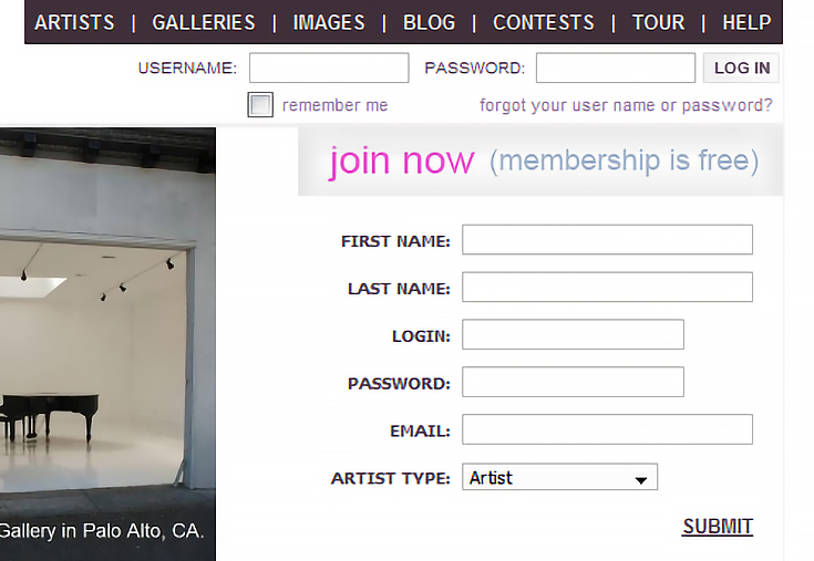
There was an option to purchase a premium account for $75 per year, or $125 for two years, in return for a slightly more personalized gallery with your own custom URL (something like myartspace.com/yourname).
The premium account also gives you the ability to publish press releases for your upcoming shows, or post your art events on the MyArtSpace.com calendar—and premium members have their own section, too, for more exposure.
MyArtSpace doesn’t seem too intent on trying to sell their premium version, and from what I saw the benefits are pretty meager for the price. I imagine most people just stick with the free version.
But free or paid, creating galleries and uploading your art is easy, as it should be. It’s also pretty standard, except for one unique addition—you can upload music or an audio track to go with your artwork, and your art can be a video if you like.
Naturally you can send messages to other MyArtSpace users from your account, or add people as contacts, just like any other social network.
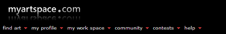
Design and layout problems
This is where MyArtSpace.com really falls short, in my opinion. Their layout is cluttered and messy, and not that easy to navigate. It was a complete turn-off for me, and I’m sure it is for other artists, too.
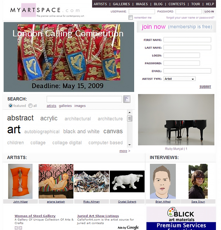
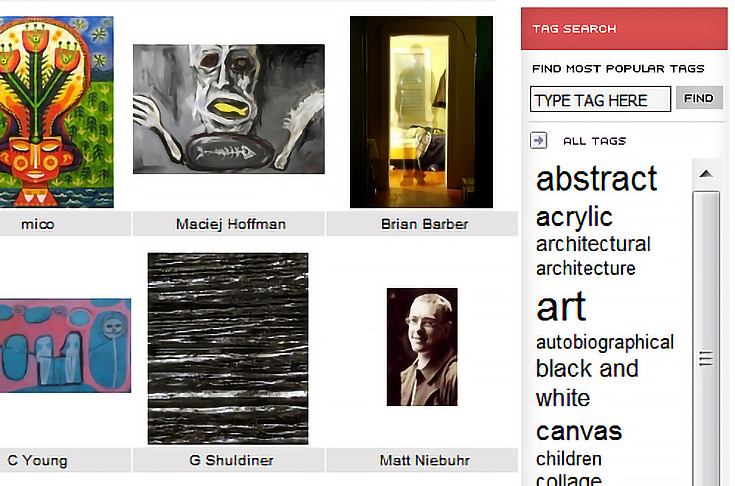
If you follow the links at the top of the home page, though, you can browse through member art, look for specific artists, or search through various galleries. The design seems a bit cleaner on those pages, but it’s still not that great.
From a branding standpoint, MyArtSpace is making some very strange choices, too—like having different headers/logos for different parts of their site. Every once in a while it almost felt like I had stumbled outside their website, just because the branding had changed so much.
Maybe they’re just going through some design changes right now, I don’t know. I kind of hope so, though, because they definitely need to start improving their look if they want to appeal to more artists. (UPDATE: The logo variations are being phased out.)
Possibilities for exposure on MyArtSpace.com
Ignoring the design issues for the moment, I do want to give MyArtSpace credit for trying to help their members get more exposure, both online and offline. In fact, one of the reasons why their home page is so cluttered is because they rotate artists through there on a regular basis.
More impressive is the fact that MyArtSpace occasionally partners with real-world galleries (not just online venues) to create competitions, exhibits, and even art scholarships for their members.
I also noticed that there’s a section in each user’s account labeled where you can set up a free store on NYAXE.com, another site owned by myartspace.com.
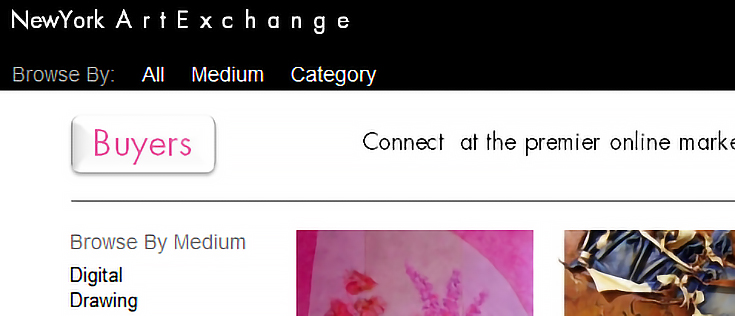
NYAXE.com seems a little more focused on selling art, and I played around with that for a bit before realizing that a store was only “free” for up to five works of art (and there was still a 15% commission fee).
So how does MyArtSpace.com compare?
Every other social networking site I’ve reviewed on EmptyEasel looks and navigates better than MyArtSpace.com. That alone makes me hesitant to recommend them.
The one advantage that MyArtSpace seems to have is their willingness to go outside the internet to create opportunities for artists. It was definitely the bright spot in my experience with them, although I don’t know that it was enough.
Head on over to MyArtSpace.com and see what you think. . . who knows, maybe you’ll feel differently than I did about the design. And if you’ve got another few minutes, I’d suggest checking out the MyArtSpace blog and NYAXE.com, too.
This post may contain affiliate links.