The complementary underpainting technique is a multi-part drawing technique for colored pencil artists. . . it involves first putting down the complementary color of the color you intend to use, and then glazing that second color over the top, often with multiple layers.
In this article, I’ll just be explaining the process in general, but subsequent articles will demonstrate the effect it can have when used in actual artwork.
Before we start, here’s a reminder on what complementary colors are. Complementary colors appear opposite each other on the color wheel. Yellow is opposite purple. Red is opposite green. Blue is opposite orange, and so on. The basic color wheel below shows primary colors (red, blue, and yellow), secondary colors (orange, purple, and green) and tertiary colors.
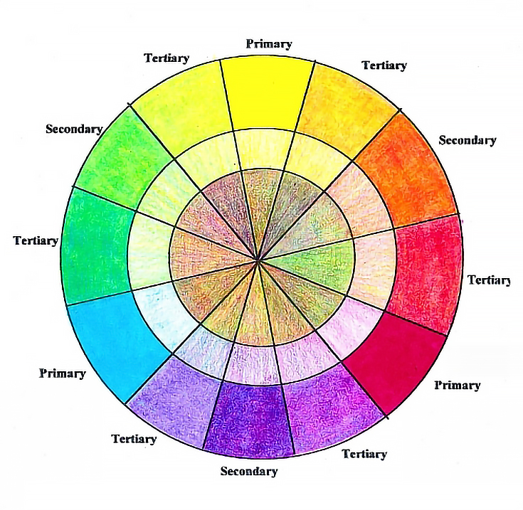
NOTE: If you haven’t made a color wheel, take the time to do so. It’s a great way to see what your colored pencils can do and the resulting color wheel is a valuable part of your artist’s toolbox. (See Making Your Own Color Wheel in Colored Pencil by clicking here.)
The reason why complementary colors are important, is because when you place two complementary colors side by side it creates a visual “sizzle.” Pure complements are often paired at or near the center of interest in a painting, in order to draw the viewers’ eyes.
When you put a color’s complement beneath that color, it changes that color. Since light passes through all layers of transparent color, your eyes and brain will mix the colors to create a new color. A complementary underpainting deepens and enriches the surface color in way that is next to impossible using a single color.
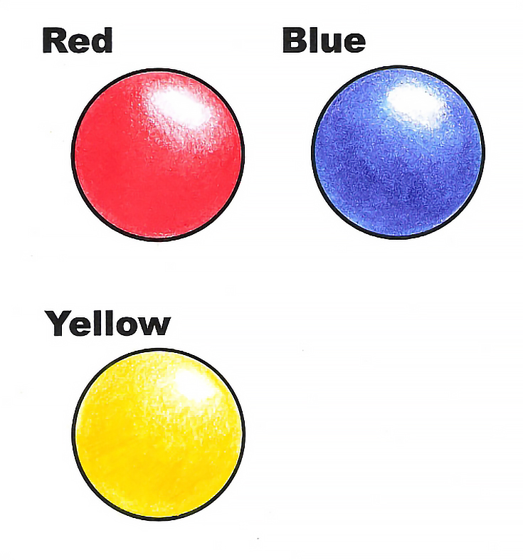
For example, below is a set of three circles, each one in a primary color. I’m using Scarlet Lake (Prismacolor PC 923), Ultramarine (Prismacolor PC902), and Canary Yellow (Prismacolor 916).

To make these colors richer and more interesting, I’m going to add an underpainting of their complementary colors, and show you how that works each step of the way.
Step 1: Creating the underpainting
The first step is deciding what color to use for the under painting. This is where your color wheel comes in handy. Find the spot on the wheel that most closely matches the color you want to use. Then, look across the wheel to see what its complementary color is.
In the illustration below, I’ve created an underpainting for each of the primary colors.
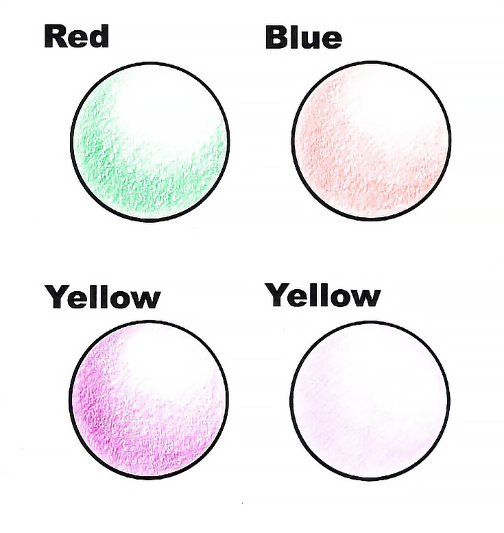
The colors I used were Grass Green (Prismacolor PC909) for the underpainting on the red circle, Orange (Prismacolor PC918) for the underpainting on the blue circle, Purple (Prismacolor 931) for the underpainting on the left-yellow circle, and Lilac (Prismacolor PC 956) for the underpainting for the right-yellow circle. I used light to medium light pressure and created the darker values with multiple layers.
NOTE: For light-value colors (yellow, for example), you may want to keep the under painting light. In the example above, I did two circles for yellow, to give you an idea of what a dark underpainting would look like versus a light underpainting.
Step 2: Adding color over the top
Start adding layers of your primary colors over the underpainting just as you would apply it with any other method. Begin light and build color through multiple layers or use one or two layers of heavier color.
Here are the circles I started above. The colors I used at this step are: Crimson Red (Prismacolor PC924) for the red circle, True Blue (Prismacolor PC903) for the blue circle; and Canary Yellow (PC916) for the yellow circles.
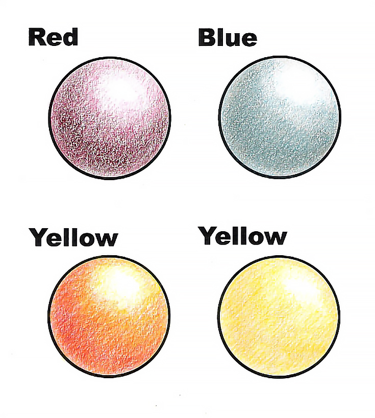
Remember the two purple underpaintings with different values? There is about the same amount of Canary Yellow on each circle and it was applied with the same strokes and pressure. The difference is due entirely to the underpainting.
Step 3: Polishing and blending the colors
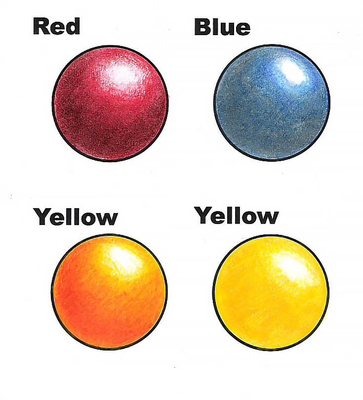
I finished the circles with Scarlet Lake (Prismacolor PC 923), Ultramarine (Prismacolor PC902), and Canary Yellow (Prismacolor 916). This time around, I used heavy pressure and multiple layers in the darker areas. In the highlights, I used medium pressure and one layer.
For the red and blue circles, I then burnished with the colorless blender. For the yellow circles, I burnished with Canary Yellow.
Remember, to burnish you must use heavy enough pressure to physically blend the colors on the paper. Pigment is also ground down into the tooth of the paper, creating rich, saturated colors with no paper showing through.
Here are the finished circles.
For comparison purposes, here are the three circles I did at the beginning of this lesson, without the complementary underpaintings.
As you can see, the difference between a color by itself, and a color over a complementary underpainting, is striking. . . and it’s even more effective (and stunning) when this technique is used in actual artwork.
In my next article, I’ll show you how this method can be used to enhance your landscapes or portrait work. Stay tuned!
This post may contain affiliate links.