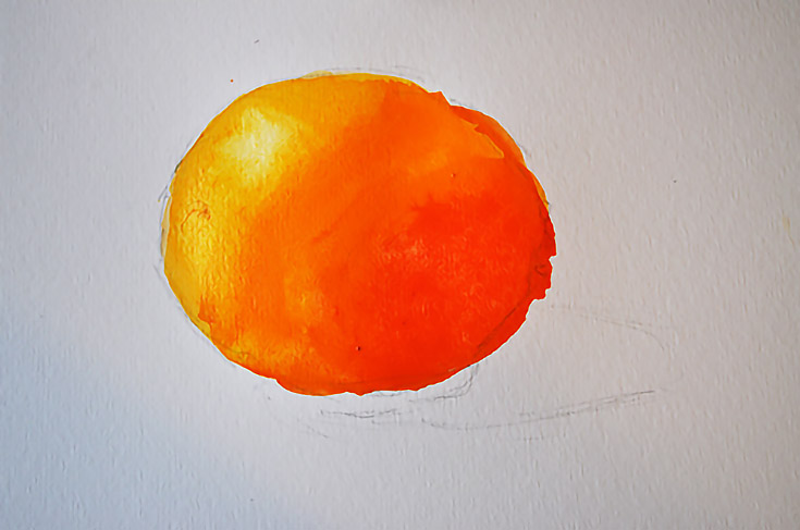
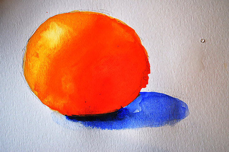
Today I’m going to demonstrate the “color wheel method” of painting for watercolor artists. I will be using the light and dark values inherent to the colors in my palette to create value and form in a simple still life painting of an orange.
While other painting mediums (like oil and acrylic) use black and white to darken and lighten color, watercolor becomes dull and lifeless with black or white mixed in—so this method avoids those, and helps keep your paintings bright and lively.
First, let’s talk about light, form, and value
As artists, we know that light creates form. A three-dimensional object lit by a single light source (for example, the orange seen below) will always have one side closer to the light and one side further away. It is the visible change from light to dark on the surface of that object that tells us what its shape actually is.
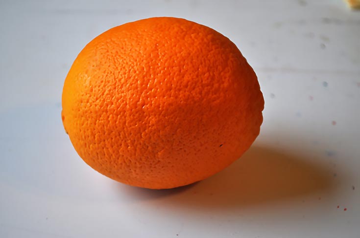
When judging “how light” or “how dark” something is, we sometimes use a graded scale called a value scale. A value scale is made with one end painted pure black, one end painted white, and several squares in between going from light gray to dark gray. By holding up a value scale in front of the object we are painting, we can judge its values more precisely and paint it correctly.
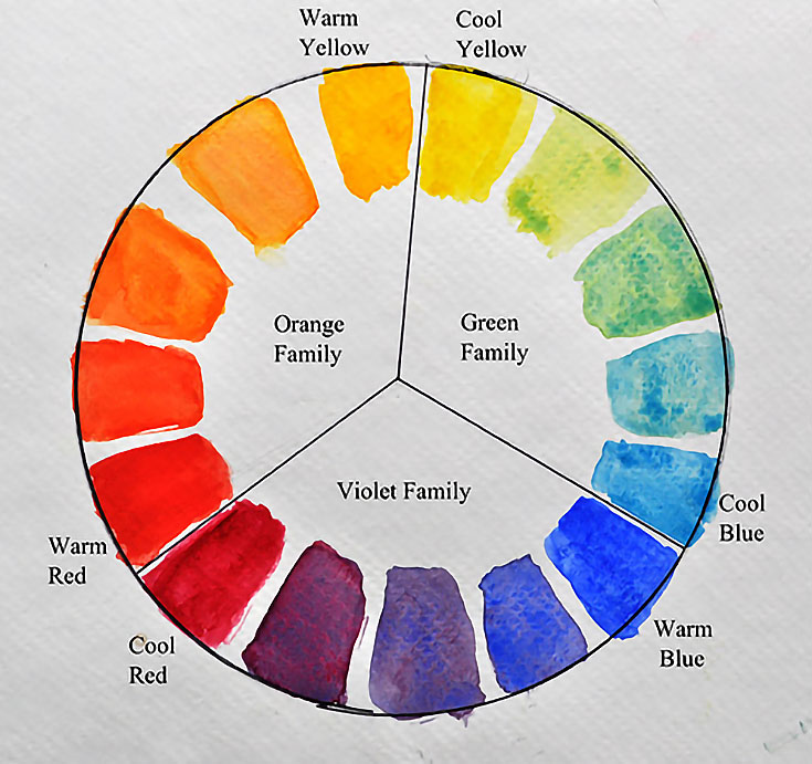
Colors have value as well. If you hold your color wheel with your cool yellow at the top, you will see that your cool yellow is the lightest “value” on the wheel. Everything to the right or left going down the wheel is a darker value than the cool yellow.
By using the colors and their relative values, we can paint three-dimensional forms quite easily. Remember, with the color wheel method of painting, we are after clean bright color and value shifts, not completely accurate color!
So, what colors make an orange. . . orange?
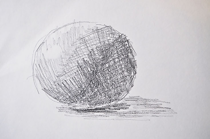
We’re going to find out by painting that orange using the color wheel method. Let’s start by placing your orange next to a window or other good light source, then make a value sketch to help you see how the value shifts on the orange.
I used a range of four to five values in the simple sketch below, with the white of the paper for my lightest light. The values are white, light, mid-tone and shadow.
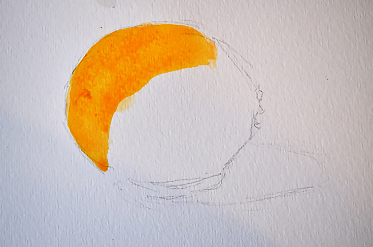
Next, draw the orange on watercolor paper (basically, draw an oval) and begin to paint the orange. You’ll need to make a warm yellow-orange paint color for the top-left of the orange where the light is strongest.
Depending on your specific paint colors, you may need to mix a few colors to get the correct orange hue for that top-left area. If you have orange paint straight from the tube, add yellow to make it a lighter color. If you are mixing orange from yellow and red, use a more yellow to make it a brighter color.
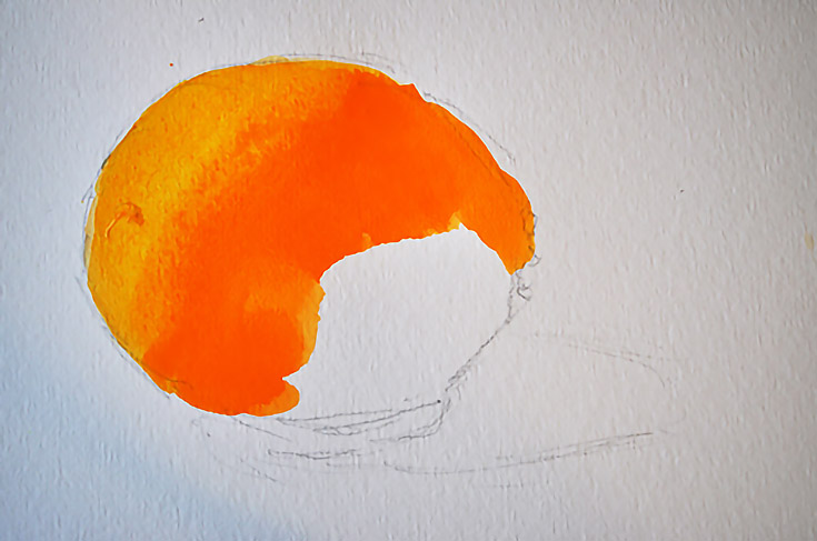
Then, without rinsing the brush, pick up or mix a slightly darker orange. Add a little red, or just use a tube of orange color or mix a true orange for this step. Use this color to paint the mid-tone of the orange where the light is beginning to turn into shadow.
Don’t use too many strokes or scrub on the paper to mix the colors. Place each color mix just next to the last, touching or even slightly overlapping. They should mingle and mix naturally on the paper. Too much stroking with your brush will create lines and an overworked look. Keep this fresh and easy.
For the last step, make a darker orange to complete the shadow shape of the orange. (You will probably need to add a little bit of red to make this darker orange.) Continue to paint the shadow side of the orange with this darker mix.
It was at this stage of painting that I “lifted” the color from the top-left area of the orange to show a white highlight. To do this I rinsed my brush in clean water, wiped it until it was just damp, and used it to remove some of the damp paint in the lightest section of the orange.
NOTE: If the paint is already dry, you will need to use a wet brush to remove the color and blot it with a paper towel.
Last, I used blue to paint in the shadow shapes. A shadow helps the orange to “sit” down so it’s not just a ball floating in the air! Notice also that the shadow’s value becomes darkest closest to the orange. This is because less reflected light is getting into that area.
Although this is just a simple example, you can use the color wheel method to paint anything. Just remember to keep your colors clean by only mixing them with the colors right next to them on the wheel, and don’t layer them on top of each other. This method may be especially helpful if you have a tendency to make “mud” or overwork your paintings with too many brushstrokes.
Have fun painting an orange (or an apple, or a pear) and try this method with other non-edible subjects too! Let the colors touch and mingle at their edges and try not to overwork it.
Happy painting!
This post may contain affiliate links.
