As independent artists, we’re always trying to make a name for ourselves—and the first step to becoming “known” starts with having your own brand, or identity.
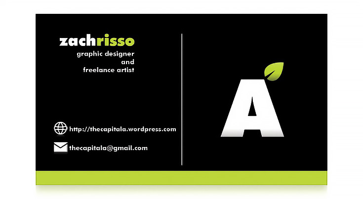
One of the most important things an artist can do to build his or her brand is have a professional-looking logo and business card. (Here’s the front of my business card.)

For most businesses, coming up with a design would mean hiring a graphic designer. But that takes money, and usually a lot of it. If you’re an artist with an eye for design (even if you’re not a designer yourself) it will be much cheaper to create your own logo and business card.
While comprehensive information about designing a logo is outside the scope of this article, here are two important tips if you decide to go that route:
Do some research before you designing a logo. Look around on the web for examples. What logos catch your eye? What color combinations express you as an artist?
Second, make sure to use free fonts in your logo, or fonts you have purchased the rights to use. After spending time and money creating your cards you don’t want to find yourself up against a lawsuit for using a copywritten font.
Now—once you have your logo completed—it’s time to decide what will appear on your business card. Keep in mind that there are probably certain elements of a standard business card that can be disposed of, as well as some that are must-haves.
With this list, hopefully you can pick just the elements of your card that you need.
1. Name of the artist
Not every business card needs to have an individual’s name, but as an artist your name really is your identity both figuratively and literally.
This should probably be the most prominent text on your business card.
2. Logo
A logo that is used consistently on your card, website, and other print materials will help establish your identity as an artist.
It is up to you to choose which should be more prominent, your name or your logo. For some artists their name or their signature IS their logo—if that’s the case, don’t beat a dead horse; skip the logo.
3. Address
A physical address can be a helpful feature of your business card, and depending on how you work, could be either your home address, studio address, or PO box.
Feel free to omit this on your card, however, if you work entirely online or just don’t feel comfortable giving out this kind of information.
4. E-mail address
In this day and age, almost everyone has an e-mail address. It’s a vital piece of information for web-based artists (and really, all artists) to include on their cards since it allows potential buyers to contact you instantly from anywhere in the world.
I’d suggest creating an e-mail account specifically for your business, putting that address on the card, and using it only for business. Keeping your personal e-mails separate will come in handy in the long run.
5. Website URL or domain name
This is an essential part of any business card whether you’re a web-based artist or not. If you’re creating a business card, then you must be serious about your work—and if you’re serious about your work, you MUST have a website.
There are plenty of options for artists who don’t want to spend any money on their online presence (and there are many paid options as well). Read through some of the ways to sell art online on EmptyEasel to learn more.
6. Phone number
This one is a toss up for me. Typically, if you do not work from home and you have a studio phone line, then you should add that phone number to your business card.
If you work from home and don’t want to give out that information, or if you’re primarily a web-based artist, then you may find adding a phone number unnecessary.
7. Job title
Not necessarily needed, since you’re not part of a large company and probably don’t have an actual job title. However, it might be helpful to state whether you’re an artist, designer, painter, sculptor, etc.
8. List of services
Lists clutter up a business card, so I try to avoid them.
If you find it absolutely necessary to add a list of what services you provide, go ahead—it can add to the usefulness of your card. However, if your services could be easily inferred, then you might as well avoid spelling it out.
For example, portrait painters would obviously paint individuals, couples, children, babies, wedding portraits, etc. There’s no need to list every iteration of what you do.
9. Graphics
Last but not least are purely decorative graphics. I’d simply caution you to not to overdo it, since the graphics should never distract from the rest of the card.
Remember, just because other people include this entire list on their card doesn’t mean you need to as well. Decide what matters and leave out what’s unnecessary.
Once your business card is printed, give it to everyone you can!
Include it in the package if you ship a commission, give it to potential customers, friends, family, neighbors, whomever. Get the word out there about yourself and you may be surprised at how quickly you see results.
For further reading, check out Zach Risso’s excellent art blog, The Capital A.
This post may contain affiliate links.

