A strong composition is an important part of any successful artwork. The word “composition” is simply an artistic term describing how an artist fills space in their artwork using elements and principles of art.
Today I’d like to share seven steps to a stronger composition:
1. Use a grid (aka, the rule of thirds)
Our phones have made the rule of thirds a near daily occurrence in many people’s lives. Have you ever used the camera on your phone or tablet? They have an option to have a grid show up on the screen as you take photographs. The idea is to place important elements in your photo near the intersections of the grid.
I’ve taken a screenshot from my camera to show you what it looks like:
This is also known as the rule of thirds. You can use this same approach in any artwork you create. Imagine this hashtag-like mark on top of your surface, or even draw it lightly on your paper before beginning your composition. Wherever the lines intersect, these are good places for focal points in your art.
2. Avoid tangents and awkward crops
Something to watch out for in your compositions are tangents. A tangent is when you draw or paint something and it lines up exactly with the edge of the frame. Here’s an example I took where both of the closest flowers create tangents with the edges of the photograph:
Tangents are very distracting to the eye and hinder a composition. It’s much better to commit to having objects in your composition go completely off the edge of your surface.
NOTE: When your objects do leave the frame, it’s typically best to do this in more than one location—an odd number of times, if possible—to create visual balance.
3. Follow the odd numbers rule
So let’s talk about the odd numbers I just mentioned. If you look at artwork across history, there is a regular use of odd numbers in arrangements of compositions. You see it in traditional still lifes as well as the Biblical and mythological stories depicted all throughout the Renaissance.
For whatever reason, having a composition with an odd number of elements can enhance the overall finished work. I’ll admit, I don’t have a good reason for you—it just seems to work! (If you’ve done research on this yourself, and have more information on why odd numbers help a composition, I’d love to hear it.)
4. Make use of triangular designs
Speaking of the Renaissance, compositions from this time period often appear in triangular forms. This was regularly used as a tool to help create pleasing compositions in their artwork.
You can see this in the two works I’ll share by Artemisia Gentileschi, below: The Birth of St. John the Baptist and Judith Beheading Holofernes.
5. When in doubt, model historical artwork
The Renaissance is a time period that just keeps giving. I found many, many artists across history who would find a painting by a master they admired, and use the exact composition in a painting of their own.
Edouard Manet’s Luncheon on the Grass or Dejeuner Sur l’herbe is a good example. You can see the work up close through the Google Art project, and I have the image for you below as well. Take note of the seating arrangement:
Now look at a print designed by Renaissance master Raphael and Marcantonio Raimondi. Observe the seating arrangement of the figures in the bottom right corner of the print.
You may as well find some historical artwork you admire, and use them as inspiration for your own compositions, too!
6. Use a viewfinder tool to frame your composition
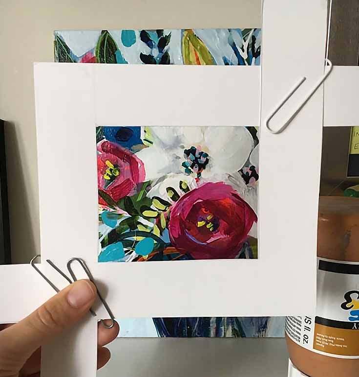
Some people subconsciously think using tools is a kind of cheat. But I’m here to tell you that’s silly. Artists from all time periods found ways to make making art easier for themselves. Van Gogh was known to use a frame tool like this viewfinder to help him decide on compositions:
I’ve made one here to show you as well.
When you are outside looking at objects or landscapes OR if you have an image reference that you want to use a smaller part of in your art, a frame like this actively blocks out areas from your vision so you can focus solely on the composition you’ve chosen.
Just move the frame around until you find the most pleasing version of the image, and then fix it in place as you complete your artwork.
7. Draw an “eye movement” map
I don’t often draw eye movement maps myself, but I do take some time looking at my art and observe how my viewing experience leads me through the artwork. This will help you see if your eyes travel to your desired focal point, and if your composition correctly emphasizes your theme or message.
Here’s an example of how my eyes travel through the artwork The Absinthe Drinkers by Edgar Degas.
Now, per usual, I want to remind you all: rules are made to be broken! My experience, however, is that artists who break these rules and create successful art have educated themselves in rules of composition first. They’ve learned how to use them, before they deviate from them.
Good luck, and happy drawing!
Special thanks to Carrie Brummer for this article! Carrie helps artists build their skill and develop their unique voice at www.ArtistStrong.com. Check out her free guide 10 Drawing Truths here.
This post may contain affiliate links.


