Earth tones are some of my favorite colors. (Yeah. I know—with all the bright, beautiful colors available in so many mediums, why would browns be my favorite?)
But earth tones are a staple on my palette because they factor so heavily in my favorite subject: horses. Honestly, earth tones are the foundation for most of the things I paint. The only thing I can think of that doesn’t usually include an earth tone of some type is the sky. Especially clear, blue skies.
The most obvious place I use earth tones is in the final stages of a horse portrait, when I’m glazing color over the painting. Colors like Burnt Sienna, Burnt Umber, and Yellow Ochre are all important for the realistic depiction of everything from cremellos to blacks. But I also use an earth tone for underpainting work when I use the Flemish method.
For under paintings, I almost always use Raw Umber because it’s opaque, non-fading, and has a blue cast that’s perfect for under painting most of the subjects I paint.
My favorite brand of oil paint
I use M. Graham Oils exclusively for a variety of reasons.
First, they’re made with Walnut Oil, which is naturally non-yellowing. Walnut oil also slows drying, so I can work wet-into-wet longer than with oils ground in other vehicles. Need things to dry faster? A walnut/alkyd medium is available.
Second, they can be used without mediums or solvents (the company actually recommends avoiding solvents altogether). I rarely use a solvent of any kind anymore. That means no more fumes!
Third, most colors are fluid enough to use right out of the tube without thinning. When I want to thin a color, all I have to do is add a drop or two of walnut oil. And, almost all of the colors are transparent or semi-transparent, including those lovely earth tones!
But best of all, I can clean my paint brushes by dipping them in walnut oil, wiping them until no more paint comes off, and then just leaving them until the next day of painting. Clean up at the end of the week is easy, too—soap and water is all you need.
My favorite earth tones
Even if none of those points were true, however, I’d still use M. Graham Oils because they manufacture three earth tones that I never knew existed until I switched brands years ago: Transparent Red Iron Oxide, Transparent Orange Iron Oxide, and Transparent Yellow Iron Oxide.
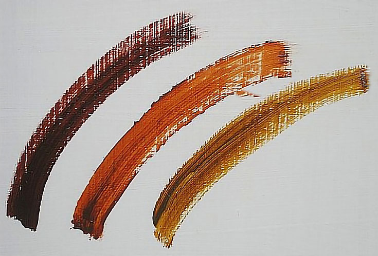
Transparent Red Iron Oxide (on the left) has replaced Burnt Sienna as my favorite horse color. Straight out of the tube, the two colors look pretty much the same, but Transparent Red Iron Oxide makes much more satisfactory colors when mixed, and it never turns pink if I have to mix it with white. I use it in some form in every horse that requires a brighter red for the coat color.
Transparent Orange Iron Oxide (the middle stripe) provides different shades of browns and reds when a lighter color is necessary.
And Transparent Yellow Iron Oxide (on the right) produces a more natural looking gold, yellow, and cream than its counterpart, Yellow Ochre. It’s also wonderful for painting horses that are more brown than red—but its real value is in painting natural-looking greens in a landscape.
How I use iron oxide colors
Since my subjects are usually equine in nature, the most common way I use transparent earth tones is by glazing them one at a time or in mixtures over an under painting. This method is especially effective if the horse (or any animal, really) is a shade of brown, gold, or cream. The colors are so transparent that I can brush or rub them onto the surface and still see the under painting.
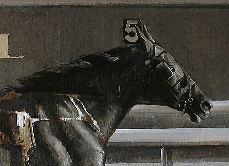
In the portrait shown below, I started with an Umber underpainting.
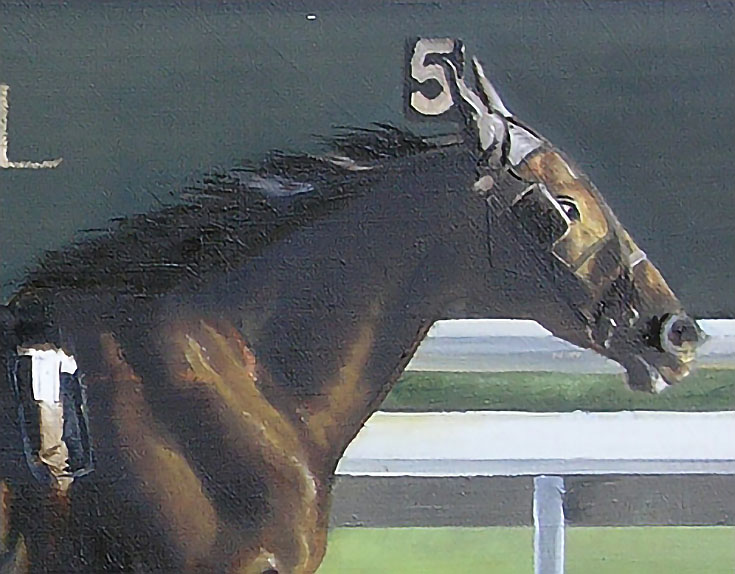
Then I glazed Transparent Yellow Iron Oxide over the light areas of the horse to get local color, followed by Transparent Red Iron Oxide in the darker areas:
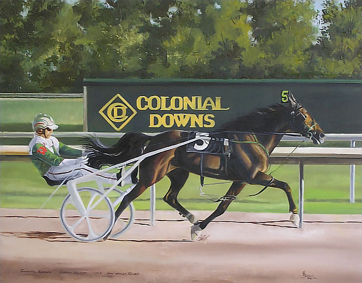
In the background, I mixed Transparent Yellow Iron Oxide with Manganese Blue for the deepest greens in the trees. For the lighter values, I added Azo Yellow or Yellow Ochre (depending on the brightness and visual temperature of the area). For the lightest areas, a little Titanium White was added.
To paint the infield grass, I used the same mixture, but in different ratios. The cooler area in the background is heavy on Manganese Blue, for example. The brighter, “hotter” area in the foreground has more Azo Yellow.
I’ve since used these colors to paint other landscapes and have found that no other colors produce such natural looking landscape greens as these. I wish they were available as colored pencils!
I recommend M. Graham Oils without reservation, but even if all you do is add the transparent iron oxides to your palette, you will be well served.
This post may contain affiliate links.