When you hear the word “contrast,” you probably think of dark versus light. But paintings can have many different kinds of contrast in them. Here are just a few:
• Cool / Warm
• Light / Dark
• Sharp / Blurry
• Thick paint / Thin paint
• Sketchy / Detailed
• Straight / Curved
Today I’m going to demonstrate how to add contrast to a painting, by showing you a commissioned portrait that I painted a year ago. I purposely included several types of contrast to give it more visual interest. . . take a look:
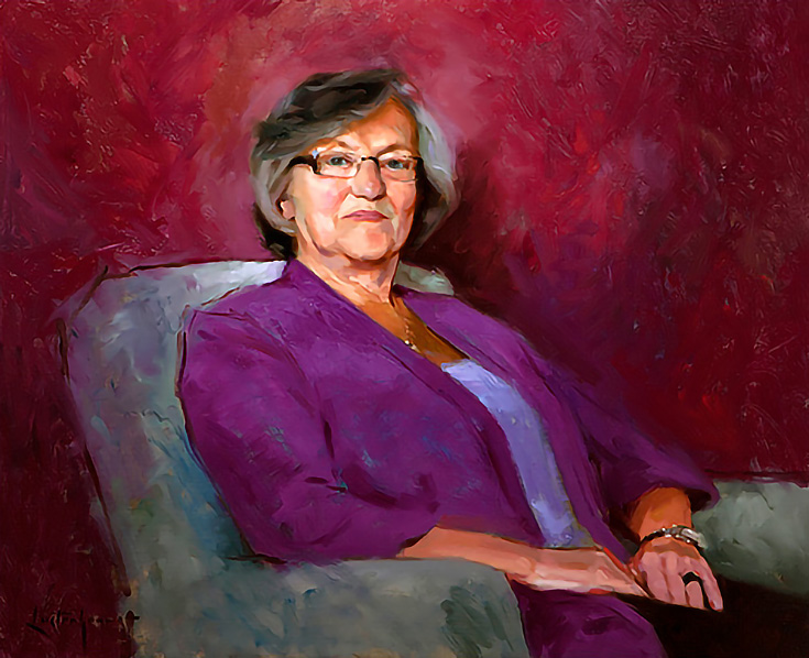
Can you pick out the different contrasts? Here’s what I did:
1. Cool / Warm contrast
The favorite colour of this lady is purple. Her clothing was purple and several walls in her home were purple, so it wasn’t hard for me to choose “purple” as the main colour in this portrait.
But if everything was purple, that wouldn’t be a very interesting painting. So I mixed a warm purple-red for the background and cool bluish-purple for her clothing. In order to “anchor” the two colours together, I put bits of both purples into the grey of the chair and her hair.
2. Light / Dark contrast
I wanted to draw attention to her face, so around the head (near the top of the chair) I painted much lighter colours, to contrast against the dark shadows of her hair. The rest of the chair I made a darker grey than in reality. I did the same for her shirt and coat, except for the areas adjacent to the head.
Everything I did with light / dark contrast was to create a focal point around her face.
3. Sharp / Blurry contrast
I blurred her left sleeve into the background, but kept her right sleep sharp against the grey of the chair. In fact, many edges in this painting blur and blend into each other, except where I painted crisp lines to draw attention to the face (which contains the clearest details of all).
4. Thick Paint / Thin Paint
My subject’s clothing is thinly painted, so much so that the blue underpainting shows through. In the background, however, I applied the paint thickly.
5. Sketchy / Detailed contrast
I added quick, gestural lines where the chair meets her right arm, to emphasize the energetic and sparkling personality of the model. This loose style of painting contrasts greatly with her carefully detailed facial features.
6. Straight / Curved contrast.
In the same way, while most of the lines and edges in this portrait curve naturally, I painted the sketchy areas with straighter and more angular brushstrokes.
There’s no law that says you MUST use contrast in your paintings, but I always try to do so. After all, merely painting a good likeness of a sitter’s face does not make an interesting painting. Adding different kinds of contrast, however, will always help.
Try adding one (or more) of these six types of contrast to your next painting—it’ll make a big difference!
For more portrait painting tips from Ben Lustenhouwer, please visit his website.
This post may contain affiliate links.