When you’re first taught to paint with a limited palette, you’re usually given three primary colors—red, yellow and blue. Limiting yourself to just a few colors teaches you how to mix colors correctly, see value and temperature, and encourages thought and planning in your color choices.
Today we’ll discuss a different limited palette, one that was made famous by Swedish painter Anders Leonard Zorn, which is often known as the Zorn Palette.
Anders Zorn didn’t invent the idea of using a limited palette, of course—that idea has been around for a very long time—but he’s well known for using a limited palette in most of his paintings.
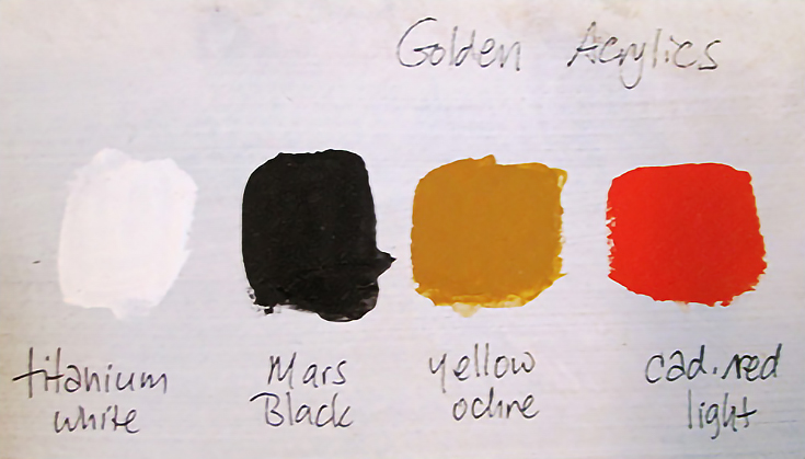
Zorn’s preferred palette was of four earthy colors: yellow ochre, vermilion, ivory black and white. There may have been a few other colors he added at times, such as viridian and cerulean blue, but for the most part he stuck with those first four.
Here’s my own representation of the Zorn Palette, made with Golden Acrylics. From left to white,Titanium White, Mars Black, Yellow Ochre and Cadmium Red Light (I didn’t have Vermillion on hand so I substituted Cad Red Light which is on many palettes anyway).
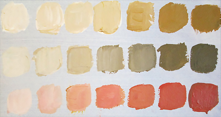
Below is another color chart using only these four colors.
The top row is simply Yellow Ochre mixed with varying amounts of Titanium White, while the middle row has a little Mars Black mixed in as well. The bottom row is a blend of Cadmium Red Light and Yellow Ochre, again with varying levels of white.
Besides making it easier to learn about color temperatures, using a limited color palette offers more color harmony, the ability to make grays without the muddiness, less confusion (because of fewer color choices) and also less expense—you only need to buy 4 colors, after all!
Of course, if you’re painting plein air, there’s less packing involved, too. :)
You’ll also notice that colors in a limited palette can still be warmer or cooler in relation to other colors. Since the eye adjusts to what it looks at, it doesn’t feel as though any colors are missing. There are cool and warm reds, cool and warm yellows and so on.
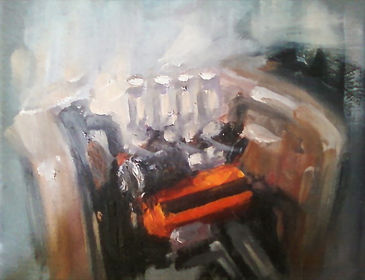
I personally enjoy using a limited color palette at times, even though I do love all those beautiful colors available in the store, online or in catalogues. Here is a photo of one of my latest paintings, Hot Rod Power, where I used a limited palette of Daniel Smith water mixable oils.
I encourage you to try Zorn’s palette out for yourself, no matter what medium you use. At least make a color chart like I did and see how many different colors you can achieve out of 4 simple earth colors. You just might be inspired by what you see!
This post may contain affiliate links.