As many of you know, in addition to EmptyEasel I also run Foliotwist.com, which is a web-based service that provides easy-to-manage websites for artists.
Today we’re rolling out one of our biggest updates ever, so of course I wanted to announce it here, first. If you don’t have a website for your art, or if you have a website but you’re just looking for something more effective, read on. . .
Since launching foliotwist.com earlier this year, we’ve only offered one template, and quite frankly, it looks nothing like a "normal" artist website. Instead, it’s a rather unique blog/portfolio hybrid, which we specifically designed to pull in lots of traffic from Google and other search engines (see below).
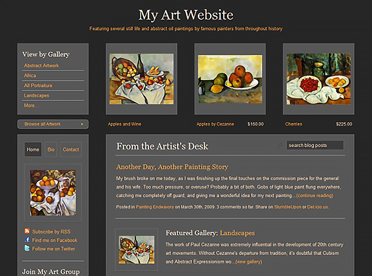
For artists who also happen to be dedicated bloggers, it works great. I know of at least one Foliotwist artist who received 350+ visitors in the very first month of using it— which is a pretty good number for a new art website (or any new website).
For artists who only want to blog occasionally , however. . . well, the design tends to get in the way. It’s just TOO blog-centric.
So, based on feedback from our artists, we started working on a new template that would be a little more appealing to non-bloggers without sacrificing any of the powerful features and tools that Foliotwist offers.
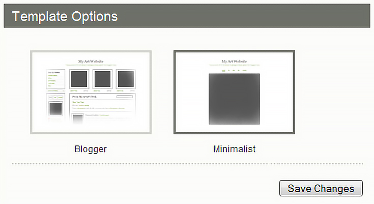
Here’s what we came up with:
Minimalist and modern – The new homepage is a study in minimalism, with just a title and tagline, navigational links, and one featured image, or a slideshow of images if you prefer to have that instead.
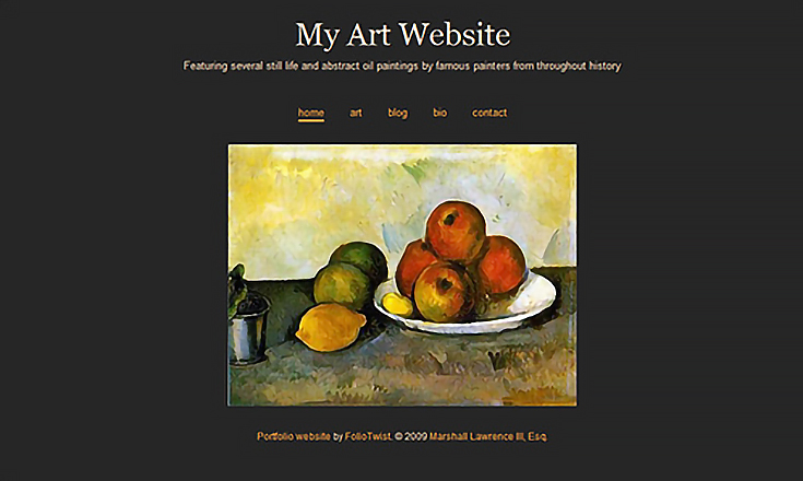
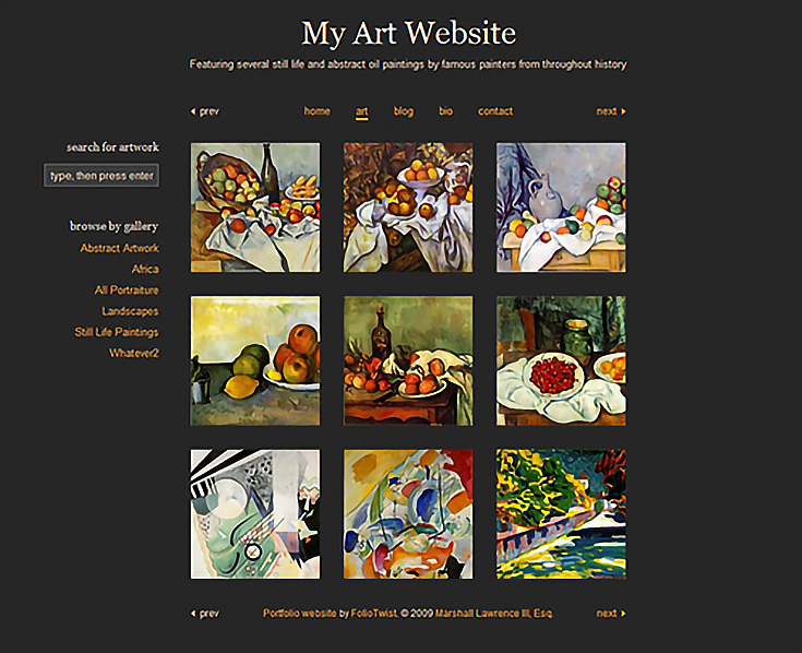
Throughout the entire template, the new design is free of any lines or borders and makes use of sleek, square artwork thumbnails, for a very modern look.
Separated blog – We didn’t get rid of the blog entirely, but we did place it on its own, separate page. Because of that, this template may not be quite as effective for SEO but we decided to go through with it anyway.
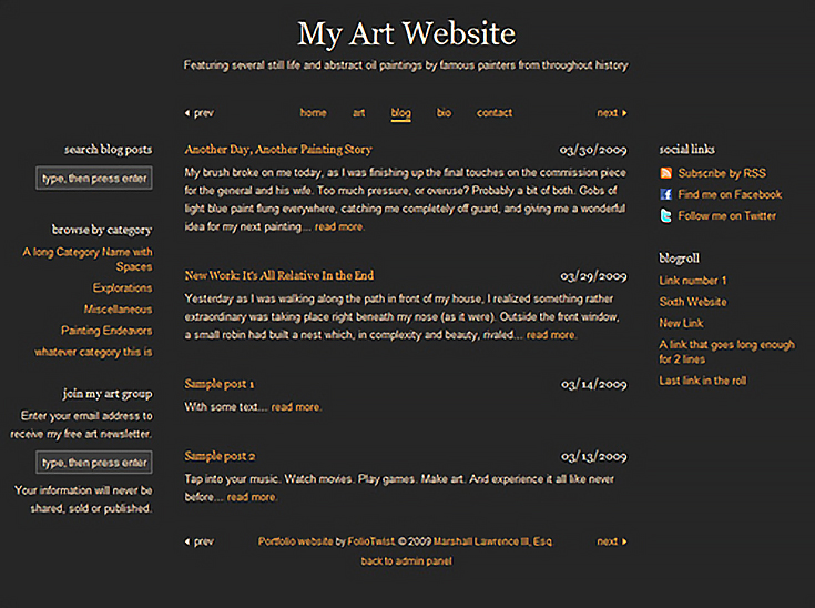
There will always be a trade-off between minimalist design and SEO, and for many of our artists, it’s worth it to have the blog on a different page.
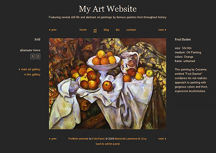
Longer artwork descriptions – The original Foliotwist template is very tight on space and has limited room for describing artwork. Obviously this was a problem, so for our new template we opened things up a bit and made sure that we didn’t have to limit how much you can say about your art.
In the process, we found a space-saving solution for the old template too. :)
Seamless switching – If you want to try out both Foliotwist templates, you can do it in a matter of seconds. Select the old template (Blogger) or the new one (Minimalist) press save, and you’re done.
You won’t need to re-upload your artwork, re-write your blog posts, or re-customize your colors, fonts, and logo—all of THAT stays the same when you switch. The only thing that changes is the template.
Of course all the features and art marketing tools of Foliotwist remain as well, no matter which template is used. You can easily integrate PayPal (just plug in your PayPal ID), send newsletters, publish blog posts, add Google Analytics, and link to your social networks. . . it’s all right there in the admin panel, no programming required.
If you’re just now hearing about Foliotwist and want to see how it works for yourself, our free 30-day trial is a great way to go behind the scenes and check it out.
One thing that I’m sure of is that you’ll be amazed at how EASY it is to manage a Foliotwist website—that’s why the free trial is there, and I hope at least a few of you will take us up on it. :)
Questions, comments, suggestions? Let me know!
This post may contain affiliate links.