When painting a landscape, it is essential that you are able to illustrate a visual “sense” of depth, through your brushstrokes, colors, and composition. We all know that this is important. . . but the question is, how exactly do you create a painting that does not appear flat and devoid of distance?
In today’s article I’ll be sharing what I consider to be the most effective ways to describe a sense of distance and atmospheric perspective in your landscapes—and it doesn’t matter whether you’re using a brush, pencil, or pastel.
6 ways to increase depth in a landscape painting
1. Overlap objects within your composition so that some are forced forward or backward in the scene.
2. Paint with less detail, texture, and definition the further back you go in the landscape.
3. Paint using lighter values and less contrast for distant elements.
4. Use cooler colors to push elements farther into the background.
5. Use warmer, darker colors to bring elements forward into the foreground.
6. As elements recede in the distance, paint them at a much smaller scale than objects in the foreground.
Examples of depth in landscapes
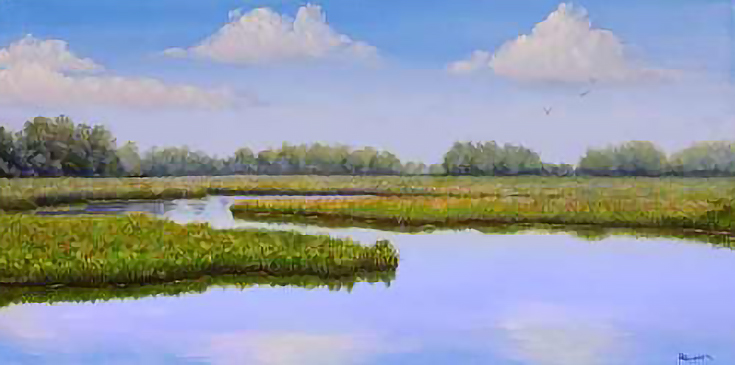
Take a look at this oil painting, entitled Eastern Shore Marsh, and see if you can spot how the above techniques are used to create depth.
The first thing you might have noticed is that a sense of distance is established by using cooler colors as the eye moves back into the painting. Values are much lighter as well, compared to the darker values clearly seen in the foreground.
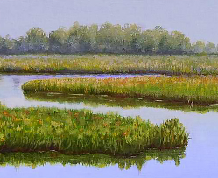
Up close, the warmer blues in the water and the warm greens in the marsh grasses visually pushes the cooler shades back. Additionally, the mid-ground and background grasses are deliberately painted with less detail and texture.
If you look all the way to the back you’ll see a clear lack of detail in the trees at the horizon, along with a cool blue-green used in their foliage. Those furthest trees are also very, very small in scale when compared to the foreground grass, which is probably the most effective distancing technique of all.
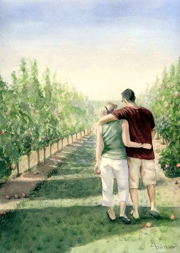
In the following watercolor painting, A Walk in the Orchard, overlapping elements play a much more significant role in pushing the apple trees back into the distance.
Each tree successively grows smaller and lighter in value, and moves from a warm, vibrant green to a cool blue-green in the distance. There is also a lack of detail in the distant trees, and the extreme linear perspective of the composition adds to the sense of depth as well.
NOTE: It’s important to realize that in both of these paintings artistic license was definitely taken. The original landscapes were not nearly as extreme in value, color, or temperature changes as my painted interpretations are.
However, that’s really the point of being an artist in the first place, isn’t it? Your interpretation is what makes a landscape—or any painting—unique.
So as you plan your future landscapes, keep the aforementioned tips in mind and make use of them as needed. For many artists (myself included) they are the key to creating depth and distance in any painting.
This post may contain affiliate links.


