The ever-intriguing question, “What color is that?” is a very common one among human beings. Colors are important in the food we eat, the clothes we wear, our homes, cars, even our pets. . . and while the colors in a painting might be the first thing a viewer notices, there’s a lot more to color than meets the eye.
So it’s up to us, as artists, to delve beyond just recognizing and naming colors to using colors for their inherent qualities, towards a specific end.
The role of colors in a painting
In a recent tutorial we looked at the roles of value in our paintings, and how these roles are independent of color. Today I want to take a look at what we can make color do that value cannot do.
You’ll notice that just like value, color has two roles: describing and composing.
Colors can describe a scene in ways value cannot
There are actually four different ways that colors describe things:
1. Hue: the location within the color spectrum
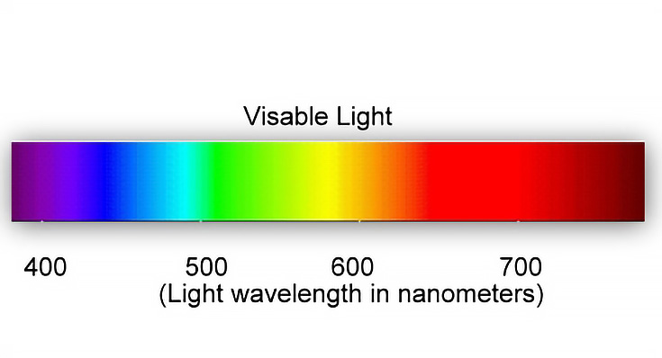
For example, the hue of lemons could be spectrum yellow or they could lean a bit towards orange or towards green.
This depends upon whether the light source is cool or warm. No matter which, it is still in the yellow family.
2. Saturation: the degree of spectrum purity
Saturation changes toward neutral when complements are mixed together. For example, when purple gets mixed into yellow, the yellow becomes less pure and more neutralized. Look at this example.

The hues are yellow in both roses, but the right rose is more neutral than the left.
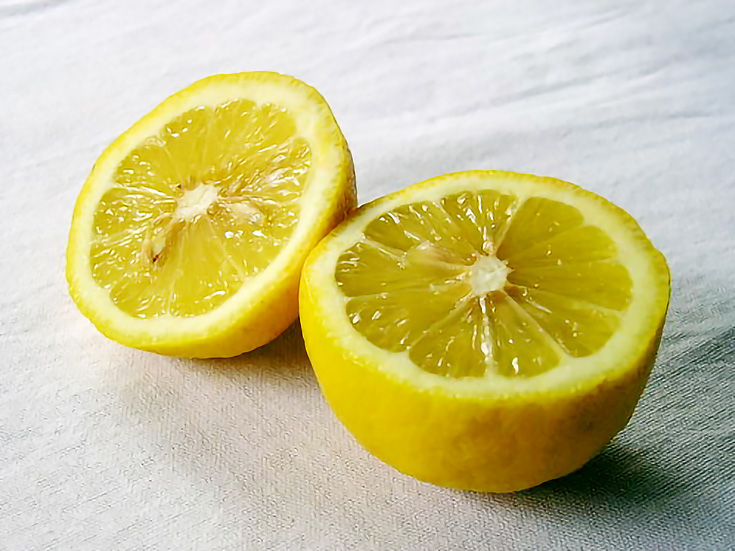
3. Temperature: warm to cool
Colors within the yellow, orange and red families tend to be warmer than colors in the blue, green and purple families. In our lemons example, the lemon half on the left is warmer than the half on the right which contains a bit of the cooler color blue.
See this article to learn how to find the correct color temperature while painting.
4. Value: light to dark
The hue of a color is not the same seen in light as seen in shadow.
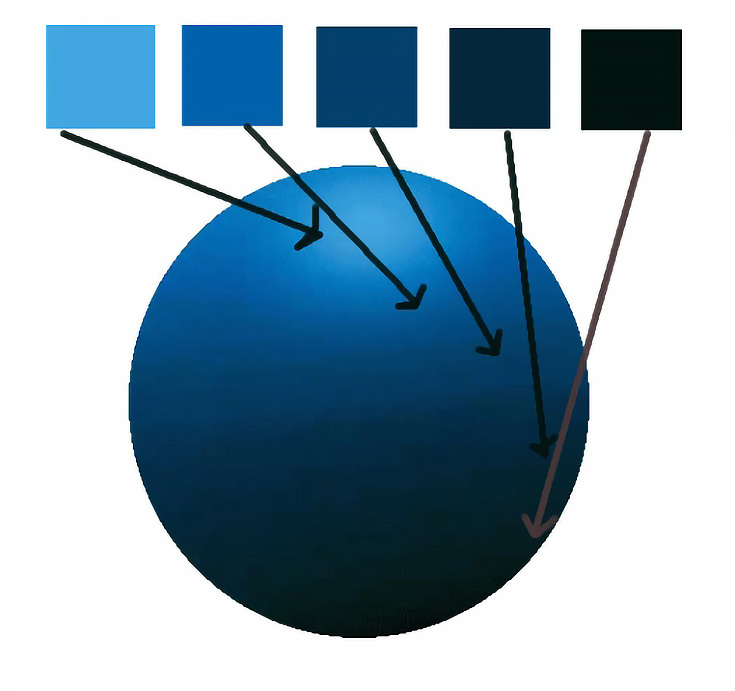
I have sampled from this blue ball five areas to show how the hue is different depending upon to what degree it is in direct light. One rule of thumb: cool light produces warmer shadows; warm light produces cooler shadows.
Here, the purplish shadow is cooler than the warmer blue in the light, where we can even see a bit of yellow. (Your monitor colors may vary.)
Colors can also affect the composition of a painting
The five major composing roles of color are as follows:
1.To harmonize (or the opposite, to contrast)
2.To unify a scene
3.To set forth a visual path
4.To produce rhythm
5.To create emphasis
In the Richard Schmid oil painting below, color functions in all five roles.
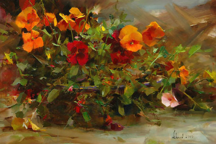
The overall warm tones create harmony along with repetition of orange and warm green. Blues in the background and foreground give contrast or counter-harmony.
While dominance of warm colors unify the painting, a visual path is created with the repeating of the brighter oranges. The repeated smaller green shapes in the foliage create a rhythm within that path.
The emphasis in this painting is from accents of yellows, yellow-oranges, that one little pink flower in the lower right and that tiny little yellow note in the lower right.
Now look at a totally different painting by Robert Genn.
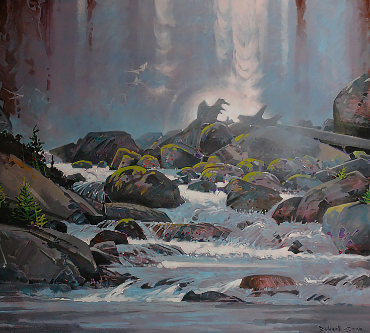
The overall bluish tone unifies, while purplish-red accents bring harmony throughout. Repeating greens set the visual path and give rise to rhythm. Emphasis results from the highlights in the water contrasting with the surrounding blue and dark gray rocks.
Finally, look at this portrait by John Burton.
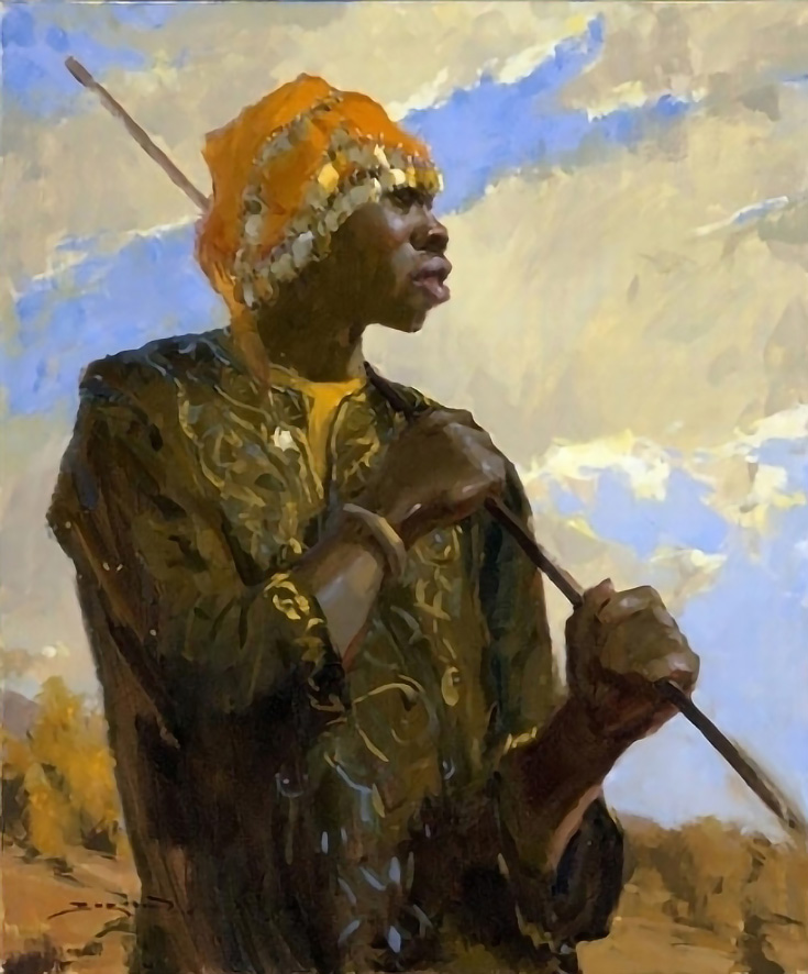
Repeated golds and warm browns harmonize the piece. That warmth receives emphasis from the contrasting cooler blues in the sky. A dominance of warms unify as the viewer’s eye is led throughout the painting with the repetition of orange-yellows.
When we observe and use the descriptive characteristics of color as composing tools, we discover a world of opportunity for creative and fresh uses of color.
Try taking your paintings this one step further—plan some of your color choices ahead of time—and see how it opens up an entirely new door to creativity.
This post may contain affiliate links.