To be suddenly awakened out of a sound sleep is unsettling—I’m sure most of us would rather ease gently
into that first glimmer of consciousness. In the same way, a painting that contains too many contrasting elements can often feel like a rude awakening to our senses.
So how can we, as artists, communicate active, vibrant life in all of it’s diversity without visually assaulting the viewer?
For many accomplished painters, the answer lies in their use of gradation.
What is gradation?
We’re probably more familiar with gradation than any other principle of composition. Simply put, gradation is a slow transition between opposites.
Light changes slowly to dark, large becomes small, one color unfolds into another. . .these are all examples of gradation. But really, any visual element—whether it be size, shape, direction, edges, value, hue, intensity, temperature or texture—can be gradated just as they can be contrasted.
And while most of us probably learned in our first drawing class that value gradation can make an image appear three-dimensional, the real question I want to answer today is this: how can we use gradation to compose better paintings?
You see, gradation has the unique ability to create a field of overall harmony within which diversity and vibrant passages can coexist. To say it in a different way, gradation ties together things that would otherwise compete with one another.
Three examples from contemporary painters:
Colin Page has successfully employed gradation techniques in Growing Tall, below.
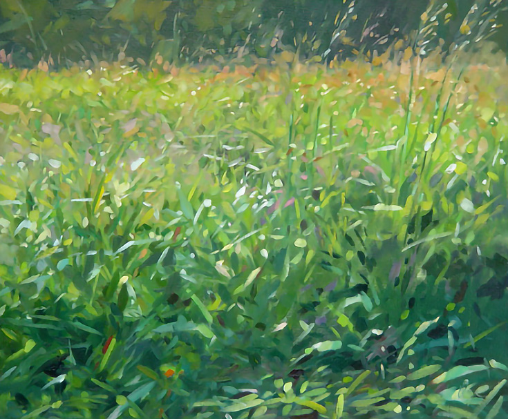
There’s a lot of activity here. . . titillating flecks of light, rapid directional contrasts, quick gestures, and so on—but if you squint your eyes at Colin’s painting and concentrate on the darks and lights, you’ll discover an underlying gradation in value.
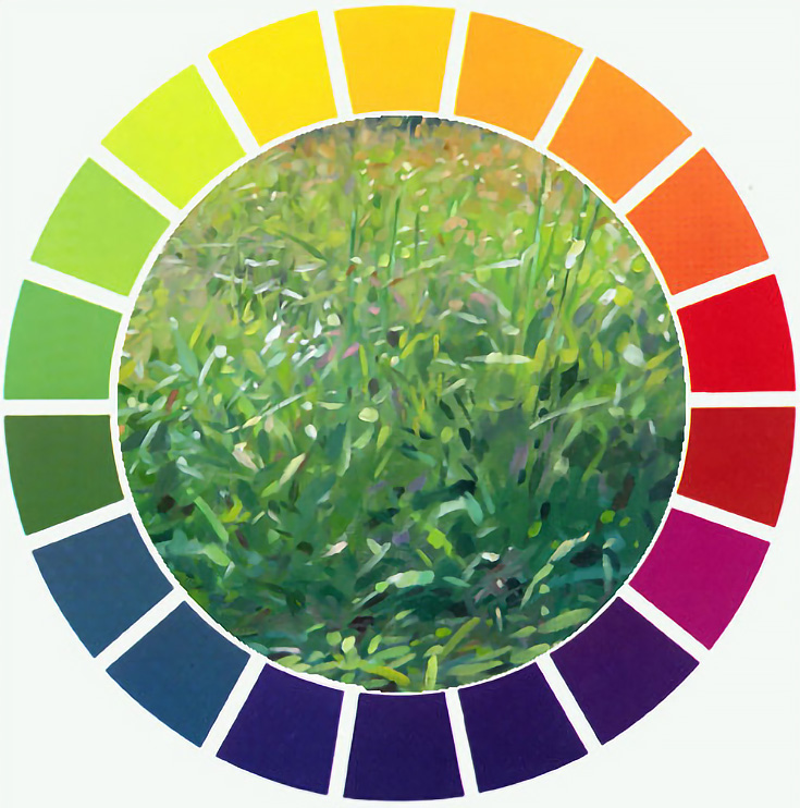
Then look at the colors and name them to yourself as they appear, from the bottom to the top—blue-green, green, yellow green, yellow, orange—they all transition in the same order as the colors on the color wheel.
Now shift your attention to the texture of the grasses. Larger, rather specific strokes appear at the bottom, and then strokes become progressively smaller and less specific as they move toward the top.
Value, hue, texture and edges all have been gradated, letting us be captivated by the diversity of contrasts rather than confused.
Taking a slightly different approach, Carolyn Anderson has used a form of gradation to tie similar objects together in this next piece:
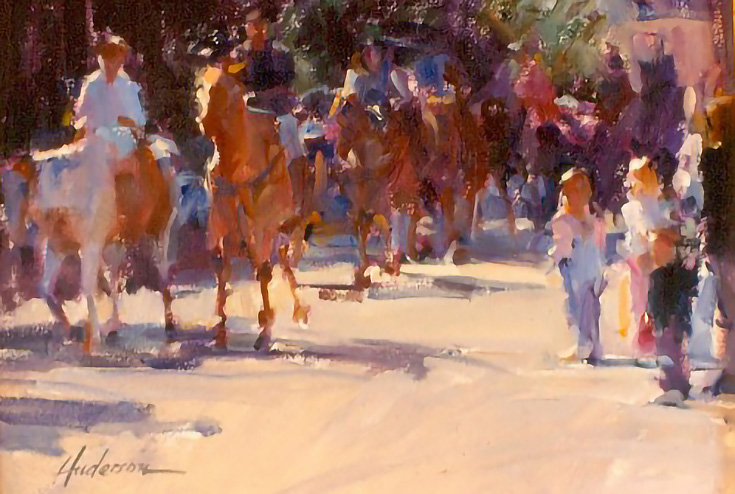
The second horse from the left is where her gradation strategy begins. Look at that horse, then switch your attention to the line of horses following it. The farther back your look, the darker they get, the smaller they are, and less-detailed they become.
Anderson has used an incremental lowering of value, gradual decrease of size, and a slight softening of edges to help focus our attention on the front horse while still unifying it with those following behind.
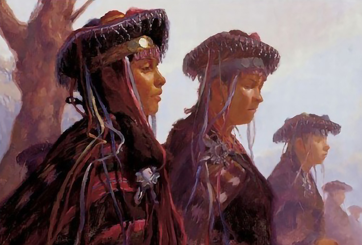
Of course the most common gradations seen in paintings are the ones that nature itself gives us. Landscape painters re-create atmospheric haze by gradually diffusing values, colors, textures and edges as they move into distance.
Things get interesting, though, when an artist applies such a principle to a different type of subject. John Burton has done this in Festival at La Tirana.
As you can see, creative possibilities abound for using gradation in a painting.
Try some of these ideas in your own work—whether your goal is realism or something else, an exciting, intriguing, and more unified painting will most likely be your result.
This post may contain affiliate links.