Pixel art is a unique digital art movement that got its start in the early years of computer graphics when video cards still had very limited capabilities. (Think old arcade games and you’ll get the idea.)
These days, Pixel art is used to give a retro feel to an artist’s work, as well as a deceptively childlike or simplistic quality to a piece.
And despite its enforced simplicity, creating extremely intricate and detailed Pixel art IS possible—it’s just a very time-consuming process since the artist must place each pixel one at a time.
This detail of a pixel “painting” by Yuriy Gusev gives an example of what’s possible.
![]()
You can see the full image (along with a lot of other great pixel works) right here.
So how do you make pixel art?
I have to say that I only use MSpaint to create my pixel pieces. Some people use fancy programs specifically designed for pixelling and others use Photoshop or GIMP. I did my first pixel piece on MSpaint, however, so that is primarily what I use to this day (I do use Photoshop when I need to make transparent backgrounds).
Here are some guidelines I follow when pixelling:
Step 1. Pick a color palette
First and foremost, you need to choose the colors that you’d like to use.
 You can tweak your colors as you go along, and you may very well change the entire thing, however it is always good to start off with the basic colors of your piece.
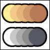
For reference, here are two simple five-color palettes. Never use MSpaint’s default colors. Always use your own custom colors.
Step 2. Choose a shading style
There are two basic types of shading when it comes to pixel art: dithering and cel-shading. Some artists strictly use one or the other while others combine the two.
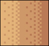 Dithering is accomplished by picking the next nearest color in your palette and placing it in a set pattern along the edge of your previous color. (As in the image to the left.)
Dithering is best used for a more “realistic” pieces since a dithered edge often appears like a gradient to the human eye.
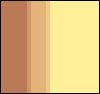 Cel-shading uses a midtone color to blend two colors together. This is accomplished either by placing a 1px line completely down the division or in strategic places along the division.
If you followed my advice in step one and picked a good palette, you should have midtone colors available already.
Step 3. Decide between Isometric and Non-isometric
Okay, so you now have your palette and you know which type of shading you want to use. Time to pick which outline format you want to use: isometric or non-isometric.
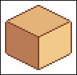 Isometric pixel art is any object that has defined angles and rules you abide by so that it is shown in a 3/4 view (or a variety of other angles, but this is most common.
Non-isometric pixel art that does not follow the rules of angles and as such allows for much more artistic freedom.
Step 4. Follow a plan. . . and practice, practice, practice!
Now that we have covered the basics, why don’t you give pixel art a shot? I have had many people ask me how they can become better at pixelling and the only thing I can say it practice! I am amazed at how far I have come just in the past year of pixelling, mostly from trial and error.
I prefer solely to work in non-isometric form. This is simply personal preference. I started out working with a lot of dithering, but I have found that I enjoy cel shading much more. I like the “cartoony” feel you can achieve with cel-shading that you often cannot when using dithering as a shading tool.
I always start with simple outlines. You never want your outlines to be all one color though. They should be the darkest shade of whatever object you are outlining. Follow this up with a quick color fill in each section so you can get a general feel for the piece, then add more colors. I like working from dark to light as I find it easier.
I feel it is now time to mention that a large part of pixelling is the fact that you are tricking the human eye into seeing what the brain wants to.
What I mean is, small gaps in a line can appear smoother and make your piece less jagged. This is why it is so important to pick the right color palette. If you don’t, you won’t be able to trick the eye into seeing what you want it to.
Trial and error is the best way to figure this out. However, if you have Photoshop or GIMP you WILL be able to “cheat” a little bit—simply create duplicate layers and change your opacity levels to find the perfect midtone between two colors.
Good luck and happy pixelling!
This post may contain affiliate links.