I don’t know how I came across these posters, but they’re too good to keep to myself.
All of them date back to the Great Depression and give a glimpse of American culture in the ’30s and ’40s.
More than that, they’re also good examples of how artists used specific techniques to overcome the limitations of their medium. All of these posters were made by either silkscreen, lithograph, or woodcut, and as such were limited in color and detail—and yet many of them are so well done you’d never realize it.
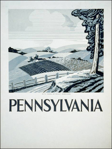
This Pennsylvania poster is made with only one color, I believe (or one plus black) by using different values of blue from a single blue ink. You can see how the artist made the most of it by creating texture and depth through his use of line quality.
In contrast, the next poster uses at least three colors, and drew on pointillist methods to create both the texture of the plowed earth and the glow of the morning sky.
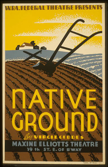
And when the subject matter threatened to be dull, a common method back then (and still today, as you can see in both the movies and photography) was to tilt the subject in order to create more dynamic, diagonal lines and angles.
A good balance of positive and negative space also helped that poster quite a bit.
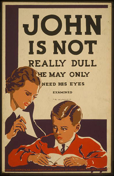
Of course, looking back on this time period, there’s a lot that strikes me as funny, just because of the nature of society then. But maybe we can also learn something artistically from their direct approach as well.
Many times people assume that great art should be shrouded in vague intellectualism. But I think boldness and brevity in art is charming all by itself.
Here’s another poster I thought was fantastically done.
I’m not sure if I like these more because of my background in design, or just the nostalgia of it all.
And if you’re ever in a rut with your art, why not think about using some of the styles and methods of the past?
Take a look at what makes these posters great. They use just a few colors, strong shapes, visual texture, balanced positive and negative areas—all the ingredients of good compositions whether you’re a painter, a photographer, or anything else.
So give it a shot. Simplify, be bold, and see what happens.
And if you want to see more, just head over to the WPA posters page at the Library of Congress.
This post may contain affiliate links.