There’s nothing more frustrating when painting then not being able to mix the right color. When I first started oil painting, it didn’t matter that I could see EXACTLY what color I needed, because everything I mixed up still turned into mud.
In the end, it just took a little more understanding of how color works, so today I’m going to share exactly what I learned, and how it helped me. Let’s get started!
First, what colors do you need?
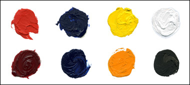
The eight colors I list below are all that I use when painting, and all of them can be purchased fairly affordably at Blick. (If they offer a “light” “medium” or “deep” for any particular color go with “medium.” You can also see my full list of oil painting supplies for beginning painters here.)
The top-left red is Cadmium Red, and the red below it is Permanent Alizarin Crimson. The two blues are harder to distinguish over the computer, but the top one is Ultramarine Blue and the other is Phthalo Blue. My yellows are Cadmium Yellow Light on the top row, and Cadmium Yellow on the bottom row(which is practically orange).
Titanium White and Ivory Black also are on my palette, but I use them sparingly. There’s no green, or any other intermediate colors, because I can mix every color I need with those eight colors of paint. At the end of this tutorial, you’ll probably be much more confident that you can do the same, so feel free to bookmark this page if you’d like to use it as a reference later.
Now, here’s my most important color-mixing tip
Before we get too far in, you’ll need to start thinking about color differently—that every color actually has another color in it too.
Sound weird? Well look at it this way: Some yellows are more “orange” than others, which means they have more red in them. Some blues have enough yellow in them to make them green. And so on.
There’s no perfect blue, or perfect red, because every color you see leans one way or the other around the color wheel. So when you mix blue paint with yellow paint to make green, you’re also bringing together two other colors into the mix—and that’s exactly what makes color mixing difficult!
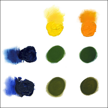
With the paints I use, I have four different ways to make green. I can mix Phthalo Blue (the top blue in this next image) with either Cadmium Yellow Light, or Cadmium Yellow. My other option is to mix Ultramarine Blue (the bottom blue) with either of those yellows.
As you can see, the most vivid green possible is with Phthalo Blue and Cad Yellow Light. Why? Because both colors already lean towards green in the color wheel!
If I use Ultramarine to make green, then I’m adding a little red to the mix, since it looks a little more purple/violet (and therefore learns toward red). Because red is directly opposite of green on the wheel, I’m essentially neutralizing the green as I mix it, making it more brown than it needs to be.
If I go one step further, and mix Ultramarine with Cadmium Yellow (my “orange” yellow) then I’m adding even more red to the mix which is great if I want brown, but not good if I’m looking for green!
The truth is, neutralizing colors is easy: you just add a bit of whatever color is opposite on the wheel. But getting bright, pure color takes knowing which paint colors won’t automatically dull down another color.
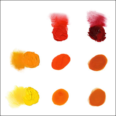
So how about making orange? Again, I’ve got four options.
The same rules apply here as they did for mixing green: if you want the most vivid orange, mix a yellow that leans towards red with a red that leans toward yellow.
Cadmium Yellow and Cadmium Red (in the upper left) make a brilliant orange-red that’s fantastic to paint with, and Cadmium Yellow Light (in the bottom left) and Cadmium Red come up with a great color too. Actually, they make just a slightly more vivid orange than Cadmium Yellow is right out of the tube.
But mixing Permanent Alizarin Crimson with either of the yellows will always make your resulting orange a bit more neutral, simply because that’s a more “blue-ish” red.
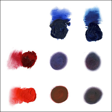
What Permanent Alizarin Crimson really is good for is making a purple or violet color, since it’s already got some blue in it.
Alizarin Crimson and Ultramarine (top left pair) give me the best result; and really no other combination compares.
Look at what happens when I use Ultramarine with Cadmium Red (bottom left). There’s so much yellow in Cadmium Red that it completely dulls down the blue and all I’m left with is a brownish maroon color.
And try as I might, all I can get with the Phthalo (by keeping a tight reign on the Cadmium Red) is a dark gray blue.
By now I hope you won’t be surprised that there are hidden colors lurking in your black and white paint as well.
Ivory Black is really a dark, neutral blue, which shows up a little bit when you mix it with white. The white I use, Titanium White, is great because it really doesn’t have that much other color in it.
At the beginning of this article I mentioned that I use black and white sparingly. The reason for this is that they’re completely neutral colors, and using them will always take away the vividness of your other paint.
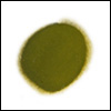
For example, if you mix black with yellow you’ll quickly find out that you don’t just get a darker yellow. Ivory Black actually turns yellow into a kind of muddy green.
And oddly enough, the two best tips I can offer new painters is to work with a clean, organized palette and ALWAYS clean your brush before mixing a different color.
I don’t mean you have to completely clean your paint brushes with turpentine in between every brush stroke, but having a newspaper handy to quickly squeeze most of the paint out of the bristles isn’t that hard.
Finally, just be deliberate when mixing colors—take your time if just starting out. Your hard work will pay off if you follow these guidelines and before you know it, matching the colors you see in life will soon become second nature.
(PS, once your masterpiece is finished, make sure to take a great photo of it for your portfolio or website. Check out these tips for photographing your artwork.)
This post may contain affiliate links.

