Kansas City artist Tina Donovan’s works with a fascinating mix of patterns, upcycled stencils, and bright, hand-painted (or spray-painted) colors.
It’s a style that clearly pays tribute to both collage and graphic stencil artwork, yet Tina still manages to be completely unique, creating cohesive abstract landscapes with just a hint of layered depth.
Curious to see what I mean? Then read on!
Inside You, below, depicts a modern cityscape inside a stenciled outline, against a backdrop of colorful stripes over a monochromatic pattern. Shadows abound, pulling each layer forward while pushing the one behind it back, unifying these separate elements and giving a sense of transparent depth to the entire piece.
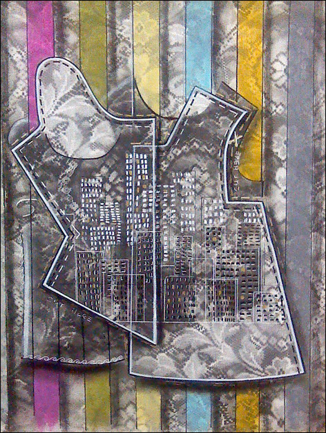
I absolutely love those vertical bands of color. . . they’re so simple, yet so important to the dynamic nature of this piece. But then, notice the far right band—unlike the others, it’s a neutral gray-blue (so neutral that it’s almost lost in the desaturated background).
It’s no accident that it makes a perfect “stop” for our eyes, keeping us circling back, over and over again, to Tina’s surreal, floating skyscrapers and the ambiguous stencil shapes that surround them.
In Interweb, a group of outline-only figures controls (or is controlled by, or maybe some of both) a network of lines which connect them all together from point to point.
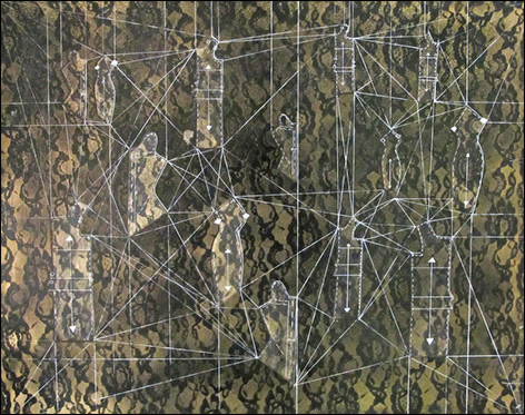
The figures seem to move, strive, perhaps even writhe, but the lines show no remorse. They are geometric and strong, perfect connections that cannot be broken, no matter how much each figure struggles to be apart.
And lastly, Labyrinthine Invert is a brighter, more chaotic landscape (which may also contain a portrait, or perhaps a figure. . . or even more).
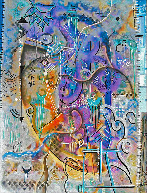
Symbols and lines and shapes coalesce and break apart, and come together again like a cosmic dance. It feels exuberant at one moment, and introspective the next. And maybe it’s just me, but it seems like Tina’s use of extreme warm oranges and yellows so close to cool purples and blues bring a sense changing hours, like the final notes of a sunset, or the early colors of dawn.
In fact, there’s so much going on there that it’s probably worth looking at a bit longer.
And when you’re finished, head on over to Tina’s website and see more of her beautiful artwork. If you like what you’ve seen so far, I guarantee you’ll love it.
This post may contain affiliate links.