I know. . . the term “Negative Space” usually applies to painting and drawing. But calligraphy, being a fine art, also uses negative space.
What is negative space?
Negative space is that area around and between an image—or, for our discussion here—the space around and between letters.
Negative space includes “counters” as well. When you make an “O” (for example) you’re enclosing a circle of blank space in the center of the letter which is called a counter. It still belongs to the letter, it just usually doesn’t have anything in it.
But we’re artists—so let’s go ahead and do something with it! It’s much more exciting to use color, line, texture, or shape in the negative space.
Examples of negative space in calligraphy:
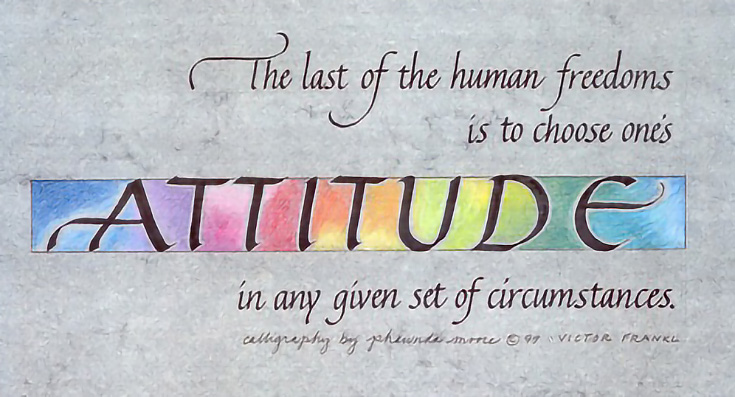
In the word “ATTITUDE” below, I used color in the negative space arround those letters. The colors create emphasis and also express the meaning of the quote.
For the bookmark, “KAITLYN,” the color is in the letters, while an intricate pattern fills the negative space around them. It can be a little more challenging to work on a dark background, so aim for drama with high contrast!
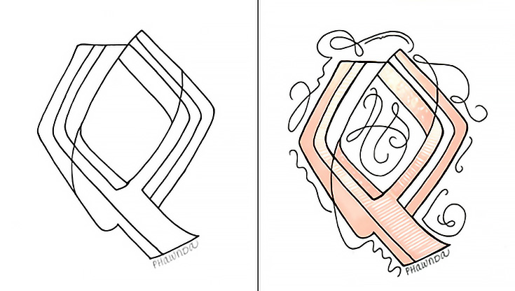
In the “Q” seen below on the right, I drew flourishes in, around and through the letter. I connected the lines of the letter with the flourish to achieve unity and interest. Curvy lines add variety to the straight lines of the letter.
This is a bit different treatment of negative space, but compare the plain Q on the left to the flourished, peach Q on the right—which do you find more interesting?
3 tips for designing negative space:
1. Create strong contrast to existing design. If the lettering is light, use dark colors for negative space; readability is important. Experiment with different kinds of contrast: line width, color shade, etc.
2. Add rhythm or repetition, as shown in Kaitlyn. I subtly repeated the letter shapes in black patterns on black paper.
3. I often find that a border helps. But not always—sometimes (like the Q), the lines need the freedom to breathe.
All of my examples began on graph paper, using a pencil and eraser. Try varying weight, color, slant and lines until you have something “positively pleasing.” Be patient with the process. You can do it!
Learn more on my Facebook page, Calligraphy and Design by Phwanda.
This post may contain affiliate links.


