The master of masking, the architect of art, the sultan of splash! Cathy Read of Manchester assumes all these identities and more with her simultaneously precise, yet free-flowing artistic style.
How does she do it? She starts with detailed, structured urban drawings, then accents them with fluid, expressive watercolor and acrylic painting techniques that breathe life into the scene. Take a look. . .
When you walk the same streets every day, they can become redundant. You stop observing the sights, and instead, turn your focus on each cement block in the sidewalk as you pass them by. Catching a Tram from the Library take this seemingly routine moment and makes it an adventure again!
Happy yellow and blue complimentary colors make the street jump to life, underneath a brilliant cold blue sky of fall. Those waiting for the tram have coats buttoned up to their chins, but the cool weather isn’t enough to keep them from stepping out into an absolutely gorgeous day and exploring the city!
I absolutely LOVE Cathy’s use of black smudges, cracks and imperfections in the scene, such as those along the tram lines and on the buildings’ foundations, as they add so much character to the city.
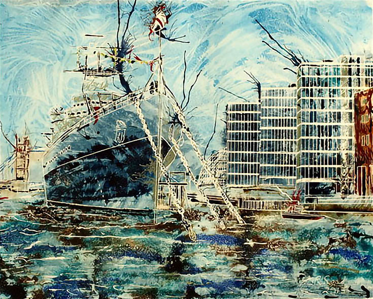
And you thought skyscrapers were huge. . . Cathy uses perspective and perhaps a little artistic license in HMS Belfast to make the ship appear gargantuan (which isn’t far from the truth, considering that it’s 613 feet long!)
Although docked, the rustling waters and active sky (portrayed with quick, thin strokes that open it up) make the ship appear to be swaying from side to side in the breeze.
The colors are equally compelling—I love how she matched up that crystalline blue with rusty brown hues. They set each other off in a truly lovely, almost antique-looking way. Meanwhile, cerulean and midnight blues detail the water’s depth and make me wonder what could be swimming below the tossing water.
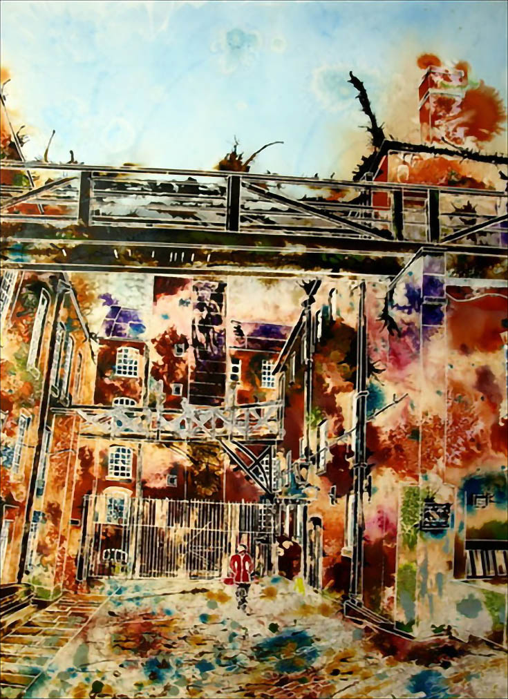
Lastly, festive fall hues dapple the canvas in Alone at the Mill like crunchy leaves falling softly all around, while a pensive figure dressed in red walks down the middle of the street, looking up at the rail jetting out overhead.
This is a piece in which I really take notice of Cathy’s masking expertise. Look closely to see each crack in the paved sidewalk stand out, as well as the multi-paned windows, small decks along each apartment and foundational outlines.
The detail she is capable of putting into each piece without it getting muddied or confusing is remarkable. Then—suddenly in the depths of the painting—I encounter these bright purples, greens and blues that lift the painting to another level. Not only that, but within the scene is a reflection of the history, personality and atmosphere of this particular place. What’s not to love?!
Cathy has an abundance of equally stunning architectural pieces on her website, so what are you waiting for? Get on over there and see for yourself!
This post may contain affiliate links.


