A grisaille (pronounced, gree-zay) is a form of drawing or painting that involves a detailed, monochromatic image, often created entirely in shades of black and white. In many cases, the next step is to glaze color over the grisaille, to create a finished drawing or painting.
But grisailles don’t HAVE to be black and white.
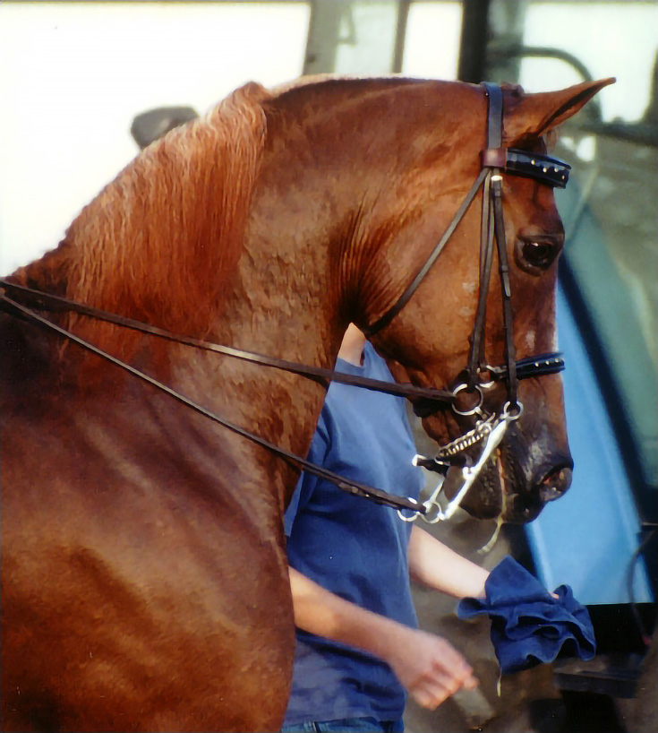
Like any other underdrawing, a color grisaille can work well as the foundation for your subject—just as a long as you choose a good complementary color for your finished piece. So today, I’d like to show you how I developed a complementary grisaille to draw this horse:
Before we begin. . .
The terms “grisaille” and “underdrawing” are sometimes used interchangeably. For the purposes of this article, a grisaille is simply a more detailed and finished form of underdrawing. In other words, all grisailles are underdrawings, but not all underdrawings are detailed and finished enough to be grisailles.
Whether you draw freehand, use the sight-size method, a grid system, or some other drawing technique, if you’re following along with this tutorial, you should attempt to draw every detail that you’d like to appear in your finished piece. In colored pencil, details get lost too easily if you don’t include them from the very beginning.
As an additional note, this demonstration was drawn on a very light gray paper, but a grisaille also works with white or any light-colored paper. It’s less effective with dark papers and may be more difficult because you develop light values instead of dark when you use dark paper. But it IS possible and the resulting drawings can be very impressive.
Now, on to the demonstration.
Step 1. Start with a detailed drawing
I do all my initial color with Verithin pencils. They have a harder lead and are made with less wax binder, so I can put down many layers without worrying about wax build up. Verithins are also easier to erase when I make a mistake, they hold a point much longer, and they’re fabulous for drawing fine detail.
Since this is a complementary grisaille, I drew it with colors that are opposite on the color wheel from the colors in the reference photo. (Where I see shades of red in the photo, I draw them with shades of green, for example.)
I began with Apple Green on the horse and Ultramarine and Grass Green on the bridle and reins. I used light pressure with every layer and developed values by adding layers. The more layers, the darker the color.
When you’re drawing a grisaille, it’s never too early to begin developing detail of this type. From the first stroke, I worked toward developing smooth layers of color. I took time to develop detail and create the illusion of three-dimensional form.
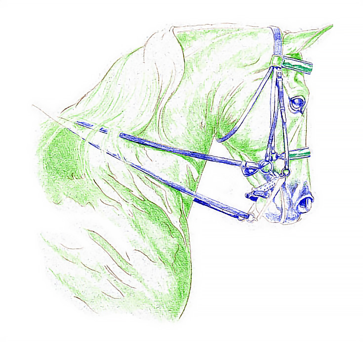
It’s also important to work carefully and with light pressure. I almost always use the lightest possible pressure in the early phases of a drawing because it’s much easier than working fast and having to make corrections. And when I do have to make corrections, it’s much easier to lift or alter layers of color that have been lightly applied.
Notice how the highlights start to jump out, as darker middle values are added around them. The drawing is quickly becoming well-developed, even at this point.
Step 2. Add layers and focal point details
I switched to Prismacolor thick lead pencils for the next step and Blue-violet, I started with the muzzle and worked upward and backward into the horse’s face, neck, and shoulders. When the first layer was complete, I added a layer of Ultramarine in the shadows.
That was followed by Indigo Blue, which I used only in the shadows and darker middle values. I used tiny, circular strokes and light pressure to get even coverage. Next, I added another layer of Indigo Blue to the horse and bridle alike. Again, I used light pressure and kept the pencil sharp.
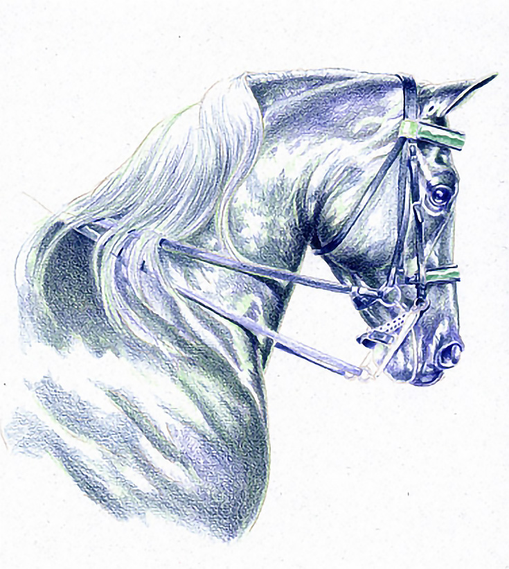
Because the focal point is the eye and face, I darkened shadows and added detail to those areas. I also darkened parts of the mane to enhance the feeling of swinging hair and to add mass.
Notice how the grisaille is taking on a three-dimensional shape. Colors are also developing—on a complementary basis, of course.
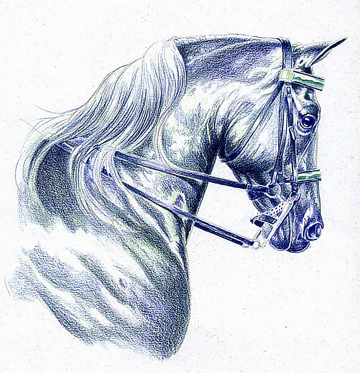
Step 3. Darken and blend colors
To complete the grisaille, the value range was broadened by darkening shadows. I also added detail to the buckles and rings on the bridle, and when I’d applied all the color I wanted, I smoothed the color layers by blending lightly with rubbing alcohol.
There are other ways to even out color. Using a piece of paper towel or facial tissue (make sure it doesn’t have lotion) are good ways to blend color. Simply rub them over the drawing with medium to medium-heavy pressure.
For a more thorough blend, turpentine or rubber cement thinner are your best choices. If you use a liquid solvent, though, test a scrap of paper first. You’ve put too much work into the grisaille to risk losing it because the paper buckles!
Here is my finished grisaille. It’s ready for glazes of color to finish the drawing.
The great thing about using a grisaille to start a drawing is that you can work out all the necessary details without having to worry about color. It’s quite liberating!
And, if your grisaille looks great already. . . well, you may decide that it’s finished as-is. Good luck, and happy drawing!
This post may contain affiliate links.