Have you ever seen a landscape painting that looked so real, it seemed like you could walk right into it? Or maybe you’ve recently stumbled upon a big, bold abstract that reached out and grabbed you from across the room.
Do you know the one thing both of those (very different!) types of paintings have in common? Edges.
That’s right—the best paintings contain a variety of edges, from hard and crisp to soft and blurred. Subtle edges mixed with dramatic, in-your-face edges.
You can draw convincing edges in many different ways, with and without special tools, and today I’m going to share 4 of my favorites. Using a mix of these edges in your own art will instantly take your work to the next level. Let’s start with the simplest:
1. The outlined edge
The outlined edge is the most basic. If you had coloring books as a child, you worked with outlined edges.
In this case, I’m not talking about doing heavy outlines on every part of the drawing. What I’m talking about is lightly outlining small areas before applying color.
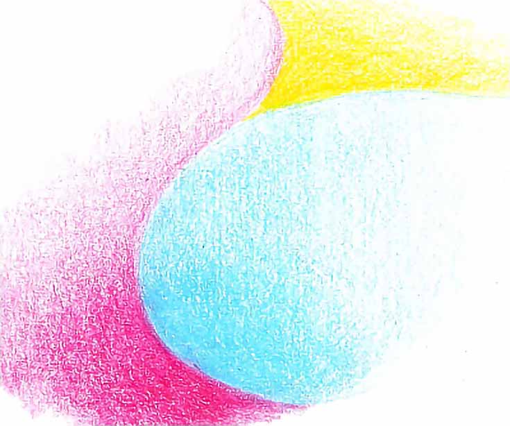
In the illustration below, I outlined the red area and blue area with the appropriate color. The pencils were sharp and I used light pressure to draw each outline. Whenever possible, I drew an unbroken line and did not draw over it a second time. Each area was then filled in with color.
I used several layers applied with light pressure and followed the contour drawing carefully, making sure color stayed within the outline. The darker areas were developed slowly and with gradually increasing pressure. I didn’t use heavy pressure with either the red or the blue, though I could have done both had I wanted better color saturation.
I didn’t have to outline the yellow shape. The red and blue shapes had already defined the area I wanted to be yellow. Because yellow is a lighter color, I started with a medium-light pressure and finished with heavy pressure.
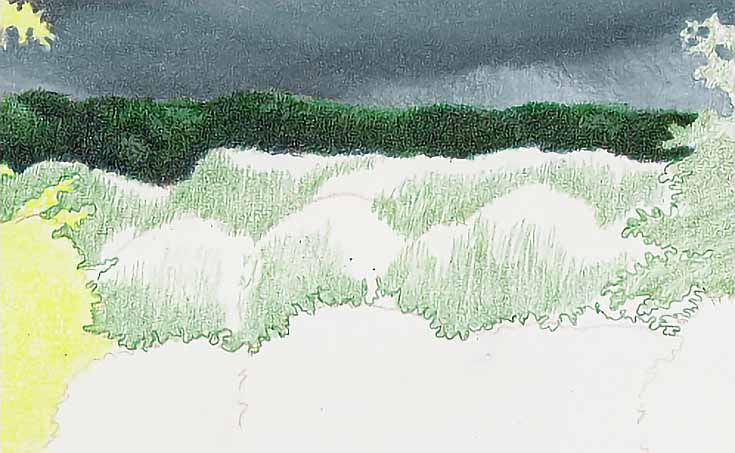
This type of edge works well wherever you want a sharp, well defined edge. You can use a straight-edge, French curves, or a hand-made tool to outline the shapes you want, but you can also outline free-hand, as I did with the work-in-progress illustration below:
As you can see, the mass of trees making up the middle-ground has been outlined along its outer borders. Then I began adding color to the individual trees. The first layer is complete.
(Notice that the tree outline is darker than the first layer. It’s important to draw the outline dark enough to be visible through two or three layers, but you don’t want it so dark, it shows in the finished drawing.)
2. The no-outline edge
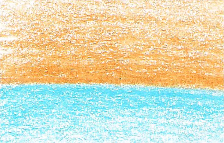
In this method, you don’t outline first. You simply begin adding color. Color is applied in parallel strokes along the edge, as shown below. Although my example shows a fairly straight edge, this method can be used for other shapes, as well.
In the image above, I started with heavier pressure where the two colors meet and decreased pressure as I worked away from that edge. After several layers, I had a nice dark color on either side of the edge without having to use heavy pressure and without actually drawing a line.
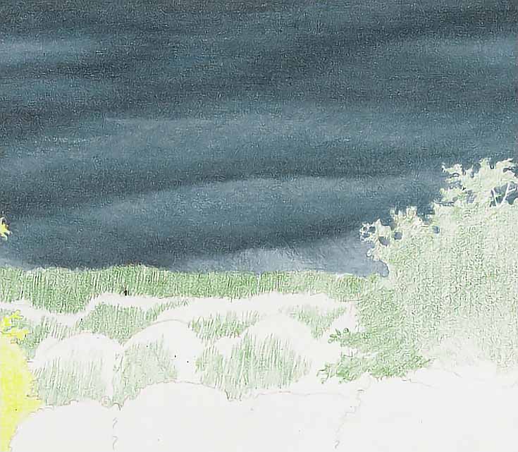
This edge is better for larger areas (like a horizon line between ocean and sky) but it can be useful in smaller areas as well. In the drawing below, I created edges between cloud masses without outlining first.
Transitions from light to dark were drawn layer by layer, with light values placed alongside dark values. The resulting edges are well-defined, but softer than if I had outlined them first.
3. The end-to-end blunt edge
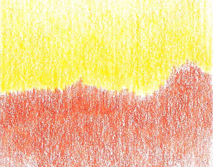
This edge is created by stroking against the edge, instead of along it, as I did above. In the following illustration, I used parallel strokes, but the yellow strokes and orange strokes meet end-to-end instead of side to side.
I used medium-light to medium pressure and increased the pressure slightly from one layer to the next. The colors do not overlap at all. They meet and in some cases, they touch, but there is a very well-defined edge between them.
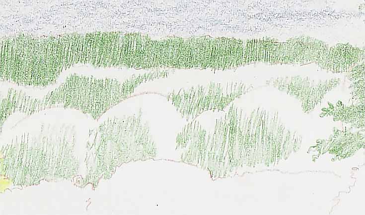
Notice how the orange shape mimics the shape of a grassy hill or a tree line against a yellow sky? This is the type of stroke I use most often when drawing natural landscape foliage, as demonstrated below.
It’s also useful in drawing the fur or hair on a variety of animals, especially if the fur is striped, spotted or features multiple colors in some other way.
4. The feathered edge
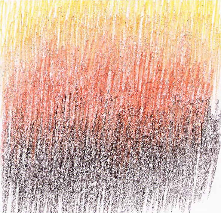
This edge is my favorite. I use it when drawing landscapes, animals, and in many other situations. It’s a softer edge because the colors overlap, allowing you to blend color by laying one color over another. You can blend just two colors or as many colors as necessary.
In the illustration below, I used four colors—yellow, yellow ochre, pumpkin orange, and dark umber—to draw values from the white of the paper to the darkest brown.
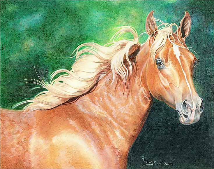
This edge is ideal for drawing transitions between dark and light values when you also want to show texture. In the example below, you’ll see the shoulder of a horse. I began by layering light colors over the areas around a bright highlight on the shoulder, then adding colors that were increasingly darker over that.
I used a directional stroke and medium pressure (normal handwriting pressure) to stroke in the direction of hair growth, overlapping colors as necessary to get the right color and shape.
Notice how each layer of color helped define the shape of the highlight without creating a blunt edge. While this method is perfect for short hair like that on a horse, it’s also great for other types of fur and even for grass.
Here’s the finished portrait. Even at this size, you can see the edges I’ve described above and you can see how each one contributed to the overall drawing.
If you take one thing away from this article, let it be this: edges are important no matter what medium you prefer or what type of art you create.
The more ways you can create and develop edges, the easier it will be to get the look you’re after for each drawing or painting—and the more versatile an artist you will be.
This post may contain affiliate links.
