In my last two articles, we looked at how surface texture affects values and at ways to enhance contrast by pushing value ranges to their limit. This week, we’ll put those two things together in a single drawing.
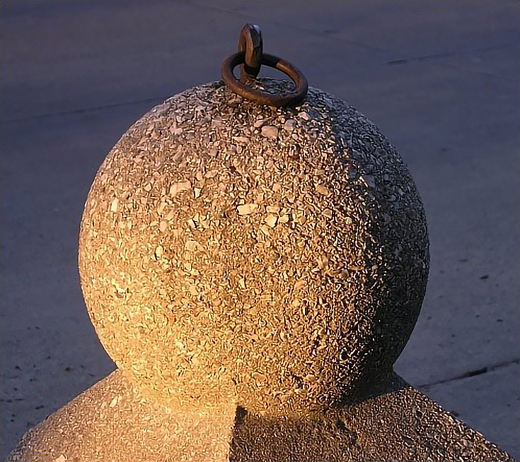
Here is the reference photo of the object I’ll be drawing today. It’s an old-fashioned hitching post for horses, made of stone and cement with lots of great texture and roughness.
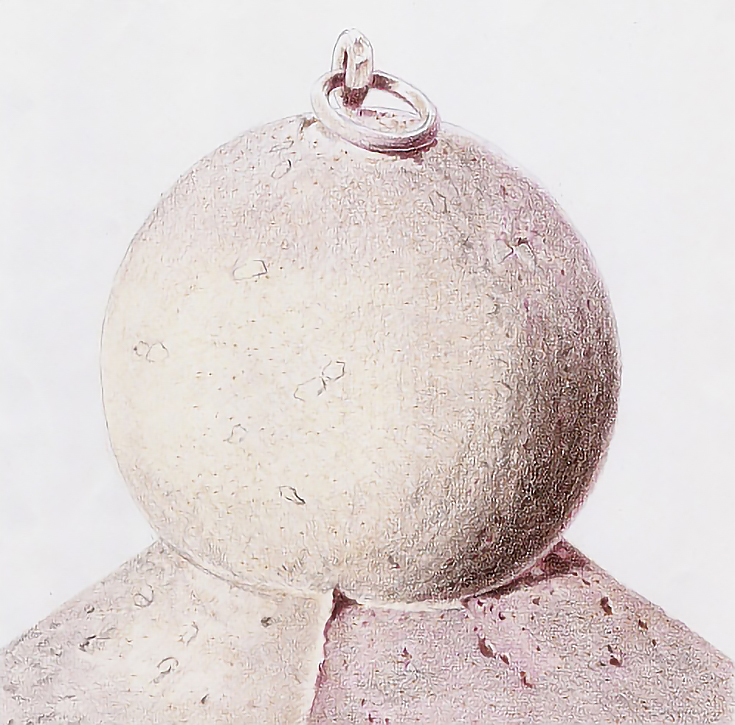
Before I dove into texture or color or anything else, I started with a precise drawing that shows the edges of shadows, reflected light, and a few larger details. Here it is:
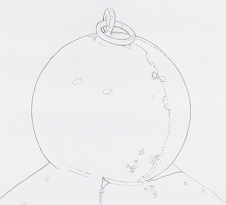
No matter what object you’re drawing, make sure to begin with a similar outline. This will be your guide throughout the drawing.
Step 1: Lay down a base color
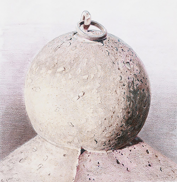
Work begins with a base color. I used Cream in the warm sunlit areas, Rosy Beige in the cool sunlit areas, Clay Rose in the lighter shadows, and Black Cherry in the darker shadows and the iron ring. In each area, I used very light pressure and loose, open strokes following the contour of the shape. I overlapped the colors enough to keep edges from appearing.
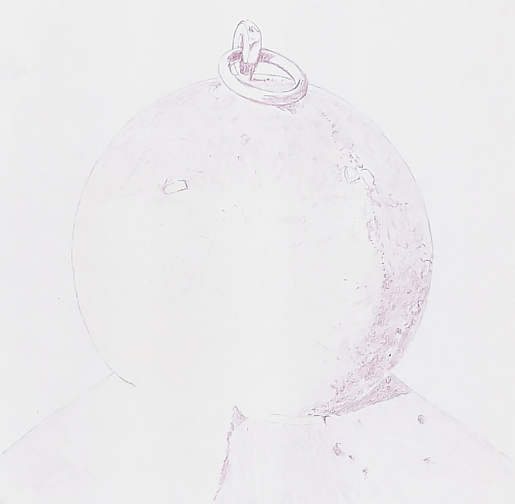
For subsequent layers, I suited the stroke to the area, but continued to use light pressure. In the darkest shadow, I used more precise strokes, but overlapped the strokes randomly to begin creating the coarse surface.
In the lighter shadows and cooler highlights, I used a combination of randomly placed, crosshatching strokes and followed up with a few squiggly strokes and stippling to add details. In the warm highlights, I used squiggly strokes and stippling to add Rosy Beige and Clay Rose accents.
I used Black Cherry with light pressure and directional strokes placed close together to draw the shadows and give shape to the ring.
Step 2: Add your basic texture
Found texture played a major role in the next step. I swept the front walk, placed my paper on it, then used Bronze to stroke the paper. I stroked from right to left to make darker color on the shadowed side of the “hilly texture” throughout the globe.
On the shadowed side of the globe, I used slightly heavier pressure, multiple layers, or both to make darker values. In the middle tones and lighted sides, I used lighter pressure, fewer layers, or both.
Because the texture on the globe should be the most distinct where shadows and middle tones meet, I made the found texture more distinct in that area.
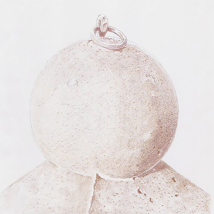
When I was satisfied, I moved inside again and continued layering Bronze over the drawing. Again, I used slightly heavier pressure or more layers to darken the shadows.
Throughout the drawing, I used short directional strokes that didn’t overlap very much to continue building the illusion of a rough and pitted surface. In some areas, I preserved highlights on the lighted rims of pits.
I worked around the general area of the highlight with light pressure and open, directional strokes. There is no clear edge to the highlight, but there is an area that is generally lighter than the surrounding middle tones.
Step 3: Add some warm and cool shadows
I used a blunted pencil tip to glaze Black Cherry over the base shadows with long, parallel strokes. Then I added darker accents and darkened the shadowed side of some of the surface texture to emphasize the coarseness of the base.
On the globe, I used short, hatching and crosshatching strokes applied with the flat side of the pencil tip to glaze Black Cherry into the form shadow then added darker shadows and accents throughout the shadow.
Finally, I used the sharp edge of the pencil tip to glaze Black Cherry into the shadows on the ring and post.
Next, I added Sepia to the cast shadows, working around some of the surface features and darkening some of the pits. I used medium pressure for most of this work.
I also glazed Sepia with light pressure and the side of the pencil into the sunny side of the base and the middle tones on the globe. For the ring and post, I used the tip of the pencil and medium pressure. In the globe, I drew a few more surface details to emphasize the texture.
Then I glazed Rosy Beige into the lighter shadows on the sunlit side of the base, and followed that with a glaze of Cream over everything but the ring and post. I used the tip of the pencil, but didn’t sharpen it first. The bluntness of the pencil helped me “skip” color over the paper and create further texture.
I then used the same method to glaze Rosy Beige over the top of the globe and Clay Rose over the lower half of the shadowed side.
Step 4: Develop additional value and color
I began developing values by adding Clay Rose, Slate Gray, and Sepia to the background. All colors were applied using the tips of sharpened pencils and horizontal strokes.
I darkened shadows with Indigo Blue applied carefully around the surface features. I added pits and stones within the shadows but also emphasized the irregular edge of the form shadow by adding pits and stones along that edge.
Then, because there is a lighter shadow above and to the right of the dark shadow, I switched to Sepia and used a sharp pencil to work around the surface details within the shadow and along its edges. I also layered Sepia over the Indigo Blue.
For both colors, I used medium to medium-heavy pressure.
Next, I applied Slate Blue and Rosy Beige into the reflected light areas. Finally, I glazed Dark Brown over the middle tones around the highlight area using the side of the pencil and very light pressure.
Step 5: Push your value contrasts
I continued building contrast and shape by layering the various colors over the globe. But I also layered Sand over all of the globe and base. I did one layer over the lighted areas with the paper lying on the front walk to pick up texture. The next layer was applied in a more traditional manner, with closely spaced strokes to even out the texture.
I followed up with Bronze throughout the globe, but worked around some of the stones embedded in the surface. I burnished the stones with Cream, then with White before glazing Rosy Beige into the cool lighted area, Clay Rose into the cool shadowed area, and Dark Brown over all of the shadows. In the background, I layered Mediterranean Blue to reduce the brownness.
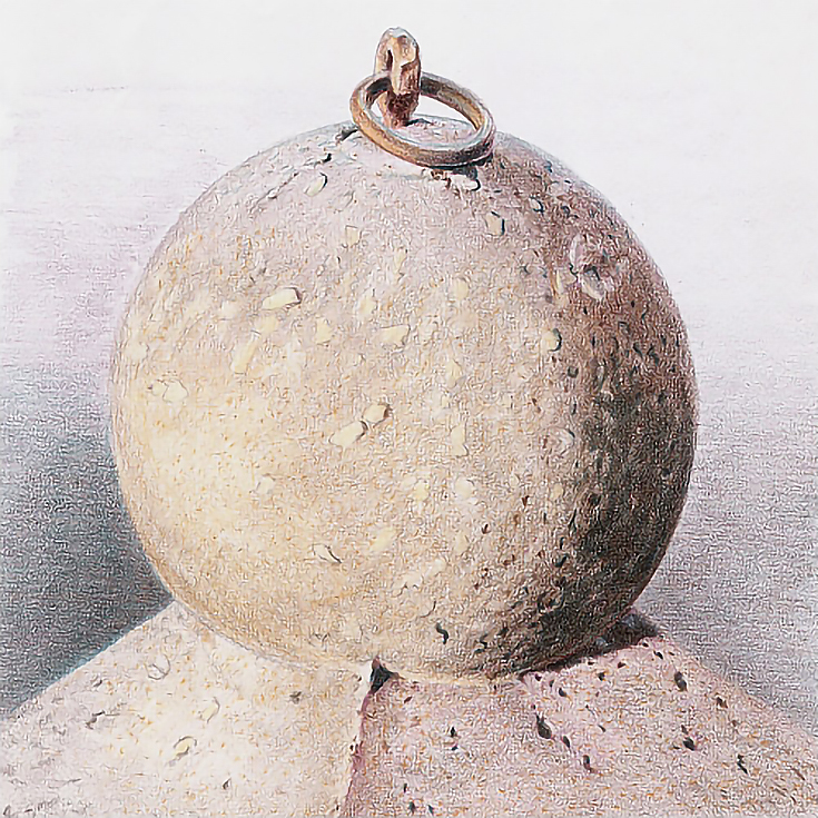
I drew the ring with Red Ochre, Dark Brown, Sand, and White, using slightly heavier pressure with each layer. The highlights were burnished with Sand then white.
For reflected light on the ring, post, and stone, I added Sky Blue Light with medium-heavy or heavy pressure after a glaze of Slate Gray.
Depending on the type of work you do and your subject, you might wish to push the value range even further or add more surface detail—that’s entirely up to you.
Good luck and happy drawing!
This post may contain affiliate links.