When learning to draw and paint, one of the most valuable tools an artist can have is a gray scale value finder.
A gray scale value finder is a bar divided into 10 squares (some might have 8) of various shades of gray. At one end is the lightest light-white value, and the other end is the darkest dark-black. In between are several different values of gray.
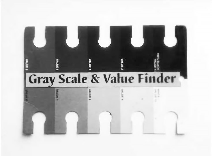
A value finder simply shows you how to check for values—the lightness or darkness in a drawing or painting—and makes it easy to compare them to the colors you see in front of you.
I purchased the gray scale value finder above from my local art store, but I’m going to show you how to make your own. It’s pretty easy, and the process itself will show you how to mix grays and judge values.
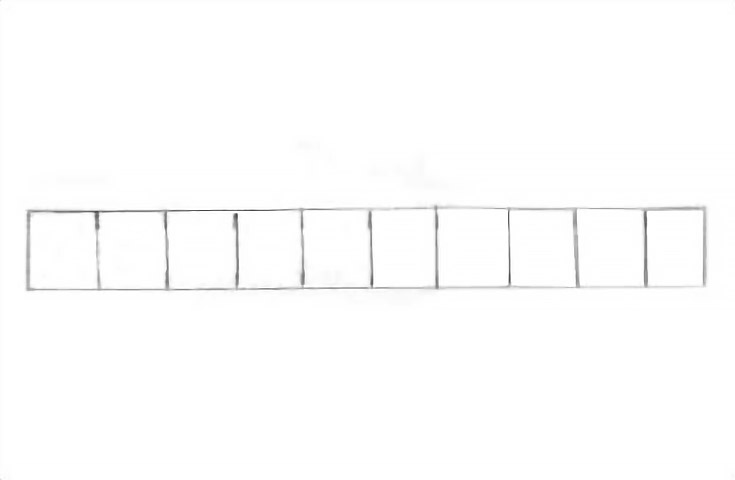
To start, take a pencil or charcoal pencil and make a grid like the image below. You should have 10 squares next to each other, each one an inch in size.
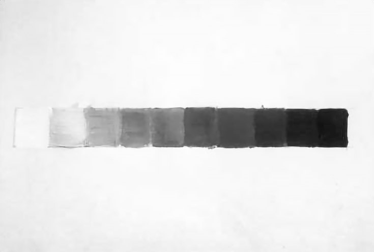
At one end, paint in the square with white paint. For this demonstration I used Golden Acrylics. At the other end paint the square pure black.
Now comes the fun part:
Squeeze out mostly white paint, and a tiny bit of black, in the square next to your pure white paint. Mix it, and you should end up with a very light gray.
Keep adding a bit more black to your white for the next square and the next and so on. You’ll also use less white. Eventually you will end up at the next darkest value before black. . . this square should be mostly black, with just a tiny bit of white.
Your scale should look something like this.
Once you’re done with this step, you can punch a hole in the various boxes (if you’d like) so that when you hold the card up in front of you, you can see how a specific section of the figure, landscape or still life matches up to the value in your value finder.
Move the value finder left or right until the square of gray matches the value of whatever you’re looking at. Squinting your eyes a bit will help determine lightness and darkness.
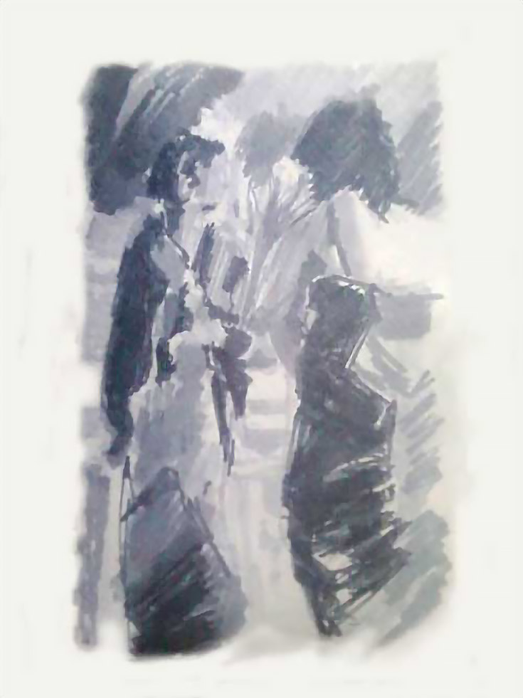
Here’s just one example of a value sketch I’ve made using a gray scale value finder. I’ve blocked in basic grays, from light to dark, in order to get a sense of the overall composition and how the various values play off of each other.
I’ve also recently started doing value sketches with Prismacolor markers (you can use either warm grays or cool grays) and it’s made a huge difference in my final paintings. I use the ones labeled 70%, 40% and 20%.
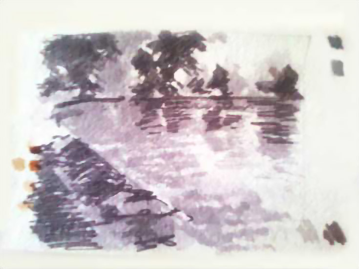
You can see both the warm and cool grays in the sketch above, giving just a bit more control over the compositional study.
Of course the goal of using a gray scale value finder is to achieve a nice range of value contrasts within your preliminary sketches.
By themselves, these sketches aren’t very finished, or much to look at. . . but if you can get good contrast in a simple sketch, and make a composition that pleases the eye, you’ll be miles ahead when you start your final painting or drawing. I can almost guarantee your finished product will be more cohesive and polished.
Good luck!
This post may contain affiliate links.