There are a number of powerful visual areas within a basic rectangle that artists can use to enhance their compositions. Some of those areas we’ve already talked about in our golden ratio tutorial and in last week’s lesson on rabatment.
Today we’re going to look at how the rule of thirds can be used as a tool for enhancing and improving our compositions.
Why the rule of thirds works
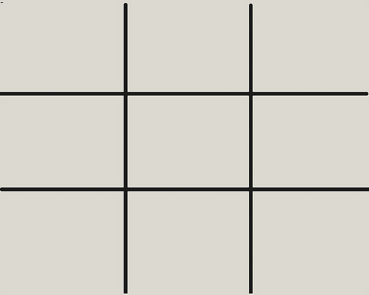
In the diagram below, a rectangle has been divided horizontally and vertically by four lines. The rule of thirds states that the centers of interest for any rectangle lie somewhere along those lines.
Photographers and cinematographers have dubbed the intersections of those lines power points, shown by the green dots here:
Interestingly, these power points occur just within the eyes of the rectangle which we discussed as part of our golden ratio tutorial. In this next illustration, those power points are marked with blue dots while the “eyes” are marked with green dots.
How to use the rule of thirds in your art
Similar to how we’d use the golden ratio or rabatment, by aligning an image with these lines or by placing our focal points near the power points we can give balance to a composition while simultaneously making it more engaging to the eye.
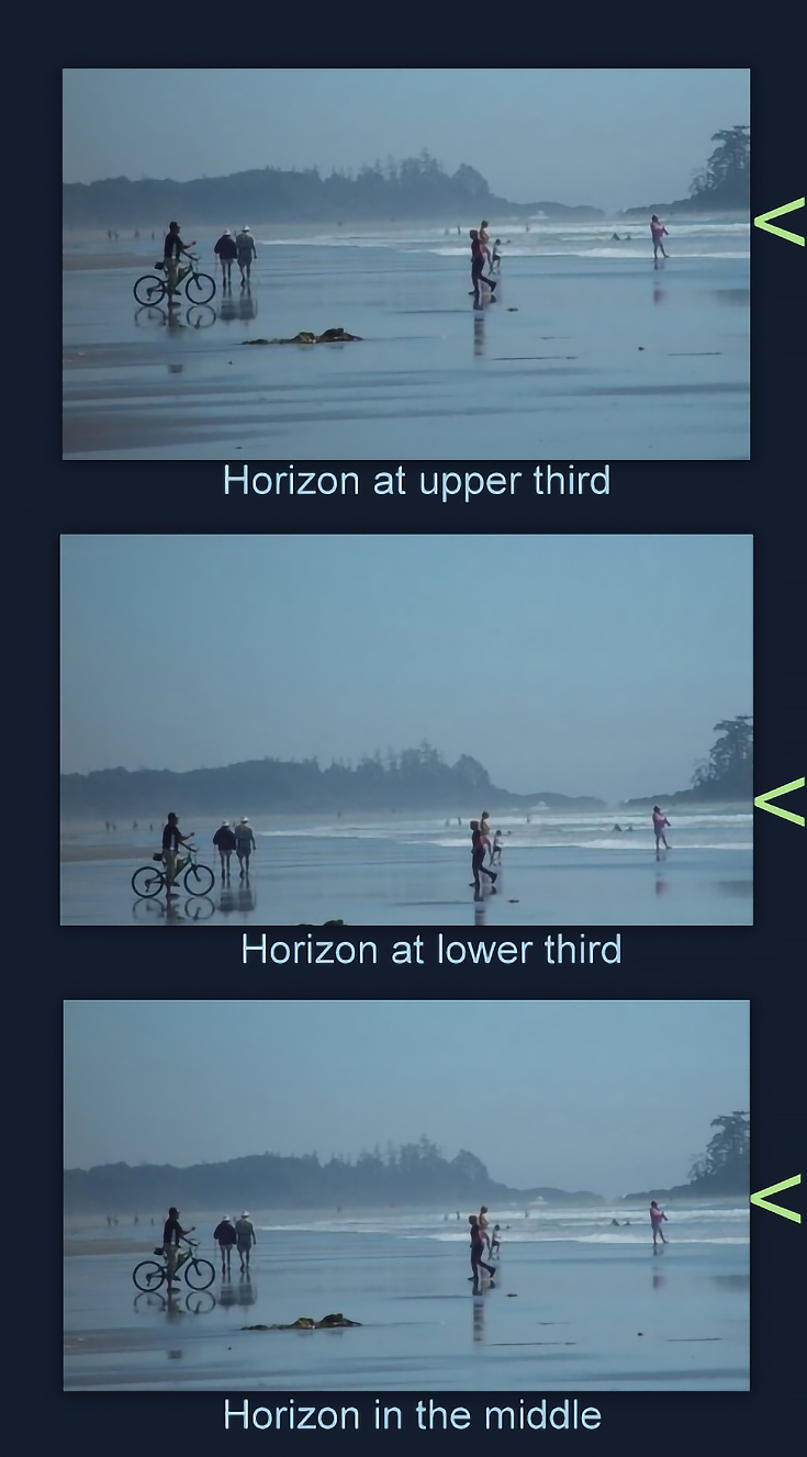
For example, we all know to avoid placing the horizon line of a photograph directly in the center of the image. Putting the horizon line 1/3 of the way from the top or 1/3 of the way from the bottom creates a more attractive composition.
This is the rule of thirds in action. And of course, using the rule on art with vertical elements instead of horizontal ones works just as well.
However, it’s very important to consider ALL the vertical elements in an image when you start aligning things by thirds—take a look at the photos below to see why.
In the left-hand photo there are two strong vertical images—the tent pole and the guy in the red shirt and jeans.
That red shirt against its cooler surroundings is the true center of interest, so by placing the tent pole 1/3 from the left in the first photo we’ve pushed the red shirt to the center and created a composition that borders on the mundane.
The composition of the center photo is even worse. When the red shirt is 1/3 from the right edge, both figures seem to be watching the shiny metal pot leave the picture frame. Unintentionally, we’ve created a visual path that leads the viewer’s eyes directly off the lower right edge of the photo.
Notice the improvement in last photo, however, when we put the red shirt 1/3 from the left. The composition now feels balanced.
Pushing the rule of thirds to the limit
Testing the the rule of thirds (like we did above) can also result in very exciting compositions. Look how Charles Reid successfully teases the rule here:
Both the woman’s head AND her drooping hand are located within the center section of the rectangle. . . yet her face is looking toward the left edge of the painting while her elbow is pointing toward the right.
Those last two factors (combined with the dark square shape on the lower left) result in a push/pull composition that leads the viewer’s eyes back and forth through the power points of the rule of thirds, thereby keeping the viewer’s attention fully engaged.
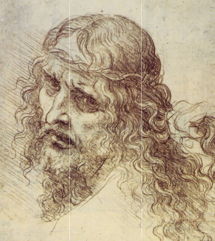
In one of his drawings of Christ, Leonardo da Vinci does something similar.
Even though the face is placed daringly close to the left edge, those eyes pointing back toward the center keep our attention from leaving the image.
Then by drawing the head tilted toward the right third and the hair flowing off toward the right bottom corner, Leonardo created a stunningly balanced yet dynamic and emotional image.
As you can see from the two examples above, compositional genius is often found by testing a principle rather than strictly obeying it. Finding ways to tease, then appease the rule of thirds will always be worth exploring in your own paintings and sketches.
This post may contain affiliate links.


