Close your eyes for a second, then quickly look in any direction. Now ask yourself: what is the first thing you saw? And what caused you to see it?
Did something catch your attention because its color contrasted with its surroundings? Was it all by itself? Or was some other object directing your attention towards it?
Whatever the case, you have just experienced visual emphasis, an effective tool for artists who want to make specific areas of their art stand out and be noticed.
How to create areas of emphasis in your paintings
1. Contrast a shape with its surroundings.

2. Create a contrast of temperature

3. Use a darker or lighter value

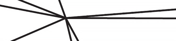
4. Focus attention with converging lines
5. Isolate the object you want to emphasize

6. Increase an object’s intensity of color

Some examples of emphasis in art
Naturally, there are many more ways to create emphasis in your art than just the six methods above. For instance, one way to easily emphasize a central subject in a painting is to use symmetry.
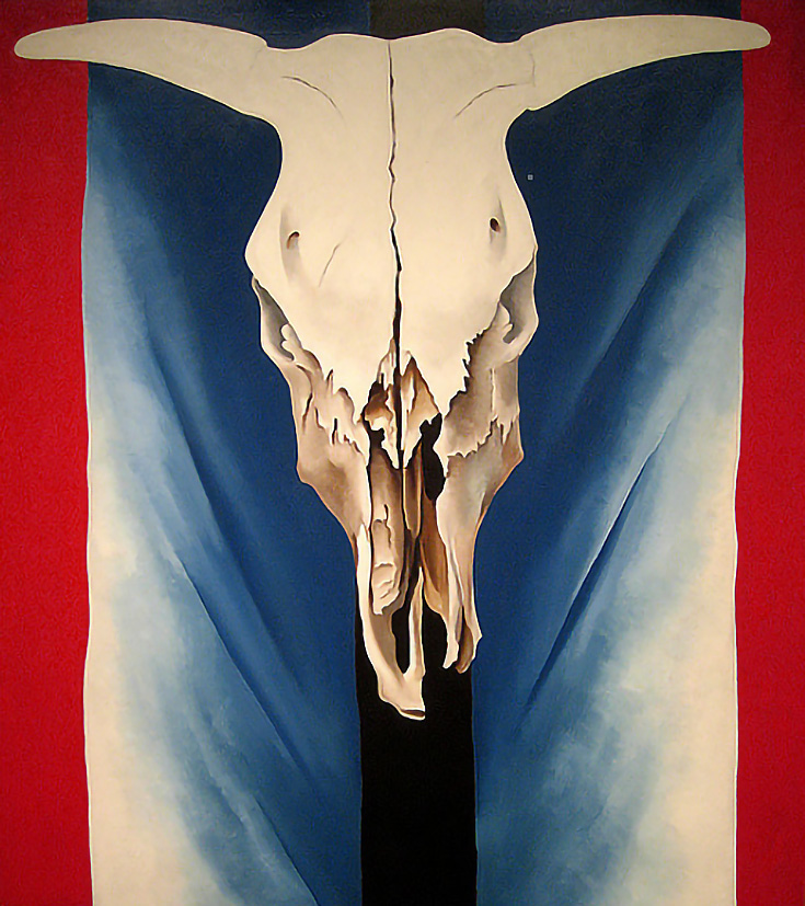
All you have to do is place your subject in the center of the painting and allow either side to somewhat mirror the other. Georgia O’Keefe repeatedly used this method, as seen in Cow’s Skull: Red, White, and Blue.
Leonardo’s Last Supper is perhaps the most famous example of symmetry in art.
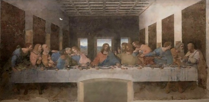
Leonardo positioned the architectural features, the groups of disciples, and several little objects on the table so that, to a great extent, one side mirrors the other.
However, he didn’t just leave it at that. Notice how the lines of perspective all lead towards the head of the central character as well.
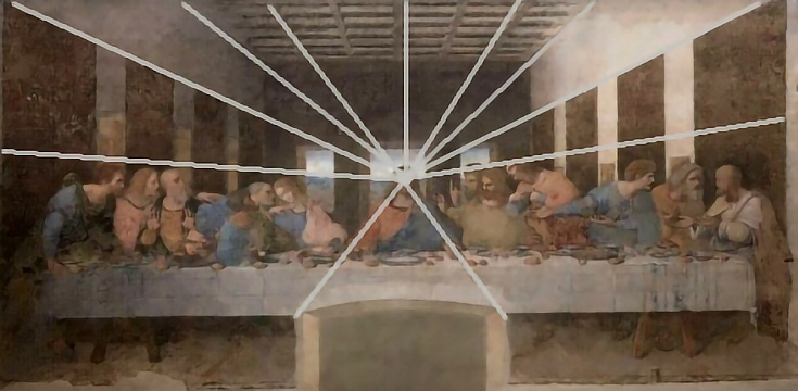
Master of painting that he was, Leonardo manipulated the entire building to guide our attention—but the truth is, we rarely need to go to such lengths.
How to use pre-existing emphasis to your advantage
There are usually points of emphasis already available within a scene that we can put to use. Jennifer McChristian’s painting, California Dreaming, is a perfect example of how an artist can work with areas of emphasis already in place.
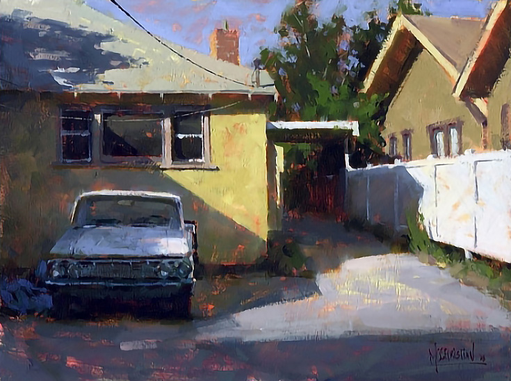
In the painting above, there are a few strong areas of light that catch our attention. One of these is the white fence, which leads us deeper into the painting and up the carport post. Our eyes then continue along the carport’s edge and up to the sunlit roof area, where the light eventually pulls us down to the front corner of the house, then to the car roof and front fender, and finally to the sunlit area of the driveway.
By subtly emphasizing those lighter values and warmer temperatures, Jennifer uses several naturally occurring elements to keep us moving throughout the painting.
Here’s one of my own examples, originally painted from two separate photographs.
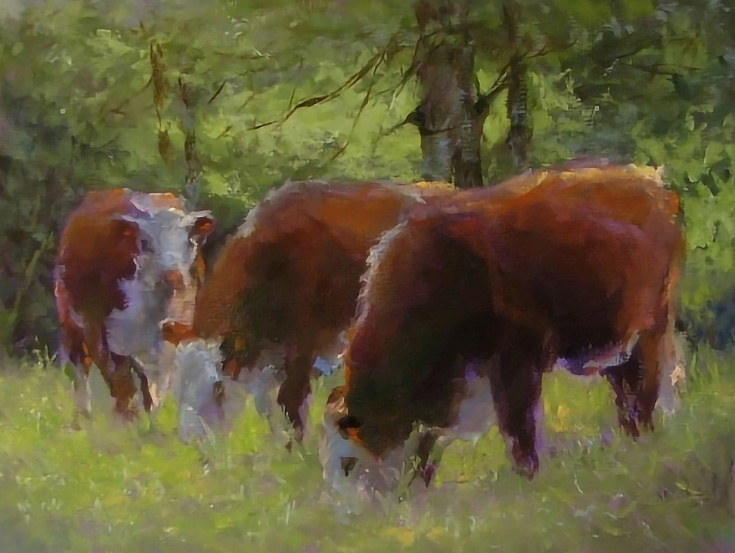
I chose the cow looking at the viewer as my focal point and painted his face in slightly cooler tones than the foliage around him. I also used parts of the surroundings to “point” toward his face (like the branches, for example).
From my own experience I know it’s best to always look for pre-existing emphasis within your own subject matter—and when it’s there, make sure to use it!
When it’s not, be creative and find a way to create your own emphasis using contrast, directional lines, or any of the other methods mentioned above.
This post may contain affiliate links.