Chiaroscuro is an art term that’s used quite frequently, but sometimes without an understanding of exactly what it means. This article will cover the more important aspects of Chiaroscuro, primarily as it relates to painting.

The word Chiaroscuro itself is Italian, and roughly means, “light and dark.” It was first used to describe a type of drawing on medium-dark paper where the artist created both darker areas with ink and lighter areas with white paint.
Later on the term was used for woodcut prints which essentially did the same thing, using white and black together.
When it comes to painting, however, Chiaroscuro truly came to life in the paintings of Caravaggio during the late 16th century.

Caravaggio began to use deep, dark backgrounds for many of his paintings, and seemed to almost turn a spotlight on his figures. The high contrast in those paintings made for intensely powerful and dramatic works of art.
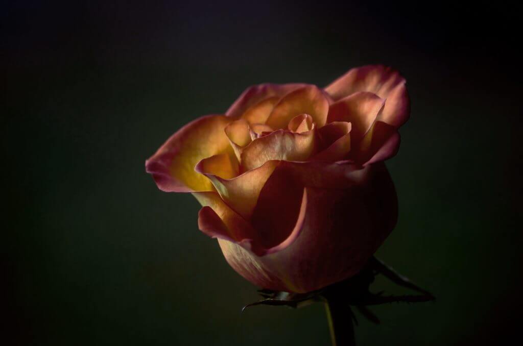
Because of Caravaggio, Chiaroscuro became very popular, and today the word is most often used to mean “high contrast” more than anything else. (To achieve this same sort of impact, you’ll want to mix your black oil paint yourself, for the deepest, darkest contrast.)
Sometimes the source of the intense illumination in a painting, whether by Caravaggio or other artists, was actually IN the painting—you can see examples in religious works, where an angel or other holy figure actually illuminates the entire scene.

Other times the light source is simply a candle, or a fire.
All of these situations offered artists a chance to explore silhouettes and other extremes, and obviously made the emphasis on light and shadow more important than the scene itself on many occasions.
For painters today, dramatic lighting is a tool to be used intentionally, with care.
When the focus of a painting is upon the form of objects, or the shape of a figure, then Chiaroscuro can be exceedingly helpful. Strong directional light will lift out details and features, and give a true three-dimensional appearance.
But not every painting will benefit. Chiaroscuro can be too harsh in portraits, too unnatural (how often are things actually lit by a spotlight?), or just too dramatic for what you’re trying to portray.
Rembrandt knew the value of Chiaroscuro’s direct lighting (in order to display the features of a face) but he softened edges and lessened the contrast of “true” Chiaroscuro to lend a calmness to his paintings as well.

So the next time you see an example of Chiaroscuro, think about how it’s being used—does the high contrast help or hurt the overall message of the painting?
This post may contain affiliate links.