Today I’ll be showing you how to color correct your artwork in Photoshop for a portfolio or uploading to the internet, by using one of my old paintings from college.
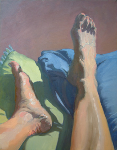
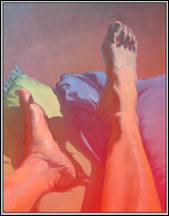
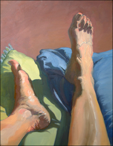
The subject matter may seem a little strange, but there’s a good lesson to be learned here. It’s from a figure painting class that I took during my Junior year of college; and we’d just been given yet ANOTHER self-portrait homework assignment.
So, to shake things up a bit – for myself and everyone else during the critique – I painted my feet instead of my face. As a result, I was more committed to not failing and worked harder on it than normal. The painting turned out to be a success, and if I remember correctly, I got a good grade for it too.
It just goes to show how a little change of pace and creative bending of the rules can make art more interesting – during the process as well as the finished piece.
OK, lets get into the color correcting.
(NOTE: your monitor may display colors differently than mine, so please keep that in mind when viewing the images.)
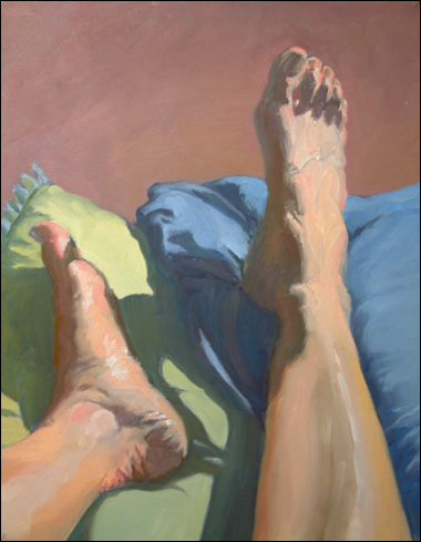
As you can see, there’s a definite blue cast to the entire painting which is coming from natural light streaming in through a window onto the canvas. It’s also a little washed out, color-wise.
Your own images of your artwork may have a greenish-yellow or red appearance due to fluorescent or inadequate indoor lighting. As you see later on, it doesn’t matter which color is the problem.
Because of that angle of the blue light hitting my canvas, I decided to add a step to this process which might not be necessary for your artwork. I’m selecting just part of the painting to color-correct, in order to avoid over correcting other parts.
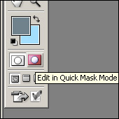
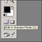
I entered Photoshop’s Quick Mask Mode by clicking on a button near the bottom of the toolbar.
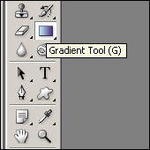
Then, I selected the gradient tool and drew a line which covered the image with a gradient of red.
Quick Mask Mode is an easy way to select a section of your image. By drawing with a brush or using the gradient tool, it’s like you’re saying, “Whatever I color red, keep exactly the way it is.”
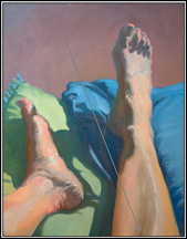
And, when you click on the button to go back to Standard mode you’ll still be able to tell what areas you’ve selected.
The red gradient will be gone, however, because in Standard Mode, your selection is outlined with a dashed line, as you can see in the picture below.
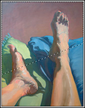 The ACTUAL area that is selected isn’t as sharply divided as it looks, but instead fades out just like the red gradient did. Any changes that are made while the dashed line is there will become gradually more subtle in the areas that were darkest red before.
This makes any photo-editing you integrate into the parts of the image don’t need to be altered, so no-one will be able to tell.
All right, now we can start getting rid of that blue color.
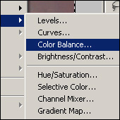 To do that, I clicked on “Layers” then “New Adjustment Layers” then “Color Balance.”
Making all of your next color adjustment on a new layer, gives you more freedom to delete or change the adjustment later if you’re not happy with how it turns out the first time.
Once I clicked OK to accept a new layer, this box popped up.
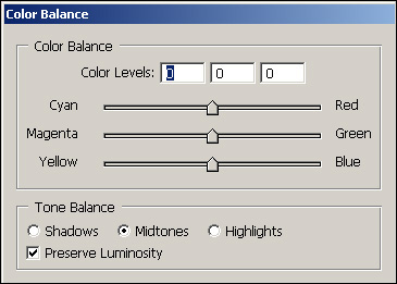
There are three buttons on the bottom of the dialogue box under “Tone Balance” which control value (lightness or darkness) of color you’re adjusting. The sliders balance whether there’s more Cyan, Magenta, and Yellow; or more Red, Green, and Blue.
Since the problem in my image was too much blue, I adjusted the sliders to diminish Blue and Cyan on each of the three value levels – Shadows, Midtones, and Highlights.
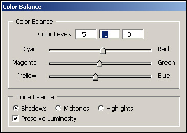
In your artwork for example, if there’s too much red just move the sliders away from red, and perhaps a little bit away from magenta.
Play around with the sliders until you can see them over-correct and create too much of the opposite color. Then find a good middle point to end on where the colors look normal.
After adjusting the color, here’s what the photo looked like.
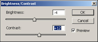
It still didn’t look quite right, so I decided to add a touch of contrast to make it look more like the original painting.
After clicking on “Image” then “Adjustments” and then “Brightness/Contrast,” I changed the sliders until I thought the picture looked correct, with darker shadows and more contrast.
And that left me with this final image.
For more information on preparing images for a portfolio or the web, check out photographing and cropping artwork.
This post may contain affiliate links.